2nd year students research and produce printed, bound books celebrating notable typographers
Students in the second year class Survey and Principles of Typography had the opportunity to select a theme and craft a 26-page book featuring 10 typographers. Completed books were uploaded to Blurb.ca to be printed and bound, resulting in a striking finished piece for their portfolios.
Newtype, by Isaac Mak, is collection of designers whose typefaces have been used in sci-fi movies.
Graeme Duckett demonstrates the two variations of the definition “Gothic” in his book; blackletter and sans serif.
As one of the final projects of the term, this project required students to leverage typographic knowledge they had gathered throughout the semester, and introduced the concept of book structure & design.
Since themes were chosen individually, a diverse and often unexpected range of subjects was selected. Some students took a more academic approach, like Graeme Duckett’s exploration of Gothic typefaces, while others chose more whimsical themes. Typographers from a specific country, such as Canada (Courtney Lamb) and Mexico (Teresa Cantu) were featured, along with those whose typefaces have been used for a particular application, such as wayfinding (Brynn Staples), fashion (Emily Huynh) and film (Isaac Mak, Alex Joukov, Nicole Shewchuk).
Sydney Toews focused on contemporary typographers for her book Not Ancient.
Canadian Typographers and What They’re Sorry For by Courtney Lamb depicts homegrown designers through the lens of our most notorious national personality trait.
Teresa Cantu’s book is a nod to her Mexican heritage.
Through their research, the work of famous names in typography such as Paul Rand, Herb Lubalin and Stefan Sagmeister were revisited, but even more exciting was to be introduced to lesser known designers and the contributions they’ve made to typography.
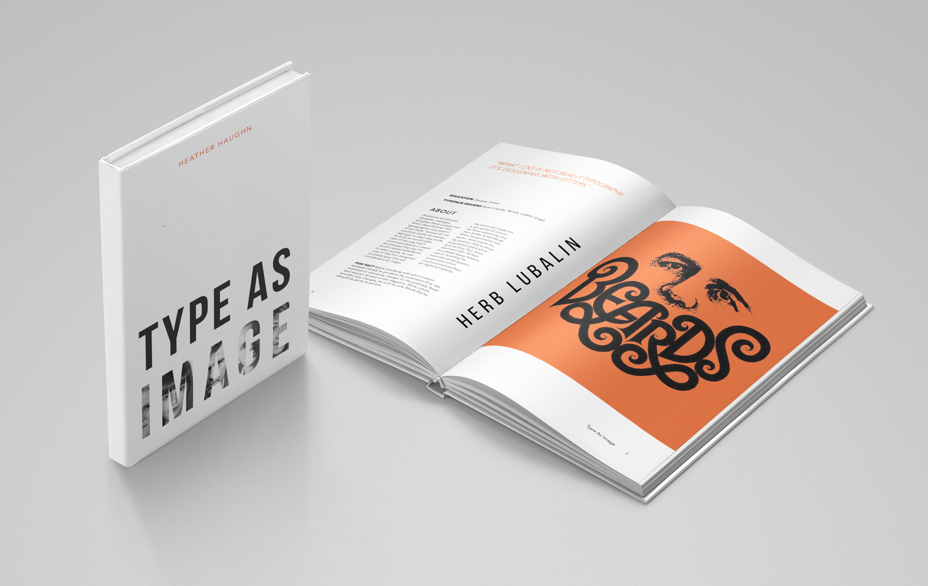
Heather Haughn provides examples of creative expression through lettering in Type as Image.
Typographers of the mid-century modern movement are featured in Jack Comer’s book.
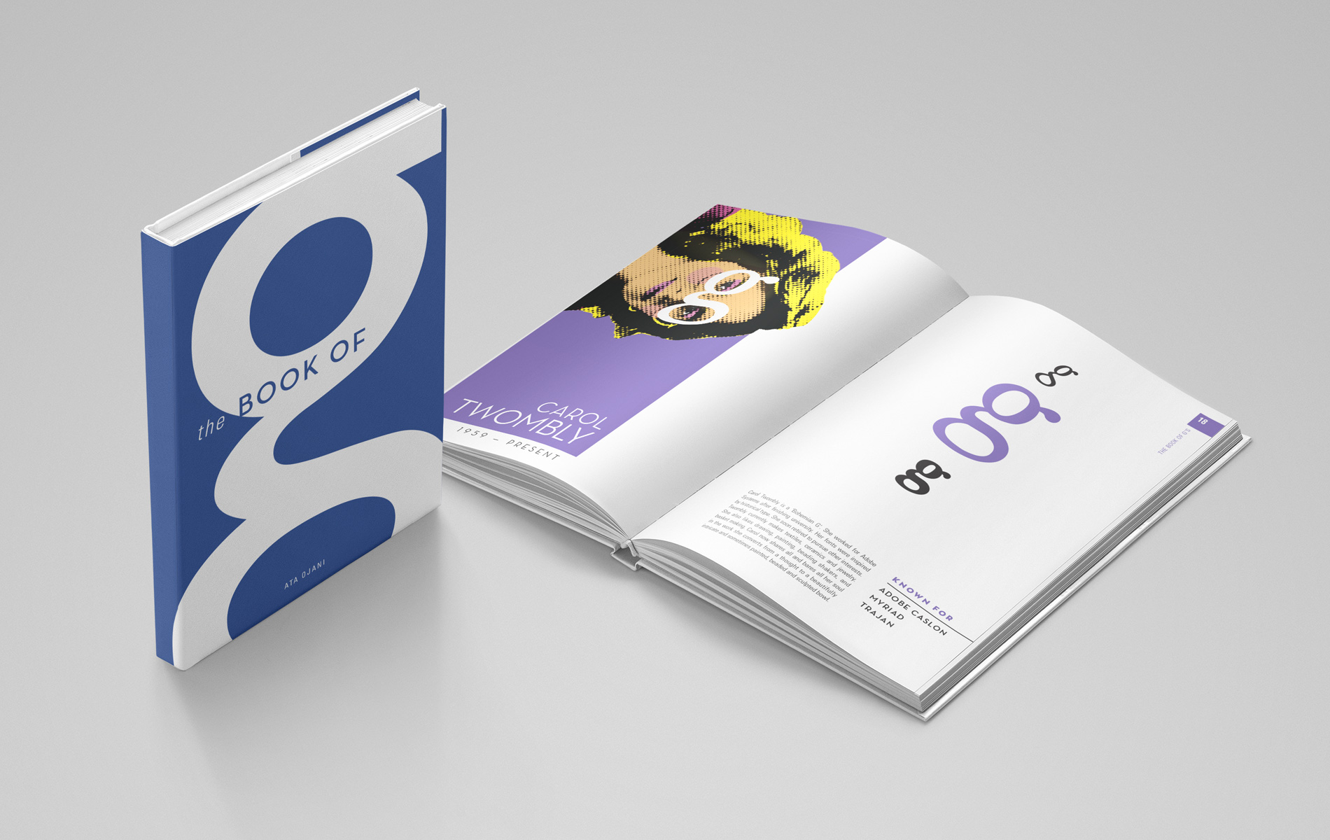
One of the most playful and inventive books, Ata Ojani’s The Book of G used the letterform to showcase variations between typeface anatomy (and what they might look like as eyeglasses!)
Atrin Yazdani-Biuki illustrates the nonsensical (and often ridiculous) words typographers choose to test a typeface-in-progress.
Survey and Principles of Typography is a course included in the second year curriculum and provides students with a thorough understanding of typography and its importance to design and communication. The principles of best typographic practice as they apply to print and digital mediums is discussed, along with the evolution of typography from the 1400’s to the present day. For additional information and program requirements see: capilanou.ca/idea/


