Annual IDEA Interprets Poster Project—Second Year IDEA students explored a timely and visceral emotion: Evil
At the end of each fall term, the final project in the second-year students’ typography and illustration classes is a poster project. The challenge is to create a unique visual representation of a broad, single-word theme. In past years the themes have been Water, The Body, Fear, and Growth. This year the students explored a timely and visceral emotion: Evil. Their solutions run the gamut from malicious plotting over a refreshment to a glimpse into a devil’s off-hours.
For the past 4 years, IDEA Interprets Annual Poster Show has been an annual school project that culminates in a public exhibition at the Ferry Building Gallery in West Vancouver. Due to health measures around COVID-19, this spring’s show has been cancelled.
In light of this, we invite you to enjoy the images here on the IDEA School of Design blog. Thirteen of them will also appear in an upcoming 2021 promotional wall calendar. Shown above: “Nurture” illustration by Talia Rouck.
“This illustrated poster discusses the concept of evil as an outside force that is most often taught, and that there is always human intention within evil acts. ”
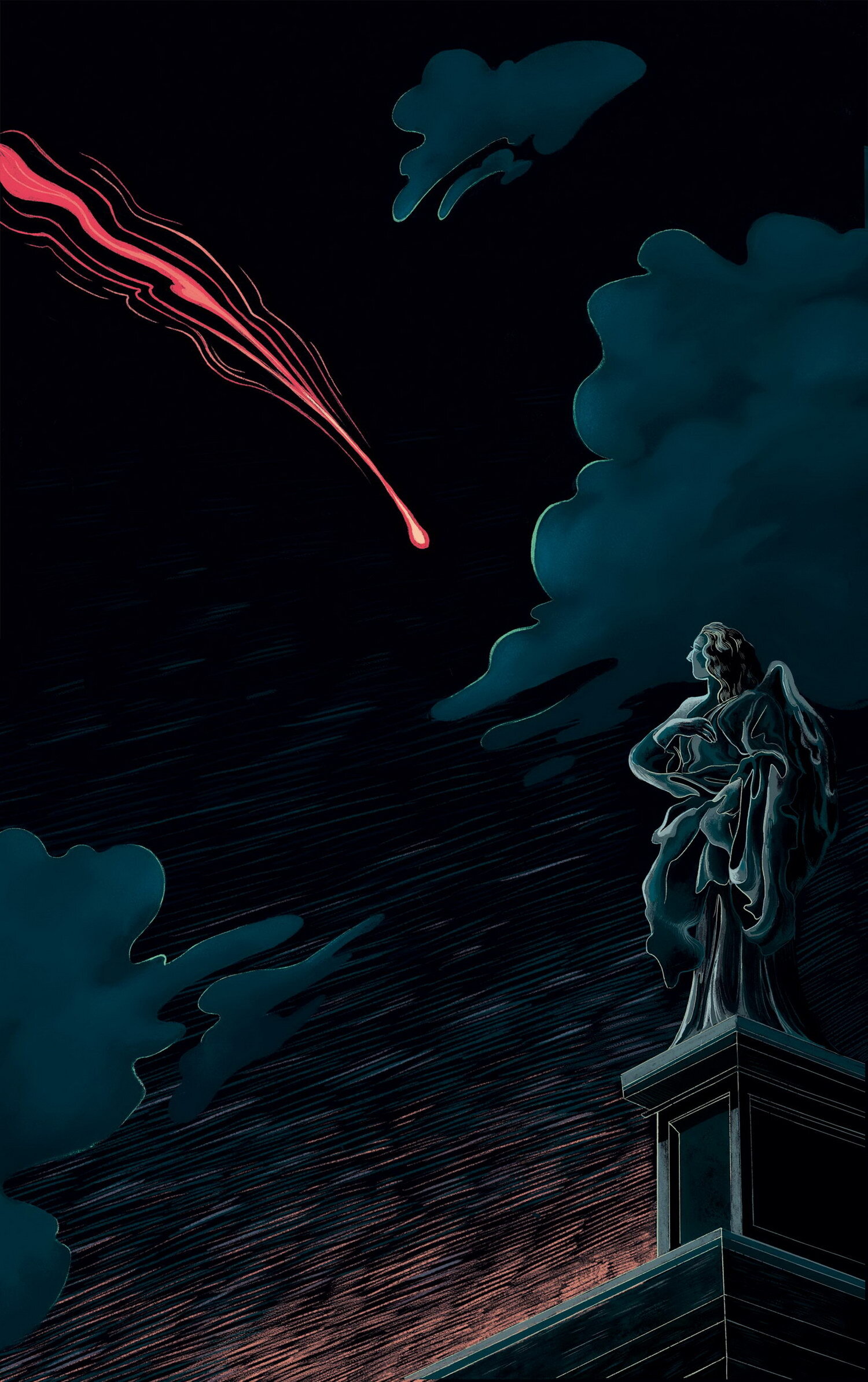
“Prelude” by Alba Palomar Robisco
Rather than the physical embodiment of evil, Alba was inspired by the prelude to evil.
She was interested in depicting superstition and the idea that certain events are messengers or portents of evil. Specifically, she was fascinated by the panic and terror comets inspired in the past. Often attributed as omens of impending calamity from a furious higher power, Alba’s poster depicts the statue of an angel turning helplessly to watch a comet streak cross the night sky. She wanted to capture a sense of dread and impending doom in the face of cosmic evil.
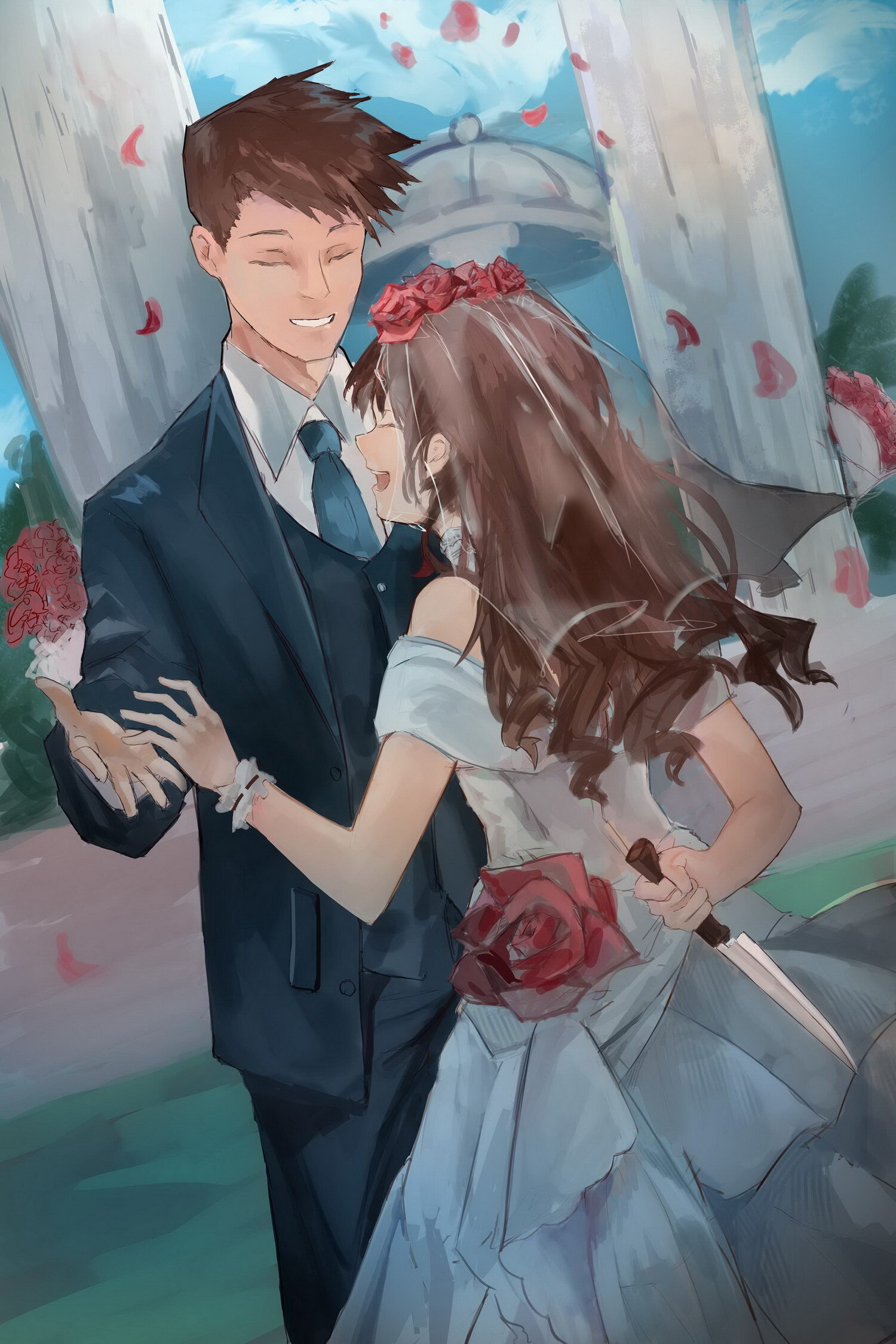
“An Unexpected Celebration” by Alex Chen
This year our class was tasked with illustrating posters with the spooky theme of evil! For this illustration Alex wanted to show a dramatic twist of evil instead of a subtle one, so he decided to illustrate a wedding scene that depicts the moment before the husband's unfortunate end! What was her intent in murdering her beloved newlywed? Money? Assets? Madness?! He’s not too sure, but he thinks the concept would make a nice movie plotline!
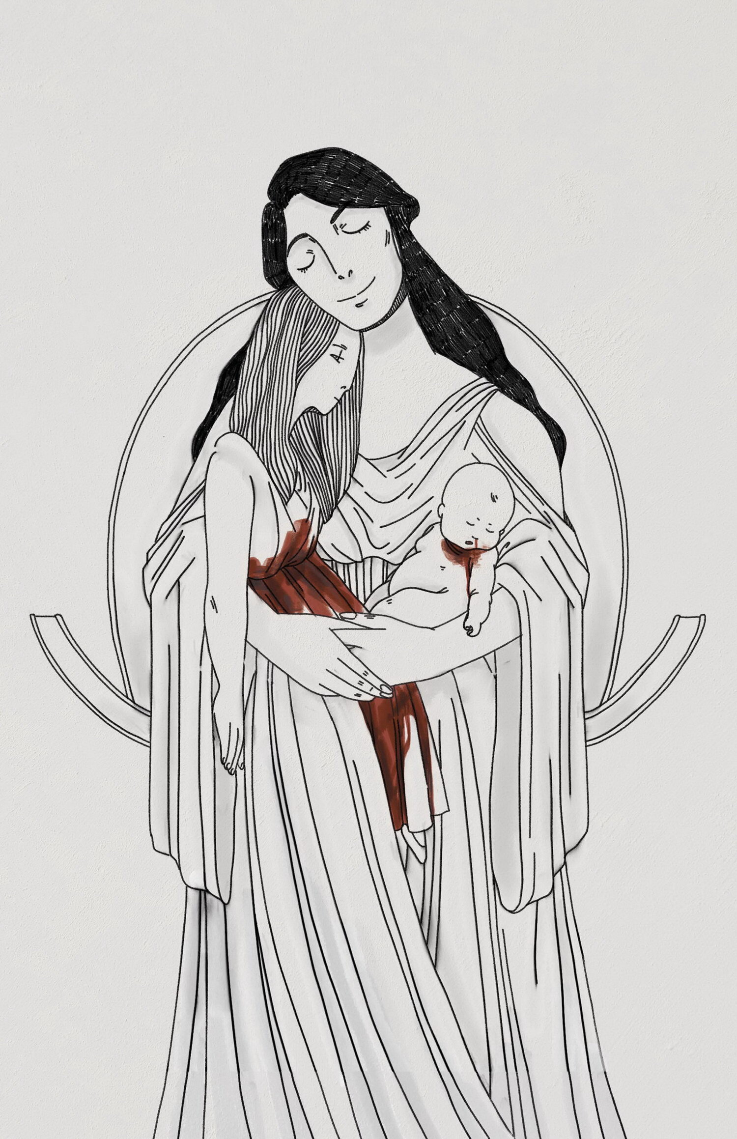
“Medea & Her Children” by Alina Sandu
For Alina’s illustration, she decided to depict what she viewed as one of the most evil figures in Greek mythology: Medea. After being cast aside by her husband, Medea decided to take revenge... by murdering her two children. As such, Alina had Medea depicted cradling the corpses of her children with a face of satisfaction, as in Medea’s mind she was in the right for doing this. The real kicker is that the original telling does view her as in the right for doing this. How morals have changed throughout the ages...
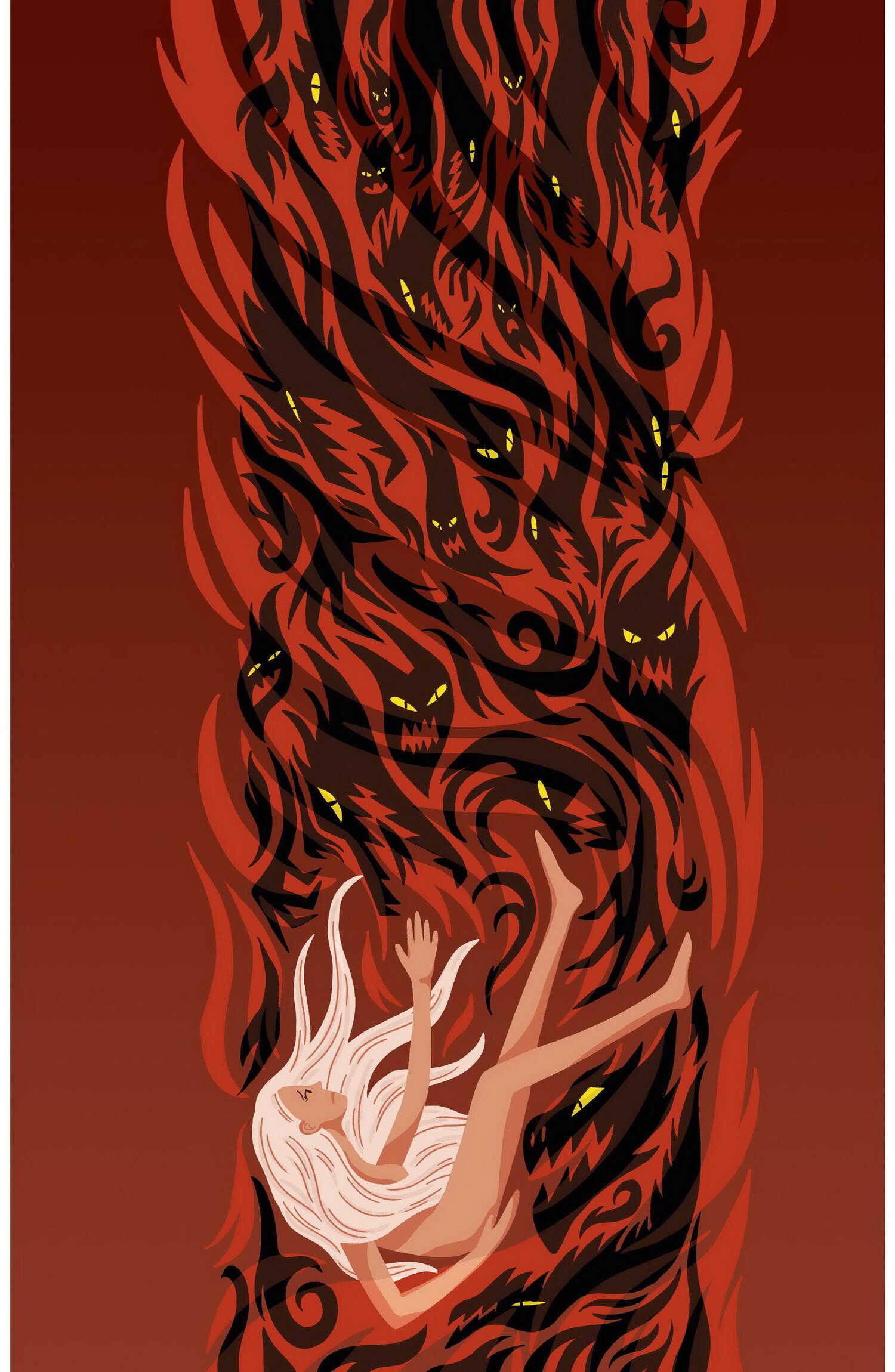
“The Fall” by Annika McFarlane
Ever wonder what it looked like when Eve fell from paradise? In Annika's imagination, it might've looked something like this. Annika was inspired by the universal feeling of failure and how it sometimes feels like we’re freefalling. Sometimes we’re alone and sometimes, we’re surrounded by a gaggle of demonic spirits.
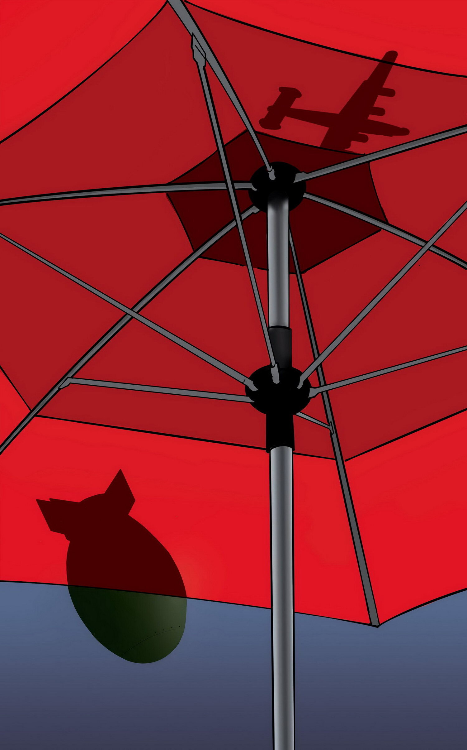
"Duck and Cover" by Carson LaBute
The approach taken by Carson LaBute in his poster was inspired by the atomic bombs dropped on Hiroshima and Nagasaki. The topic, while being extremely serious, is approached in a more subdued and calm manor, trying to reach more of a realization in the viewer that evil doesn’t just come from imaginary monsters and fables. Carson wanted to highlight the reality that more often than not, evil is manifested in the world by people.
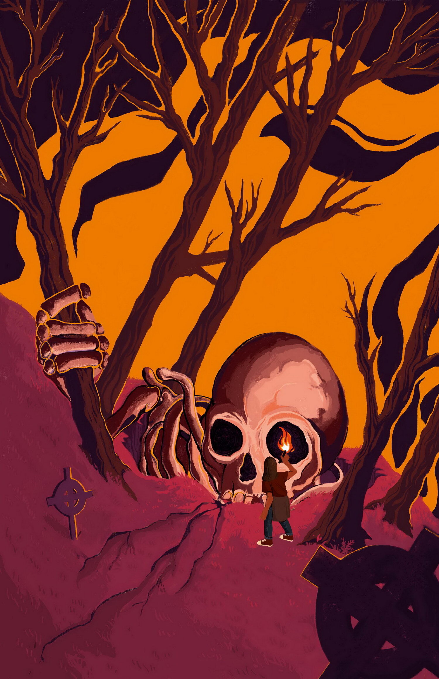
"Resurrection" by Celia Palomar Robisco
Celia is intrigued by the idea of evil in a state of dormancy, which was inspired by folkloric stories which often reference a slumbering evil beneath the feet of their heroes. More specifically, Celia is interested in the moment where that dormancy ends, and evil awakens. The poster imagines the point when evil announces its presence and the hero realizes they were never safe at all.
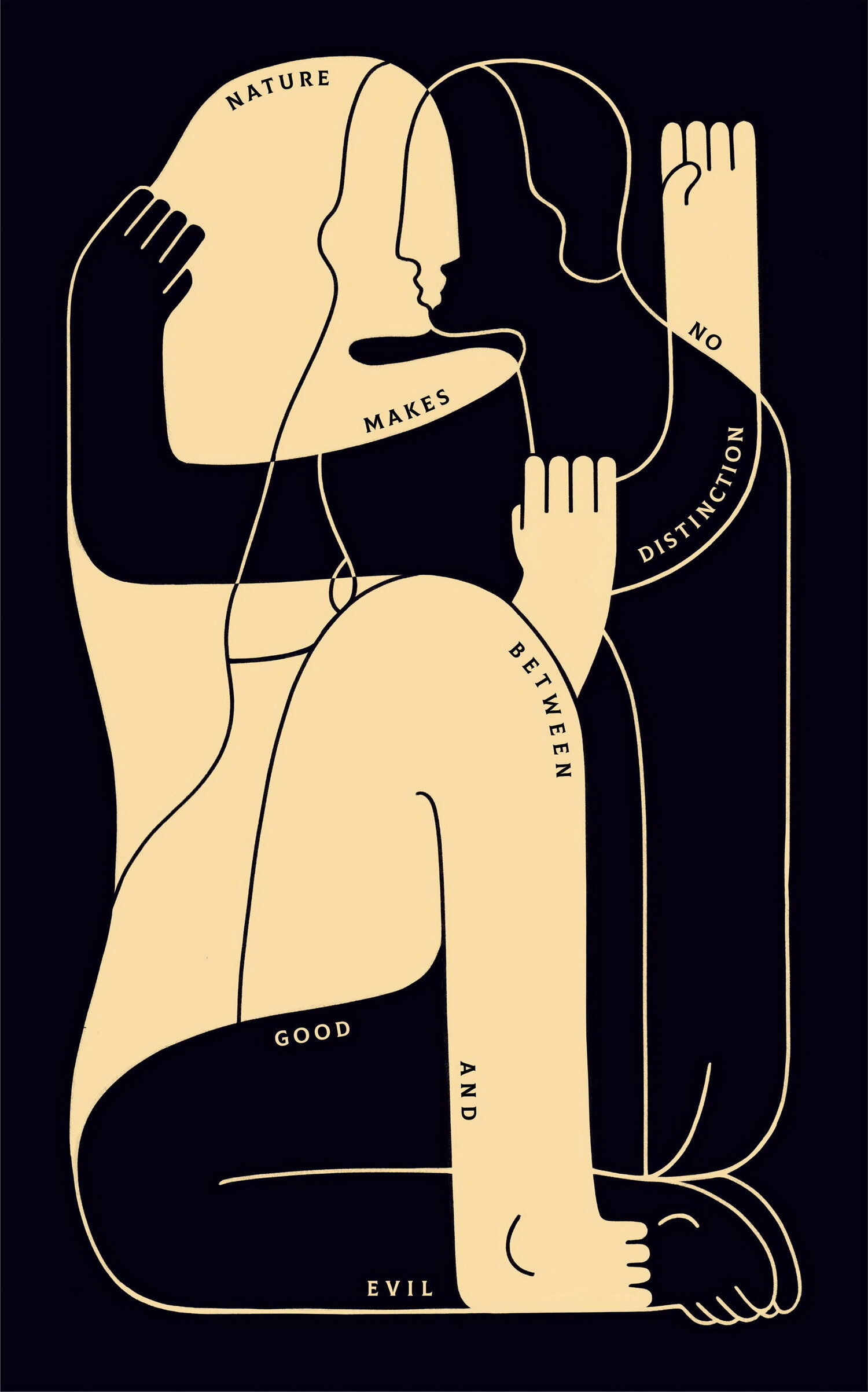
“Nature’s Embrace Rationale” by Coralie Mayer
Life’s not fair. According to Anatole France, nature isn’t either. In this piece, Coralie depicted nature’s nondiscriminatory character as a vision of lovers entwined in an embrace. The figures complete each other entirely, needing unity in order to be whole. Coralie was inspired by the notion of Yin and Yang and the impartial balance of the world we live in, where evil will not always go punished and good will not always prevail.
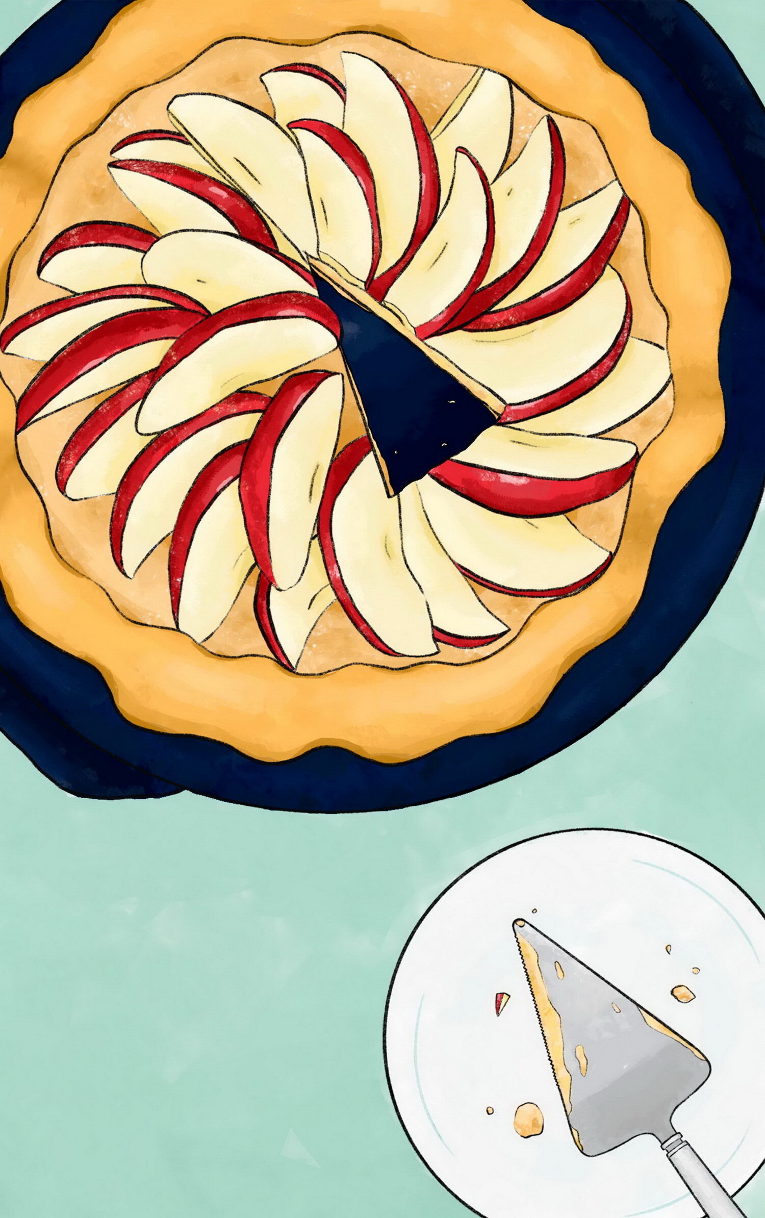
"A Slice" by Elizabeth Lin
Rather than depicting evil as a serious and dark subject, Elizabeth decided to represent it in a more lighthearted and fun way. Inspired by the meaning of evil as an action or event meant to hurt others, Elizabeth chose pie as the subject, a food beloved by most people. Pie is meant to be shared and the first slice often determines the rest, but in this pie, evil has already made its mark.
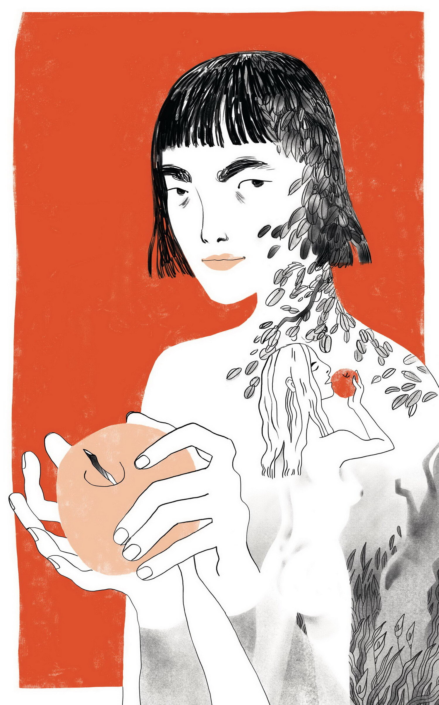
“Bite” by Emma Sato
Inspired by the biblical account of the fall of man in the garden of Eden, Emma created this poster as a reflection on the nature of our choices. Faced with Eve’s dilemma, would we have made the same decision? This struggle between desire and knowledge, the piece argues, is deeply and unavoidably human.
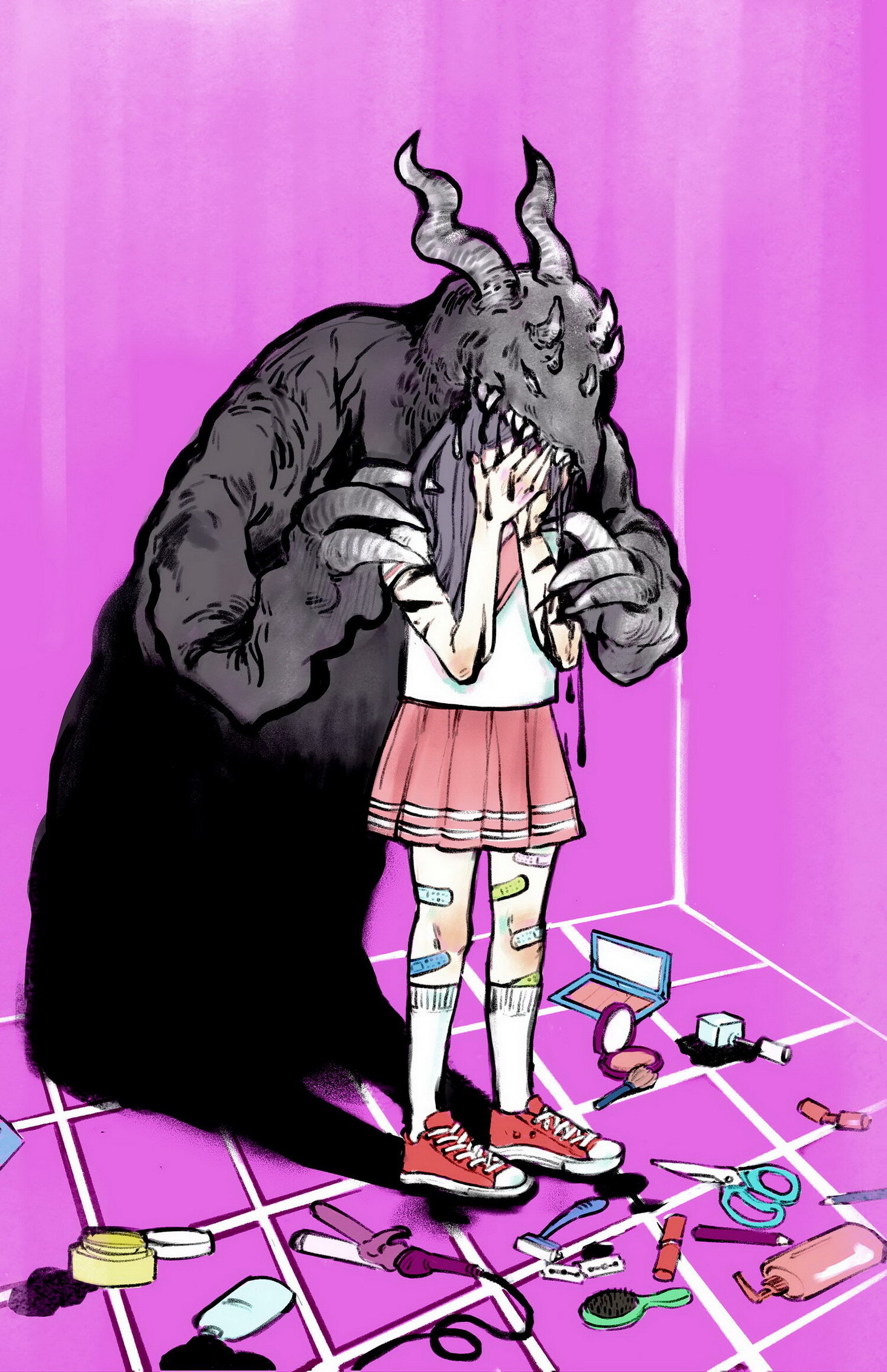
“Pretty Hurts” by Geraldine Yaris
Geraldine doesn’t apply makeup often, but when she does, she sometimes questions the creators of her favourite BB cream. The place these products hail from is called the “beauty” industry and yet it casts an ugly shadow that looms over and preys on the minds of billions impressionable individuals worldwide. What does it mean to be beautiful? And what sacrifices are we willing to make to get there?
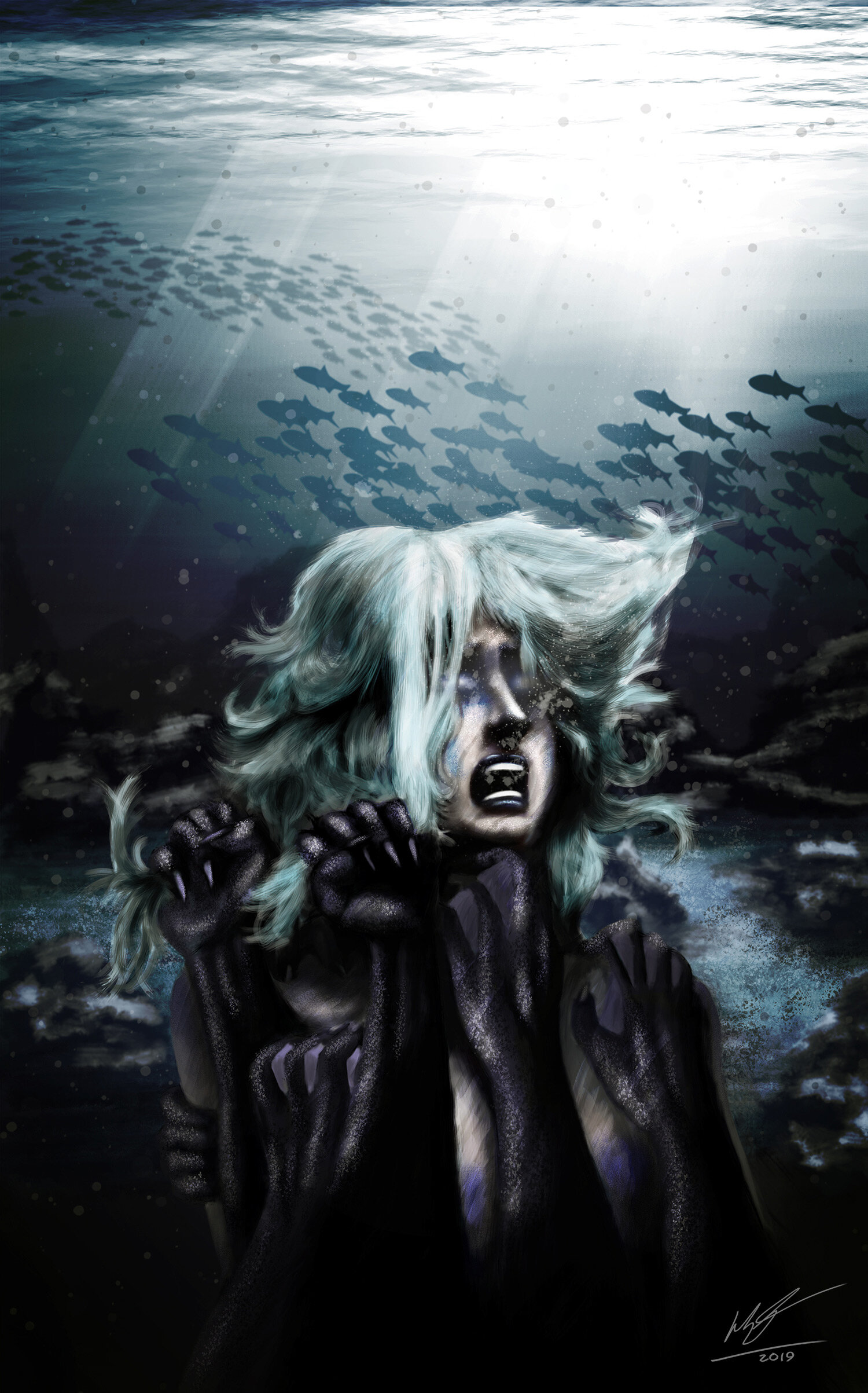
"Mermaid" by Harlen Bertrand (IDEA Grad 2023)
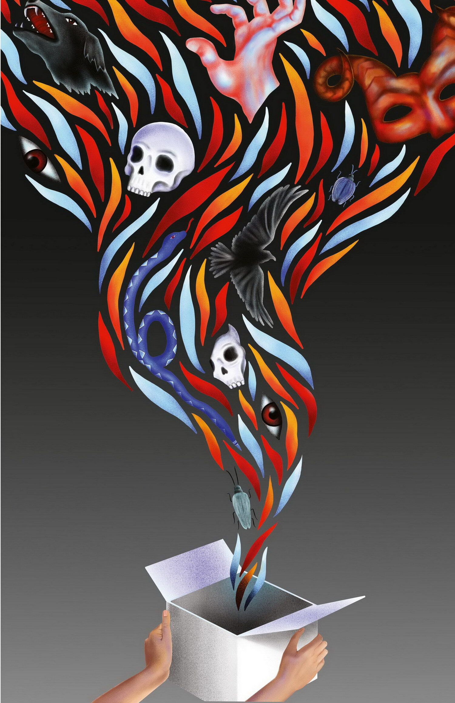
“Unleashed” by Janelle Momotani
Janelle’s evil themed poster was inspired by Pandora’s box, an artifact in Greek mythology. In this myth, Pandora’s curiosity got the best of her and she opened a box that she wasn’t supposed to. Janelle chose to illustrate the moment when the box unleashed its evil. In a world where curiosity is encouraged, this poster depicts the possibility of curiosity leading to unforeseen problems.
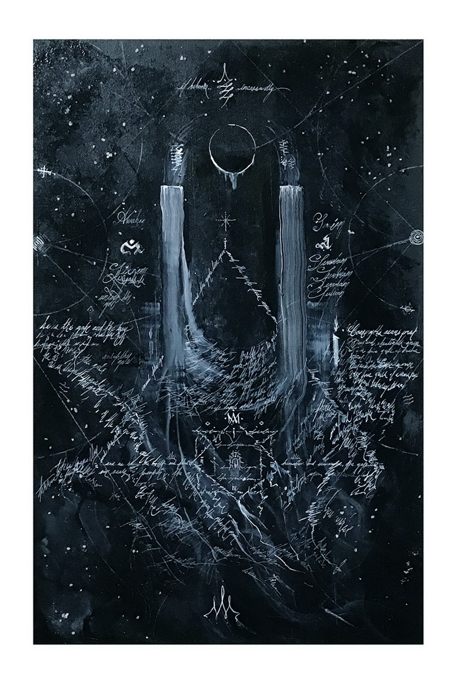
"Whispers from Beyond the Gate" by Jonathan Pachkowsky
In tackling the theme of evil, John wanted to play with the concept of not necessarily directly depicting evil, but its influence. Taking a narrative approach, he wished to depict the dreams of one who reached out and inadvertently made contact with a dread presence as ancient as the stars themselves. Frantic, cacophonous whispers ever beckoning them to cross the threshold of a smoking astral portal. Their sanity is eclipsed, and the voices demand they give themselves to the unknowable presence that lies in the frozen void beyond.
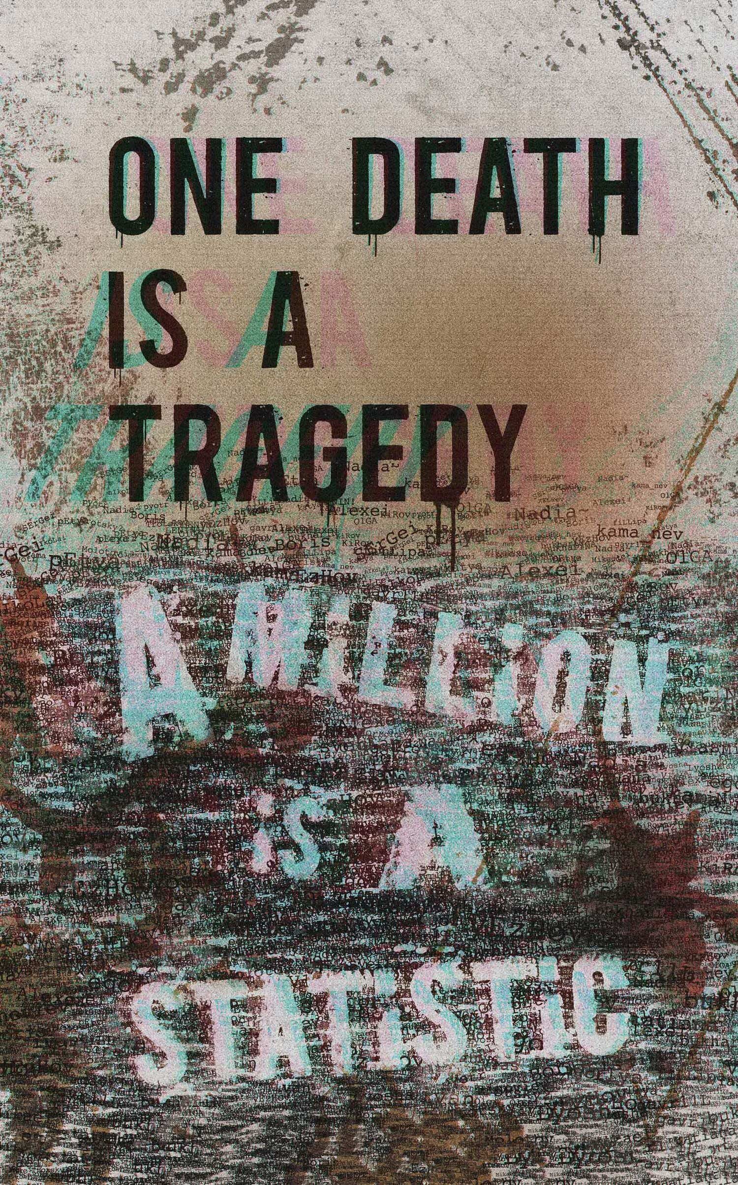
"The Purges" by Joseph Chang
Joseph Chang chose to take the quote “One Death is a Tragedy, a Million is a Statistic”, and transform it into a typography poster. The quote is from one of history’s most infamous despots, Josef Stalin. Known for his iron fisted rule over the Soviet Union, he was responsible for the deaths of millions of innocent people. Because of the person behind the quote, ‘evil’ was a natural fit. The poster was rendered in a grunge style to evoke textures both harsh and gritty, much like the meaning behind the quote itself. The bottom half of the poster contains the names of hundreds of those lost to Stalin’s murderous purges.
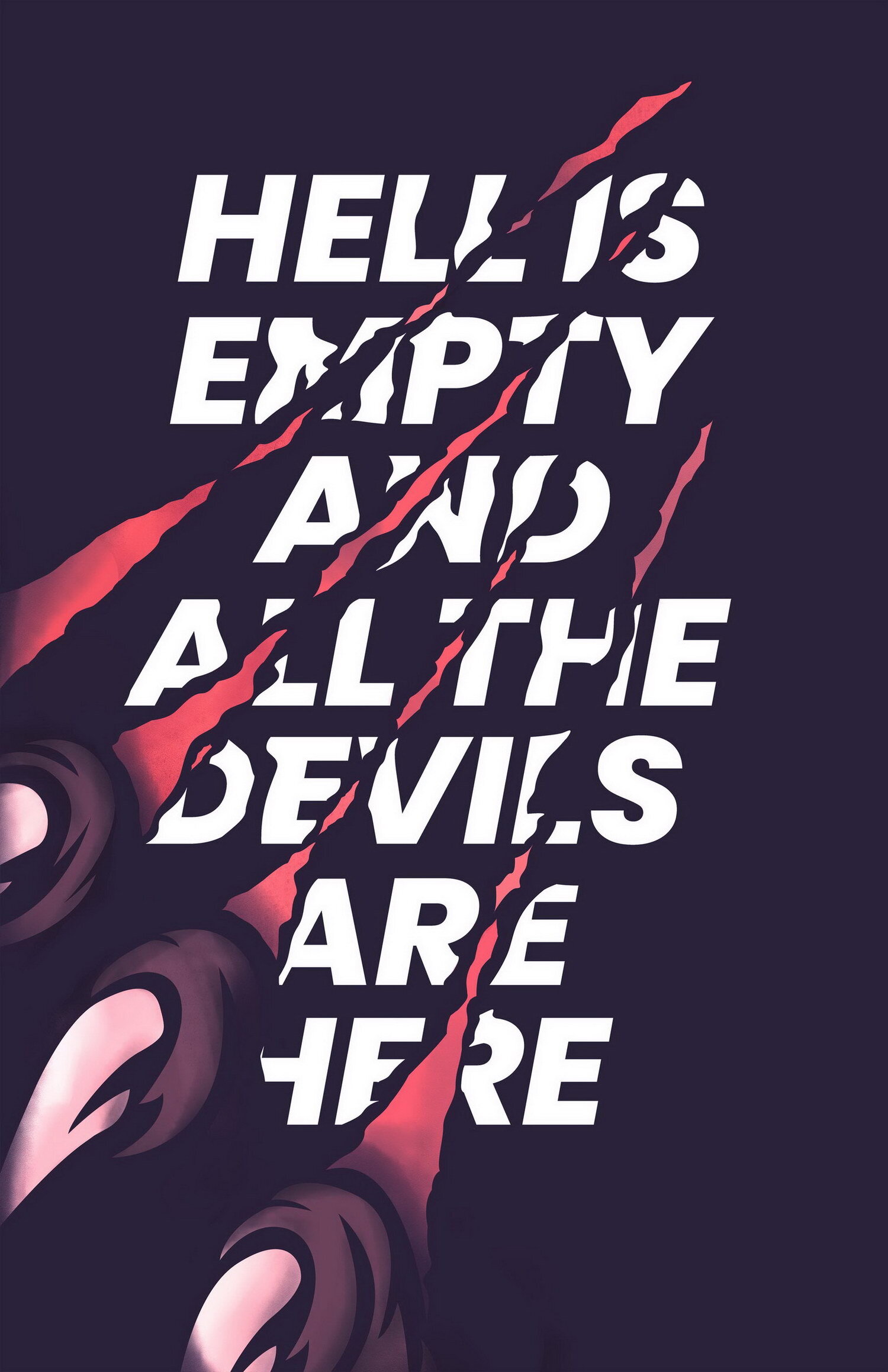
“Hell is Empty” by Joyce Chan
The 2020’s poster series explores the chilling theme of evil. Joyce designed her evil themed poster around a famous Shakespeare quote from his play, ‘The Tempest’. She wanted to encapsulate the sense of menace and dread, interpreting it as evil being present among humanity. The outcome of her poster was a spooky image of demon claws scratching through the type, denoting that there is no escape.
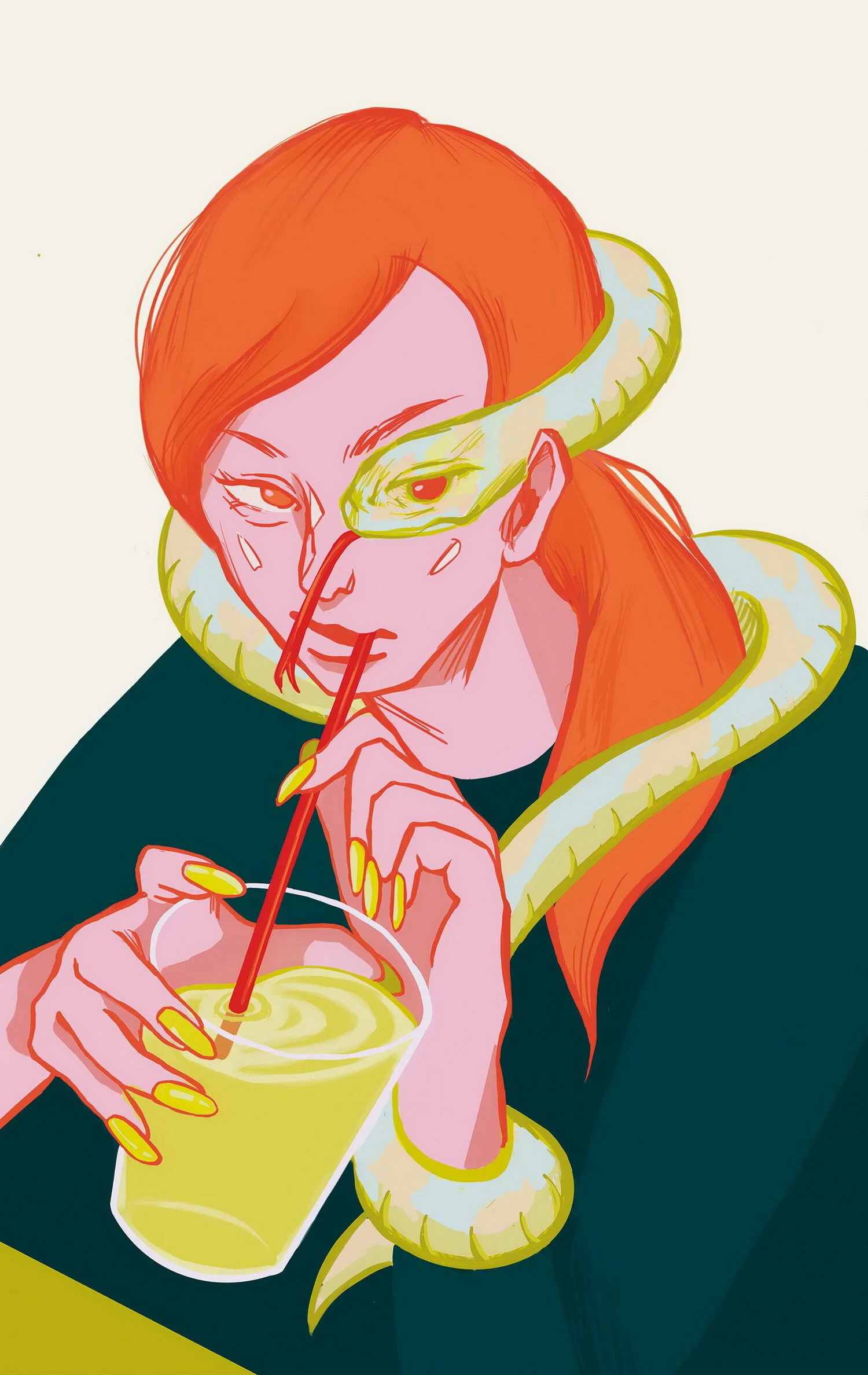
“Deception“ by Kaho Furukawa
Kaho has never seen a real-life serpent, but she sure has met a few other kinds of “snakes”. With this piece, she aimed to depict how evil can sometimes be invisible to the eye. What will the woman see through the lens of a snake ー the embodiment of calculating evil?
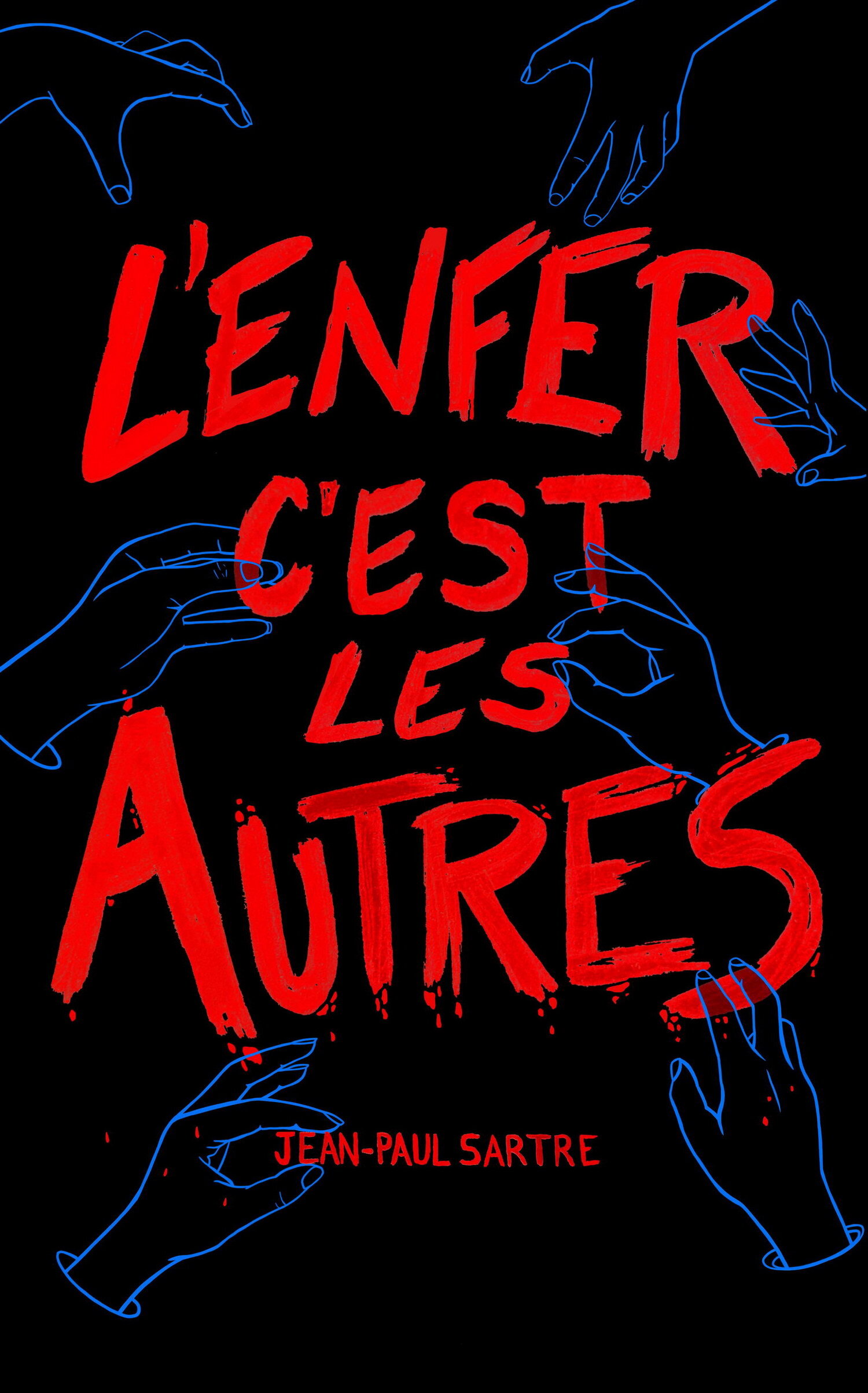
"L’Enfer C’est Les Autres" by Katrina Lashmar
Katrina Lashmar designed this evil themed poster with the quote “L’enfer C’est Les Autres” by Jean Paul Sartre which translates to “hell is other people”. The poster features bold red hand lettered text and hands surrounding it to create the feeling of imposing doom. The poster is an interpretation of social anxiety.
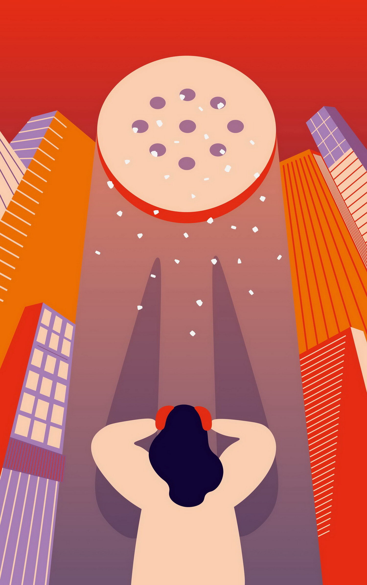
"Spilling Salt" by Marina Subach
For this project, Marina chose to take a whimsical approach. In many cultures there is a belief that spilling salt brings bad luck to a household. So, Marina chose to humour this superstition by leveraging the power of exaggeration. The saltshaker in this piece is as tall as the skyscrapers giving us a sense of impending doom. Marina is very funny.
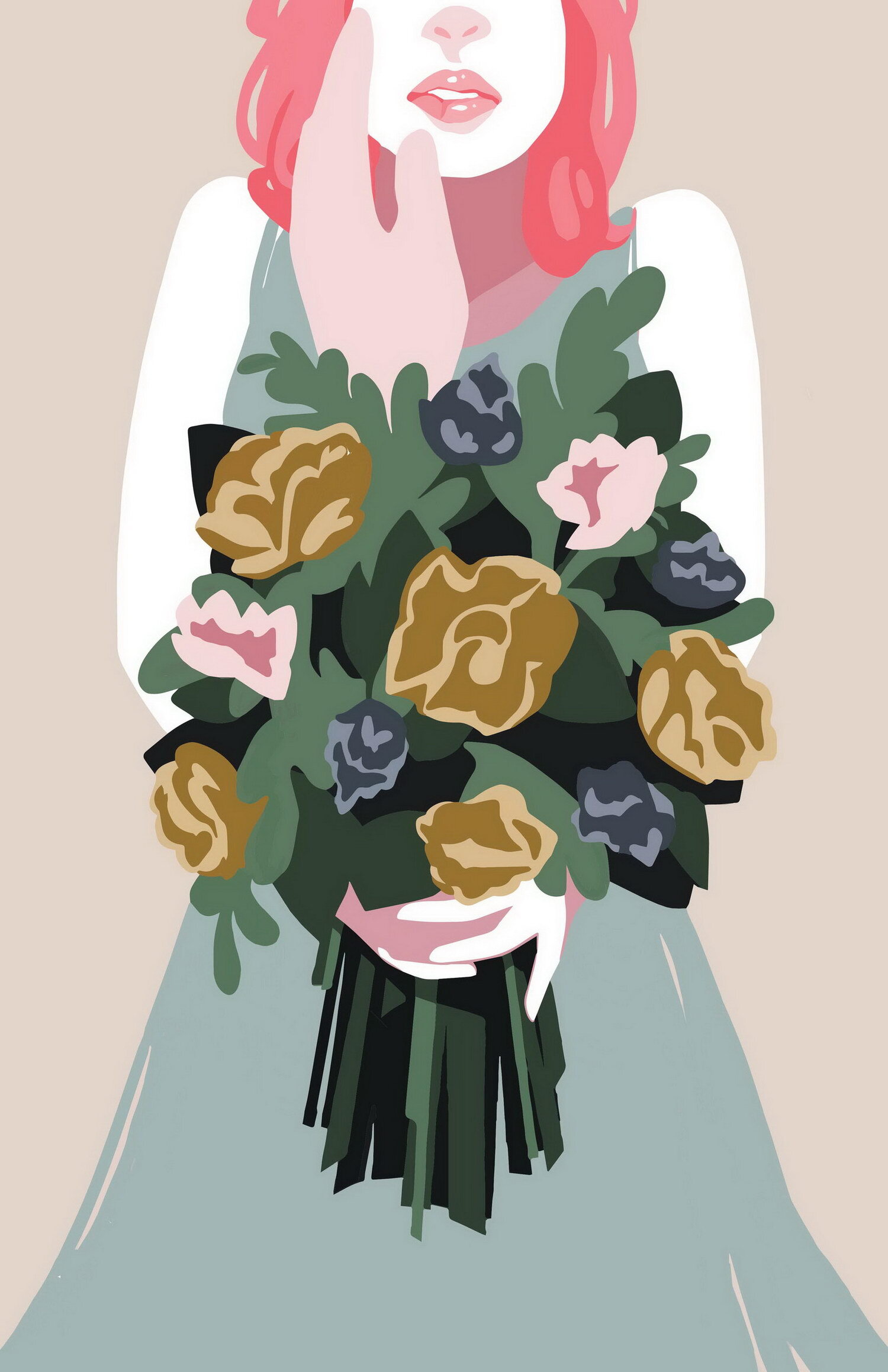
“Ulterior Motives” by Mikaela Manuel
Things aren’t always as they seem, and sometimes a sweet gesture has a wicked intention behind it. Mikaela is a pretty bubbly person, but she took this opportunity to embrace the dark side. ...well, her version of it.
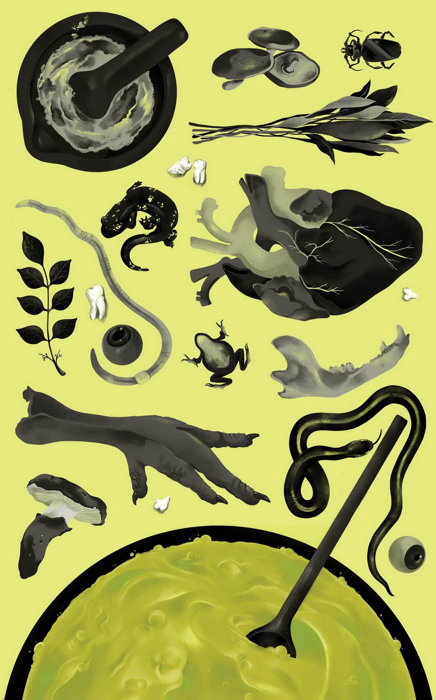
“Double, double toil and trouble” by Rocio Palomar Robisco
Rocio is by no means a good cook, but even she wouldn't cook anything like this. Using the idea of a witch’s potions and spells, Rocio’s poster is a visual representation of a recipe for a curse. She was fascinated by the idea of premeditated acts of evil and the time and care that goes into planning them. She was inspired by cookbook photography and wanted to juxtapose the pleasing composition with stomach-churning “ingredients”.
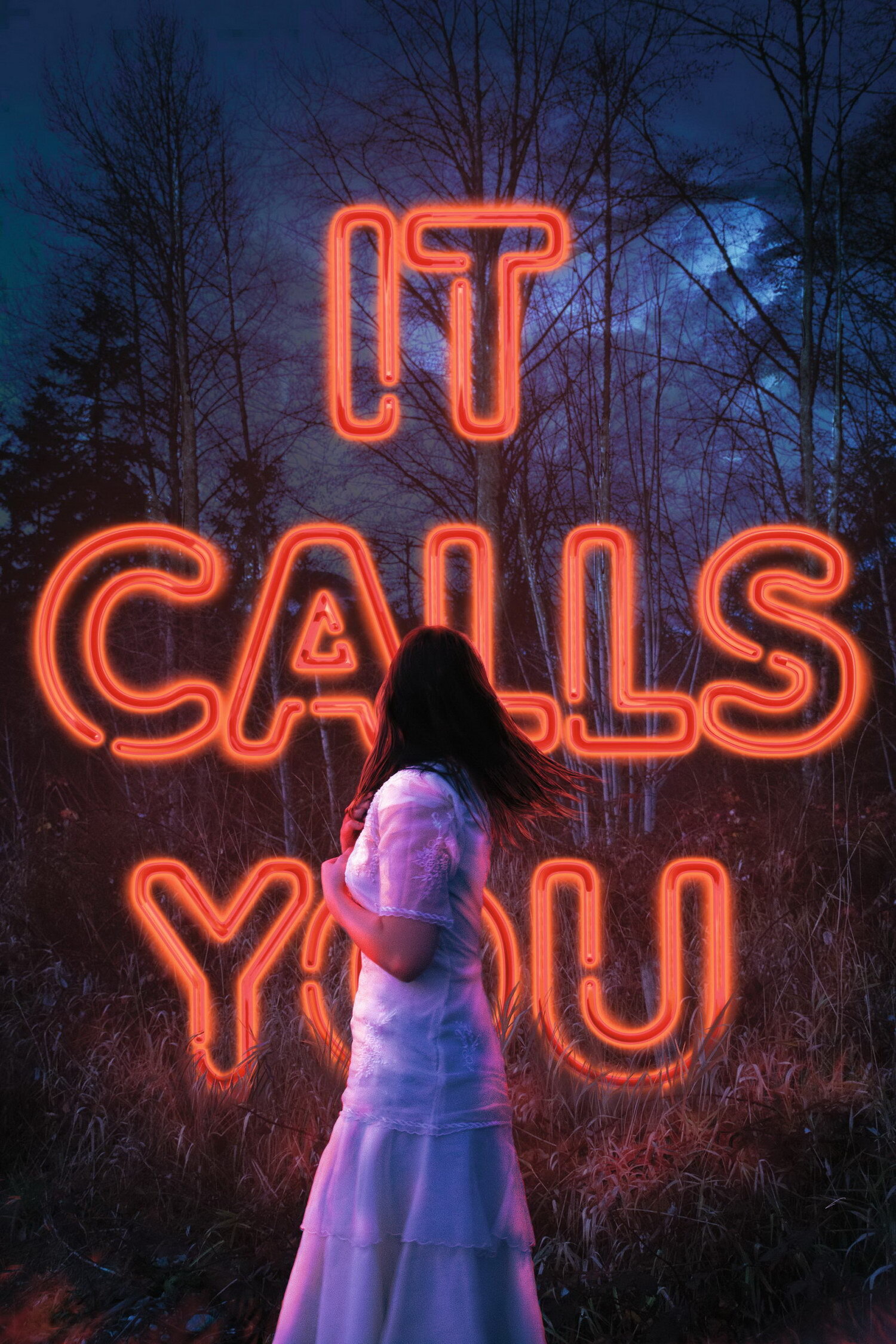
“It Calls You” (Typography) by Talia Rouck
You ever seen Star Wars? Ever heard of Anakin Skywalker? Now imagine the part where he turns to the dark side, but he’s a brunette damsel lost in the forest caught off guard by the attractiveness of evil. Talia likes to imagine that should that scenario ever take place, this is exactly what it would look like.
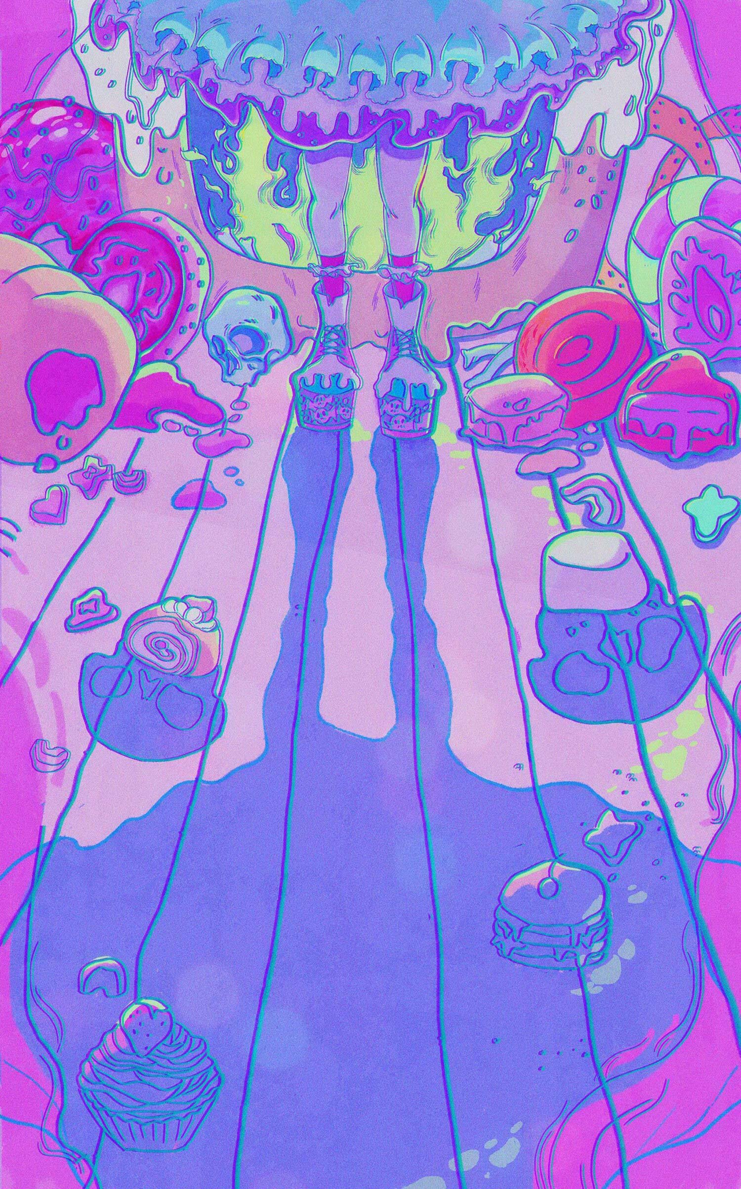
"Sweet Illusion" by Thea Pham
For Thea’s illustration, she was inspired by the German folk tale “Hansel and Gretel “, with the sweet candy house and the evil witch living inside. The story is dark, but the imagery is subtle with a hint of cuteness. It’s a reminder that you should not trust people based on their appearances.
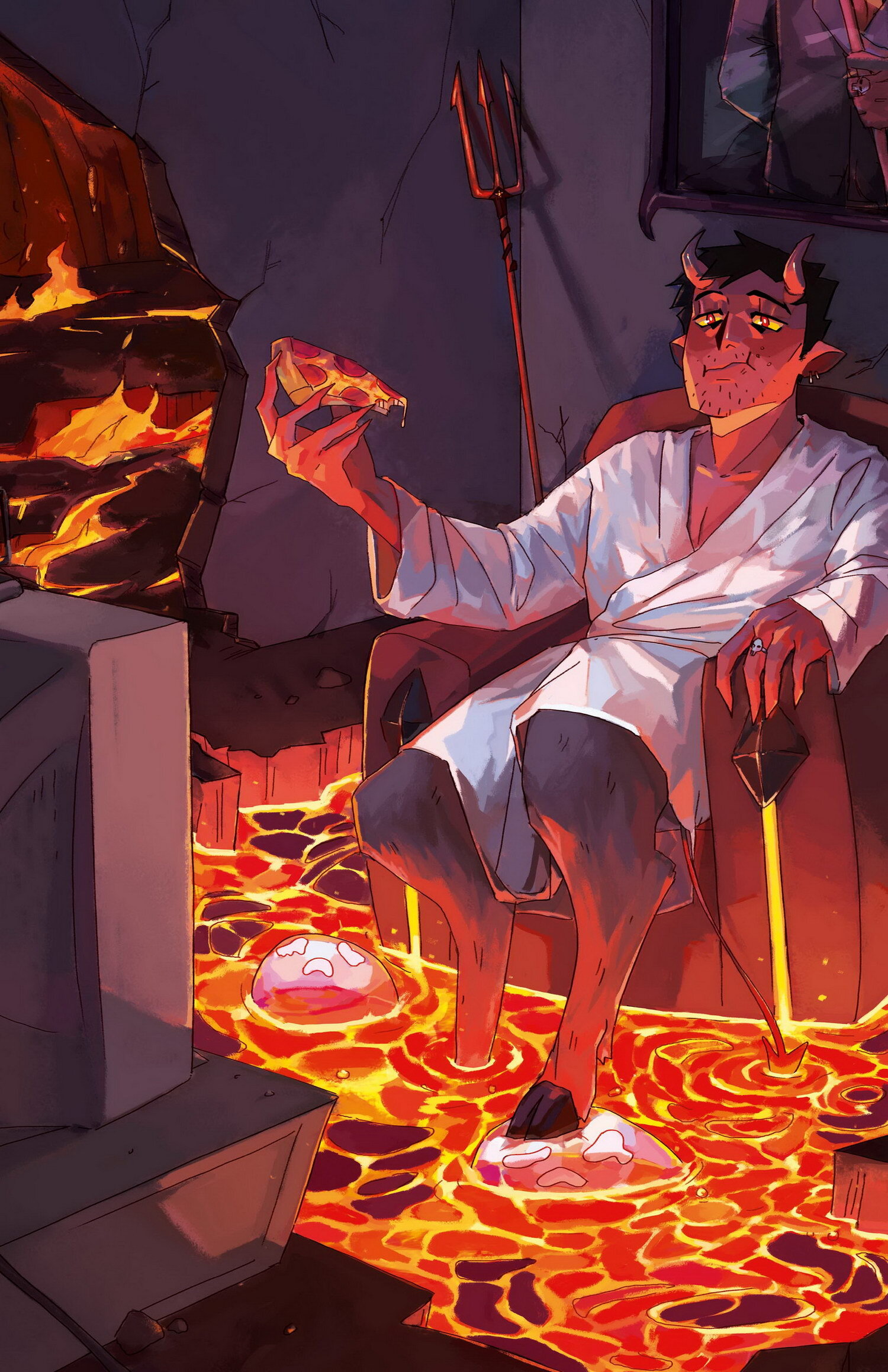
“Demon’s Downtime” by Tina Trinh
For Tina’s illustration, she went for a more literal approach of evil, an actual demon. To simply illustrate an evil demon would be much to obvious, so Tina chose to go with something more lighthearted. This resulted in Demon’s Downtime. There was something comedic about a demon, off the clock, watching TV while eating pizza in his hellish room while the souls of the damned are used as his footrest.
About IDEA Interprets
IDEA Interprets is an annual exhibition by Capilano University Bachelor of Design 2nd year students which runs every spring at The Ferry Building Gallery located at 1414 Argyle Ave, Ambleside Landing, West Vancouver, British Columbia. Instructor: Pascal Milelli.
James has over 20 years of experience in the web/interactive design and development, Internet marketing and social media industries, working primarily as a freelancer, consultant and instructor, but also as a subcontractor to small agencies. He has experience with a variety of clients in small business, government, institutional and not-for-profit sectors. James is an instructor, lab supervisor and blog/social media coordinator at Capilano University's IDEA School of Design and also teaches a CodeCore College. His specialty is HTML & CSS for designers.
