Third year students UI Design Systems Project—Designing a Finance App for Teens
Third-year IDEA students were put to task, over a 3-class UI design sprint. Students from IDEA Grad 2021, were given the challenge to make financial data analysis motivating and easy to understand for a niche user group!
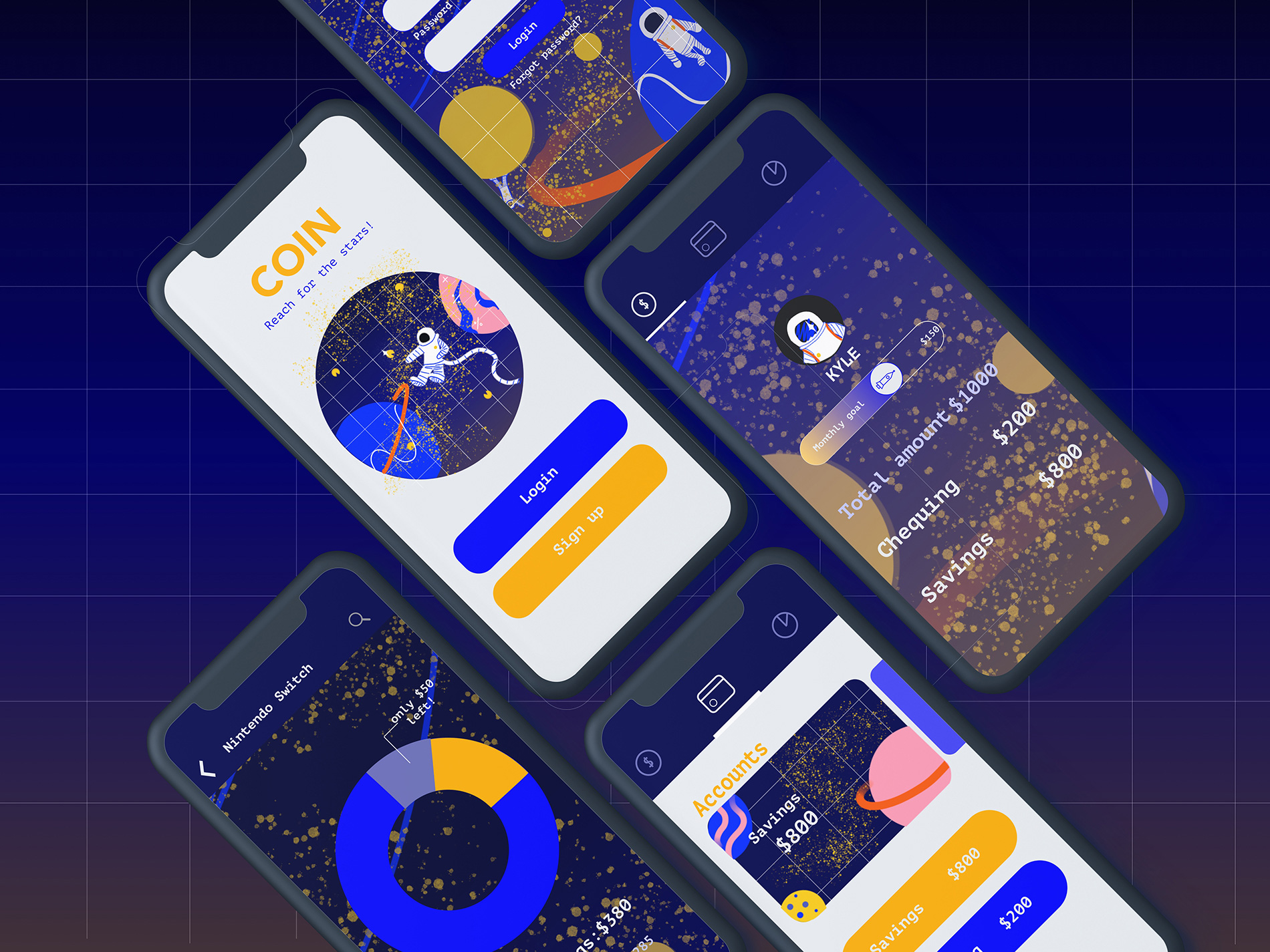
Shown above: CoinHub personal finance app UI design by Haluka Yagi (IDEA Grad 2021). Instructor: Christina Lee Kim Koon (IDEA Grad 2010). See Haluka’s published case study at medium.com/@halukayagi
For this project, students were tasked with branding and designing a personal finance app for a specific target market. Using Google’s Material Design principles as a base, the goal was to make finances engaging, easy to understand and educational for the target market.
Students could choose from two niche user groups (or redefine their own)
middle-school-aged children who are learning about money management for the first time.
Young adults, recent post-secondary graduates who are entering the workforce for the first time, earning income but paying-off their debt.
Amy Asin
Coin’s concept centres around space exploration. This is because finances seem mysterious and vast to pre-teens, much like outer space. Coin guides users and pushes them slowly further into space, allowing them to achieve bigger goals than they thought were possible. Coin shows the users that it is possible to buy both a Nintendo Switch and a Skateboard if they save their money.
See Amy’s published case study at medium.com/@amychika.asin
Sara Nguyen
CoinHub is a personal finance app geared to help teach kids how to manage their money and be an 'adult'. They make use of data visualization and personalized avatar interactions to create a one-of-a-kind brand experience for each child.
See Sara’s published case study at medium.com/@sara.sn.nguyen
Valeriya Kim
My last project’s main goal was to create a user-focused financial app that would allow juniors to investigate the financial world. Using the Design Principles provided by Google’s Material Design website, I came up with an app design concept. Its primary use is helping to understand financial data as well as stimulating young users to explore the topic of budgeting.
See Valeriya’s published case study at medium.com/@valeriyakim
Project Background
Amplify your UI design skills. Get ready to create some striking UI design backed by Google’s Material Design Principles. We will create a mobile design system, for a user-focused financial app, that examines the details of product design colour, typography, and grid systems.
Build a Mobile Design System based on Google’s Material Design Principles, for a personal finance app, similar to Google’s Material Design Rally.
Due to project time-constraints, mid-fi wireframes and UX flow was provided by our instructor. For this project, students were asked to take these existing UX and generate the UI design system. Our goal was to study grid systems, typographic scales and colour accessibility while creating a branded UI experience.
Project Deliverables
Students were required to design the following ‘screens’:
Login screen & error
Overview
Accounts Summary
Account Detail View
Educational area
Education detail
Snackbar
Dialogue box
The final project was submitted as a process case study on Medium.
“IDEA School of Design—Bachelor of Design in Visual Communication at Capilano University—is a career-oriented program for the next generation of creative professionals, with concentrations in branding, illustration and interactive design.”


