First Year students (IDEA Grad 2024) Design Some Very Creative Book Covers for Their Expressive Typography Project
This year's First Year IDEA School of Design students (IDEA Grad 2024) have designed some very creative book covers for their expressive typography project for IDES 142 Survey and Principles of Design II with instructor Vida Jurcic. Here are a few, covering a variety of genres.
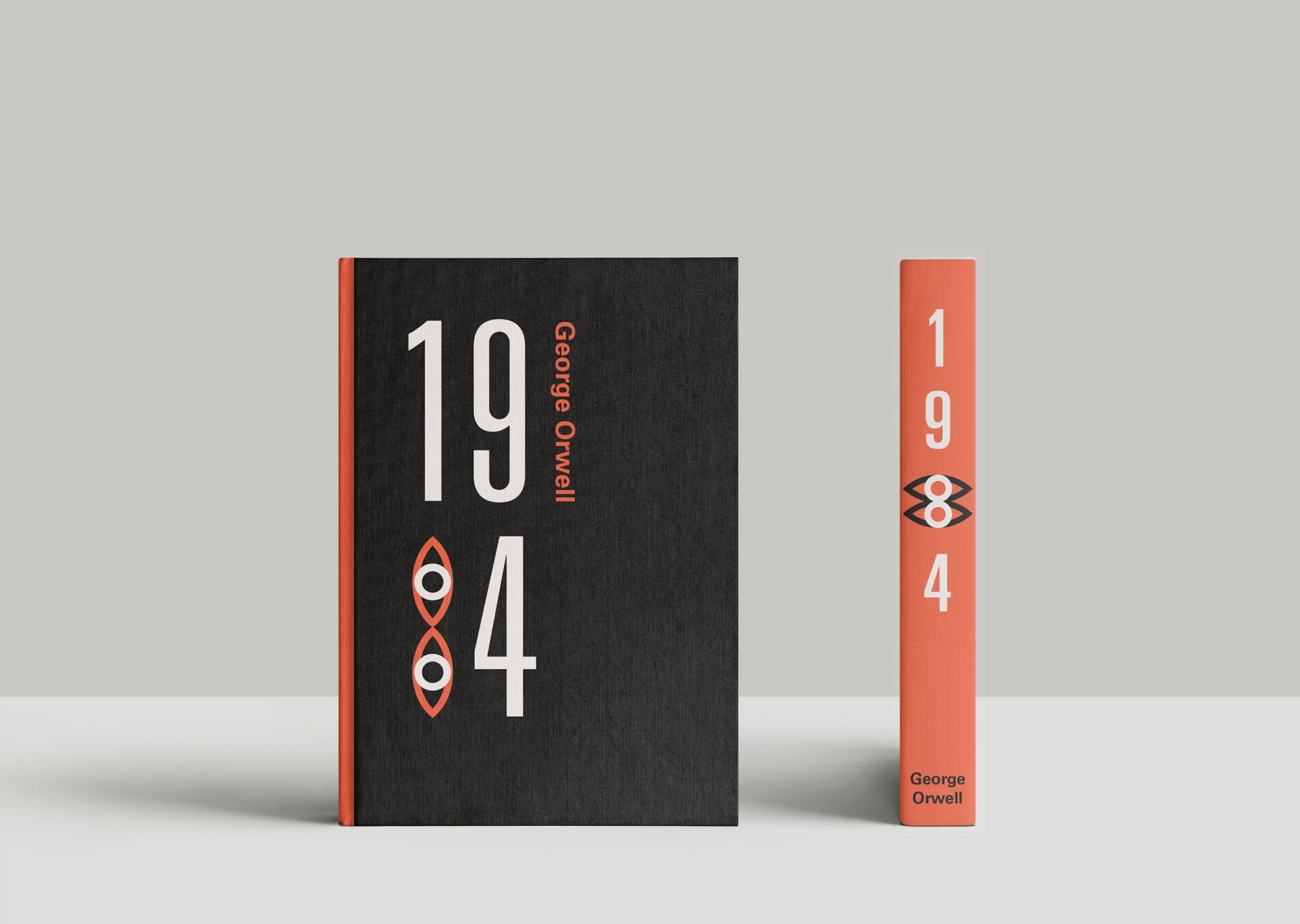
"1984 Book Cover" by Anais Bayle (IDEA Grad 2024) inspired by the strict, no-frills society that George Orwell describes in the novel Nineteen Eighty-Four (1984) is shown above.
Typographic Expressionism Book Cover Designs
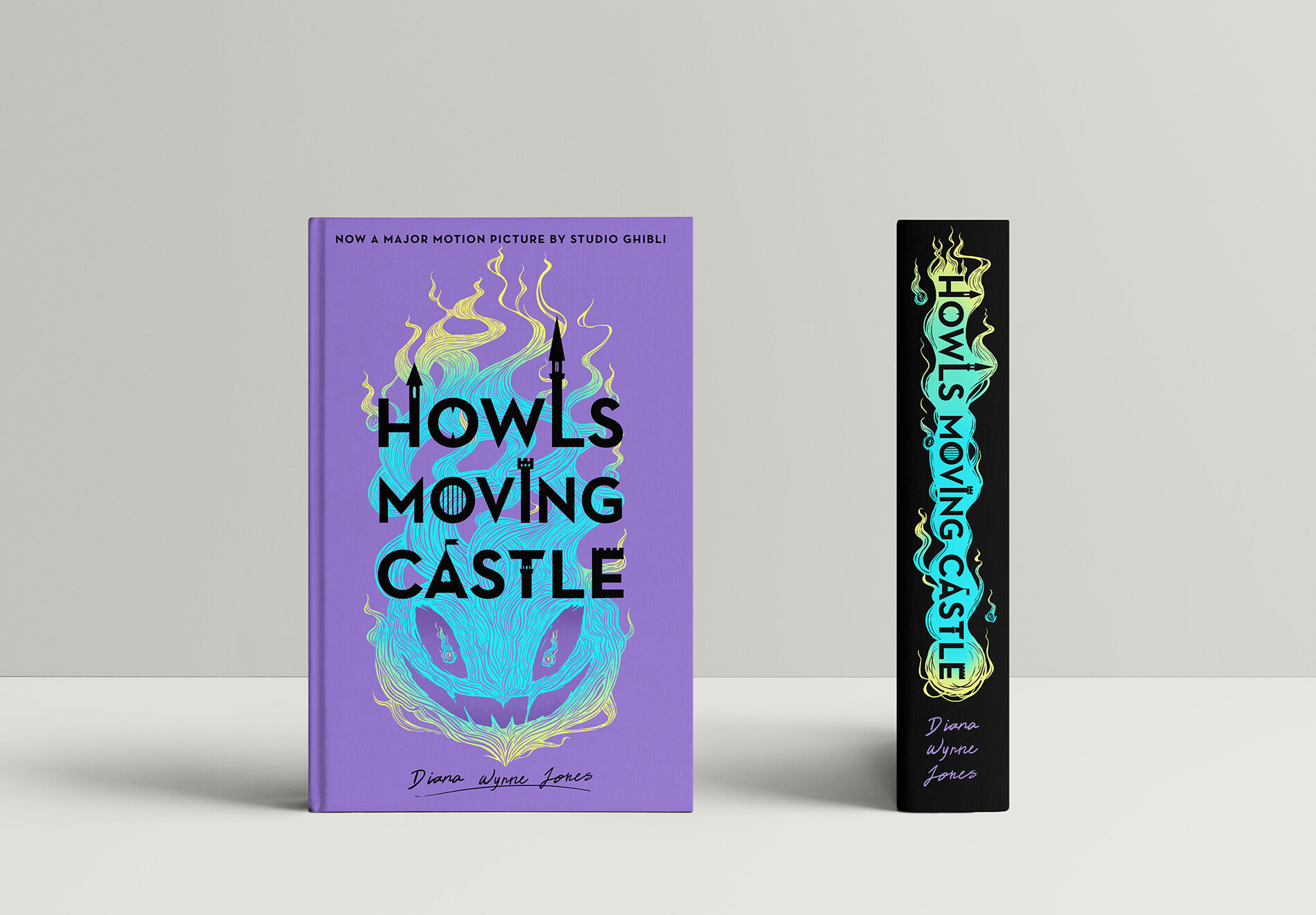
"Howl's Moving Castle" by Alison Koo
Howl’s Moving Castle is my favourite Studio Ghibli film that I treasure very dearly, so when I discovered the movie was adapted from a book, I just knew I had to design a cover for it. I drew inspiration from illustrative flat book designs but it evolved into a more graphic style as I developed my process. The illustration in the background is the character, Calcifer, a fire demon. While the type is expressed to symbolize the black castle. And the colour inspiration was taken from the original book cover design but modified to fit a modern look. For more on Alison follow her on Instagram @koolibara
"1984 Book Cover" by Anais Bayle
This book cover design is inspired by the strict, no-frills society that George Orwell describes in the novel Nineteen Eighty-Four (1984). For more on Anais follow her on Instagram @anaisbayle_art
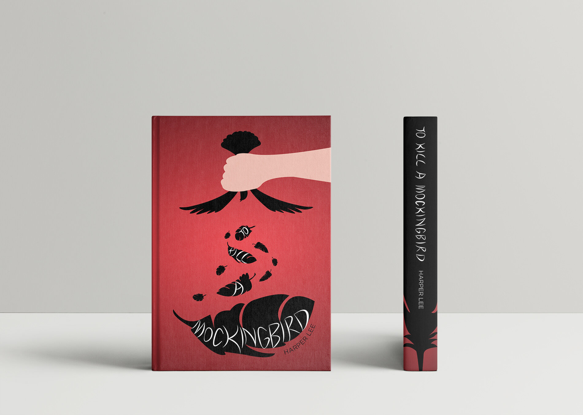
"To Kill a Mockingbird" book cover design by Clarice Mah
Harper Lee’s To Kill a Mockingbird discusses the prejudice towards the African American community in a 1930 small town in Alabama. The story follows a child whose father is a lawyer defending a wrongly accused black man. The mockingbird is a symbol of innocence, which is why I chose to illustrate it being held upside down to reflect the false accusation of the innocent man in the book. For more on Clarice follow her on Instagram @clarices_art
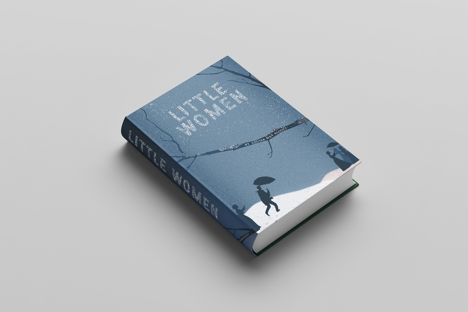
"Little Women" by Joanne C.
I created a book cover that expresses the beauty and chaos of the story Little Women by incorporating the title within a blistery winter scene. The falling snow leads to a narrative illustration of the four sisters, Amy, Jo, Beth and Meg, while the male love interest runs towards the girls. Two figures hold an umbrella one symbolizes the protection a man offers a woman while the other shows women are capable of protecting themselves. For more on Joanne follow her on Instagram @artroverted
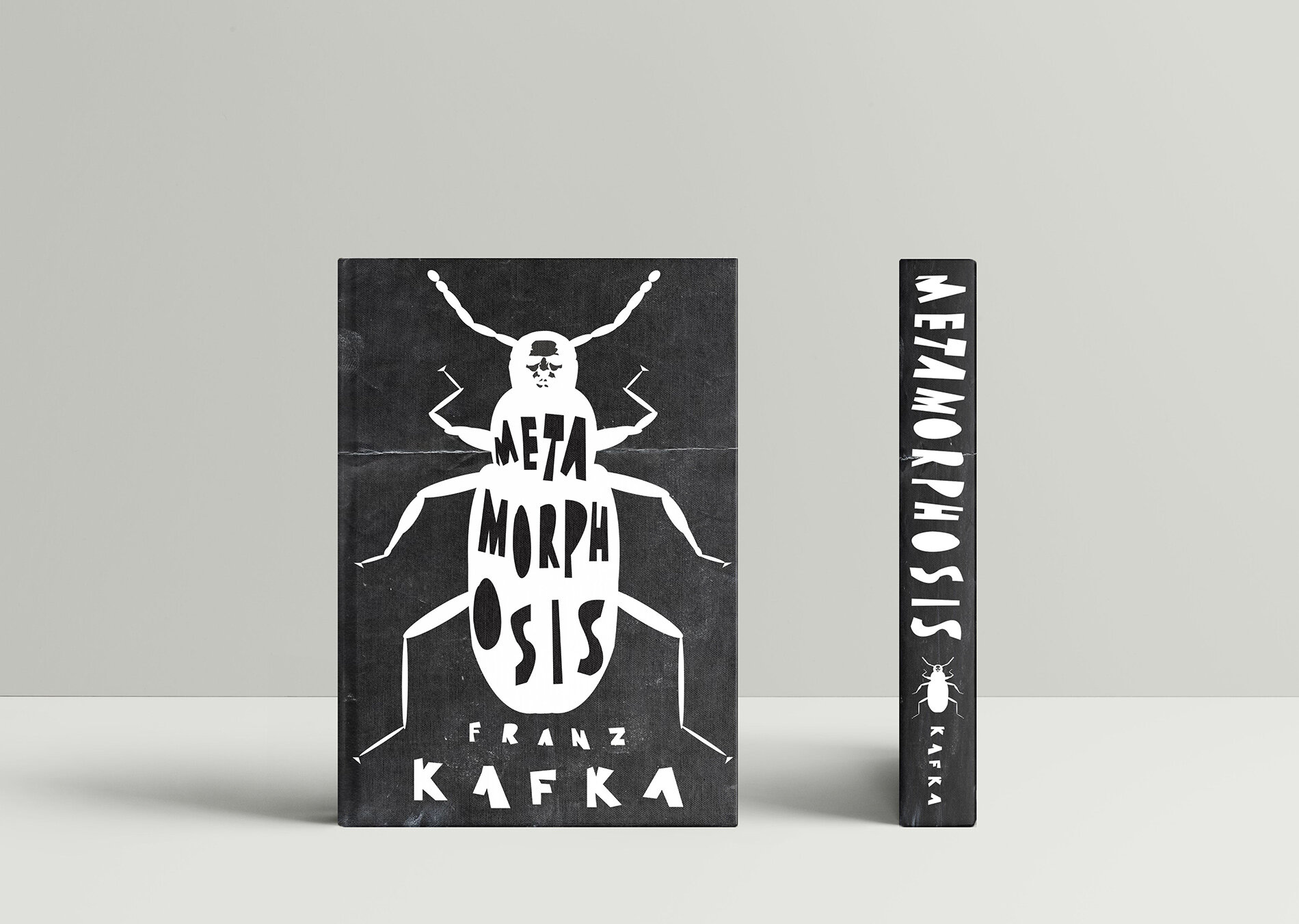
"Metamorphosis" by Lucy Benson
I had a lot of fun with this assignment! I loved exploring the possibilities of typography while also revisiting some of my favourite stories. My goal was to capture the strangeness and isolation that “Metamorphosis” offers through varied, uneven lettering and lack of colours. The objective is to grab the attention of English teachers so that it can be read with all the other unsettling short stories and more people will understand my deep fear of one day waking up as a massive bug. For more on Lucy follow her on Instagram at _lucybenson_
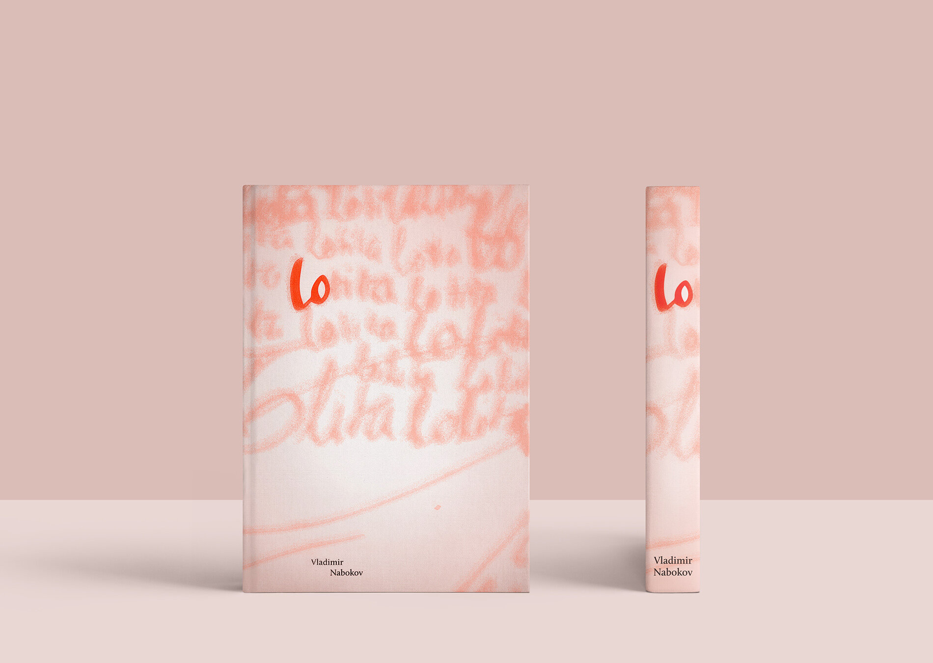
"Lolita" by Nguyen Quoc Huy Anh
Lolita has always been my favourite novel written by Vladimir Nabokov. Because of that, I have decided to re-design the book cover for my project. Lolita is a name that Humbert Humbert gives her. Lolita is not actually the name of the girl, her name is Lo. As you can see in my book cover, the repetition of Lolita represents his obsession for her but over time it starts fading away because Humbert does not really love Lolita, he loves the “young” version of her. At the end of the book, it is just Lo, and Humbert realized that his Lolita is no longer the girl he used to love. By creating a defined contrast of the word Lo, I think it would make the viewer be more curious about the name Lolita. For more on Nguyen follow him on Instagram at nguyenquochuyanh.exe
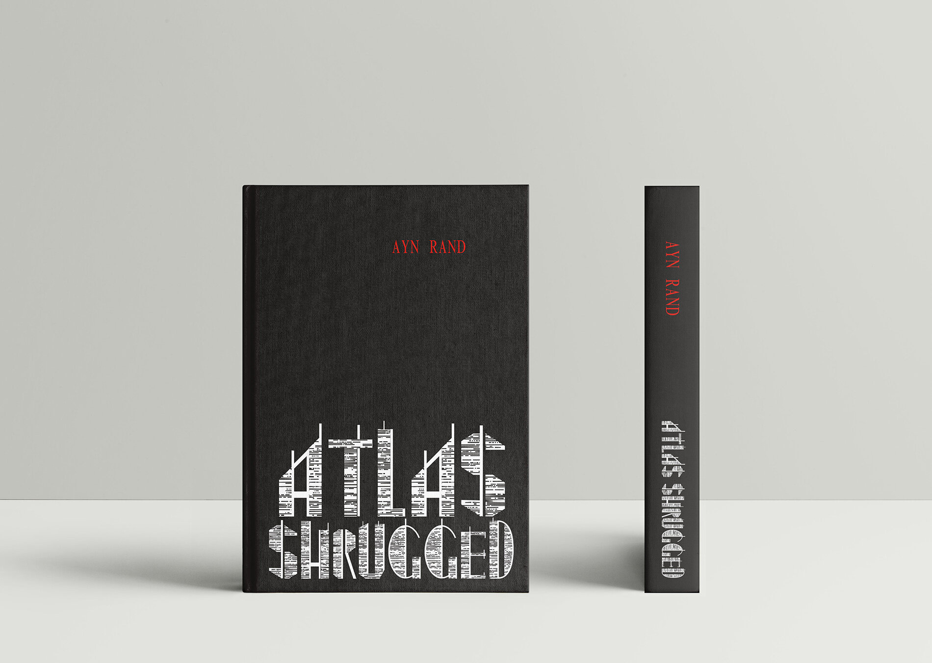
"Atlas Shrugged" by Sarah Harley
The project brief was to design a book cover front and spine for one of the classics of literature. The main goal was to use expressive typography while designing. I chose a book that I’m reading — "Atlas Shrugged" by Ayn Rand. The book depicts a dystopian United States in which private businesses suffer under increasingly burdensome laws and regulations. Where the government over regulates everything and start to prioritize the people that they appoint as elites and neglect the working class leading to a collapsing world. I wanted to steer clear of any imagery that depicted Atlas, so I decided to use a very industrial font as the story is based in the city as well as its a very industrial story since the two main characters run a railway and a steel mill. For more on Sarah follow her on Instagram @kactusblue
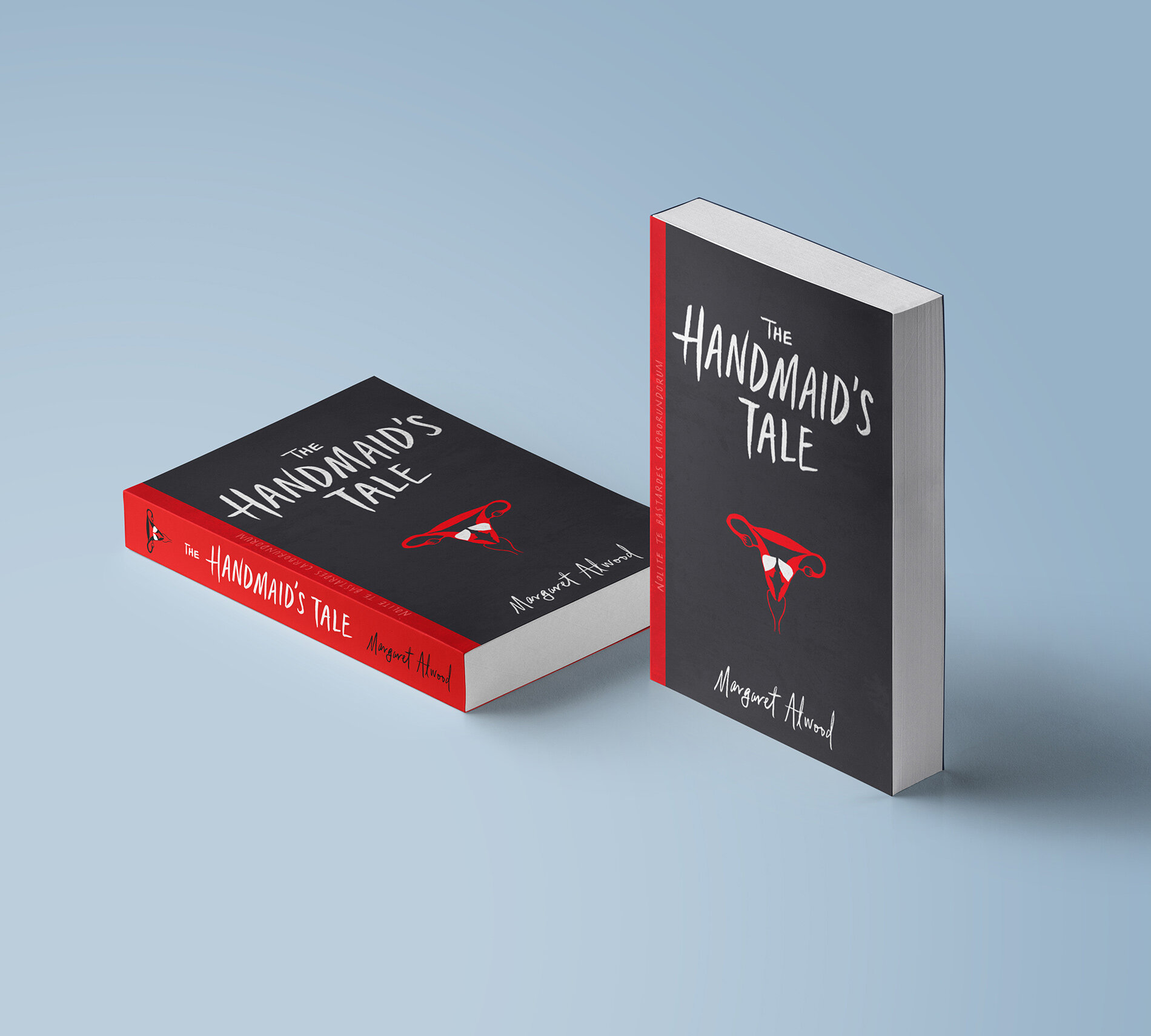
"The Handmaid's Tale" by Tiffany Zhong
I was super keen to do one of my favourite books for this project. I landed on the imagery of the handmaids trapped within walls of a uterus/womb (a play on a major theme in the book) after a critique session where the feedback was that my initial ideas were a bit too generic. I'm happy with the final result in how I was able to incorporate my own hand-lettering with the illustration to capture the spirit of the book. For more on Tiffany follow her on Instagram @t.illus
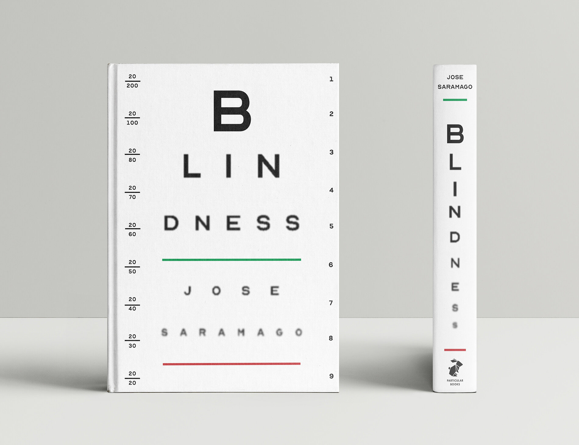
"Blindness" by Tobin Elias Eckstein
The purpose of this assignment was to design a book cover and spine that uses typographic expressionism as its main point of communication. With my chosen title being ‘Blindness’, using an eye chart was an obvious thumbnail sketch, and yet one of my least favourites to start with only because I didn't think I would be able to pull it off! Vida (Survey of Design II instructor) pushed me to explore this idea further, and I'm obviously very glad that I did! I'm very proud of my execution with this design and it’s given me a lot more confidence in my conceptual ideas and design ability moving forward. For more on Tobin follow him on Instagram @tobineliasart.
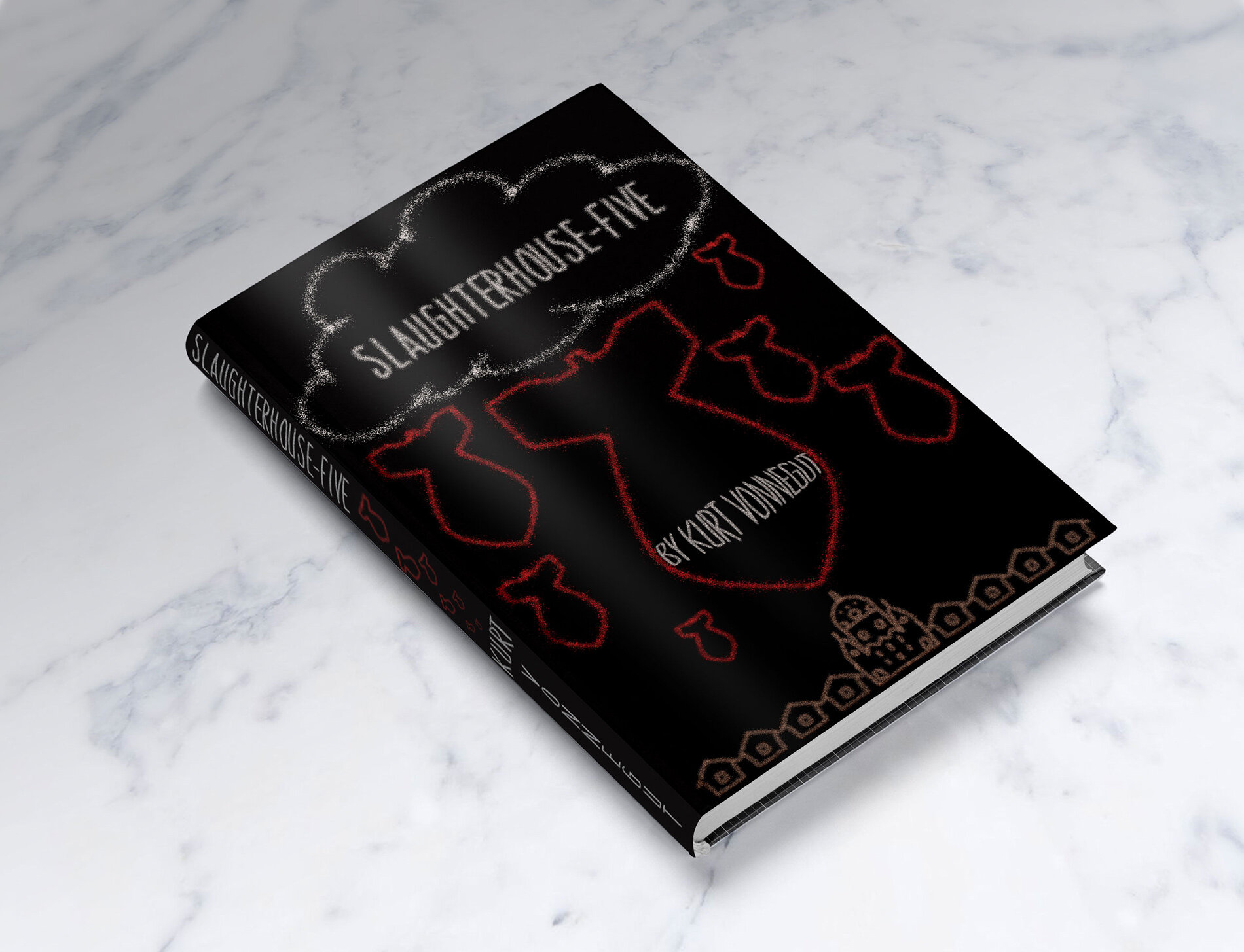
"Slaughterhouse-Five" by Valentina K.
Before my professor could finish explaining the brief, I knew what book I was going to use, there was no question in that. Slaughterhouse-Five, a whirlwind of satire and black comedy covering the sadness of reality by Kurt Vonnegut. The book itself explores the life of a man who survived the inferno that engulfed a German city called Dresden in 1945. I wanted to shine more light on the novel’s alternative title, “The Children’s Crusade” and give it a sense of an event from a child’s perspective. I have gone with many versions of the cover, most of which either depicted the doors of a slaughterhouse, or bombs, raining onto a city. First drafts did not invoke any emotion within me and I had to ask myself, “why?” The answer was so simple, yet at first, I refused to accept it; scale. Realistically, the bombs are way smaller than any house, yet flip the roles and the scene suddenly becomes ominous and intimidating. Overall, this was a very fun and enjoyable project as I got to learn more about my favourite book and the tragic story surrounding these events.
Vida is a founding partner of Hangar 18 Design Continuum, an award-winning Vancouver design firm with a legacy of strategic design solutions spanning over two decades.
She teaches Design Survey in first year and Design Studio 1 in second year of the Idea School of Design.

