IDEA Grad 2025 Cohort 1 students learn how to work with grids, imagery, and infographics in Design Studio I with Vida Jurcic
In IDES 243 Design Studio I, the second-year students learn how to work with grids, imagery, and infographics to creatively tell the story of an organization's successes, dreams, needs, and vision. The students learn how to research and distill information and present it in an engaging graphic form.
Check out some of Vida’s favourite Annual Report design projects from IDEA Grad 2025 Cohort 1!
“IDES 243 Design Studio I introduces students to the fields of communication design, information design, and advertising, and to the role of design in business and marketing. Students understand the design process by analyzing design problems, working through creative briefs, creating appropriate design solutions, and developing rationales. Instruction in design-related software supports the course.”
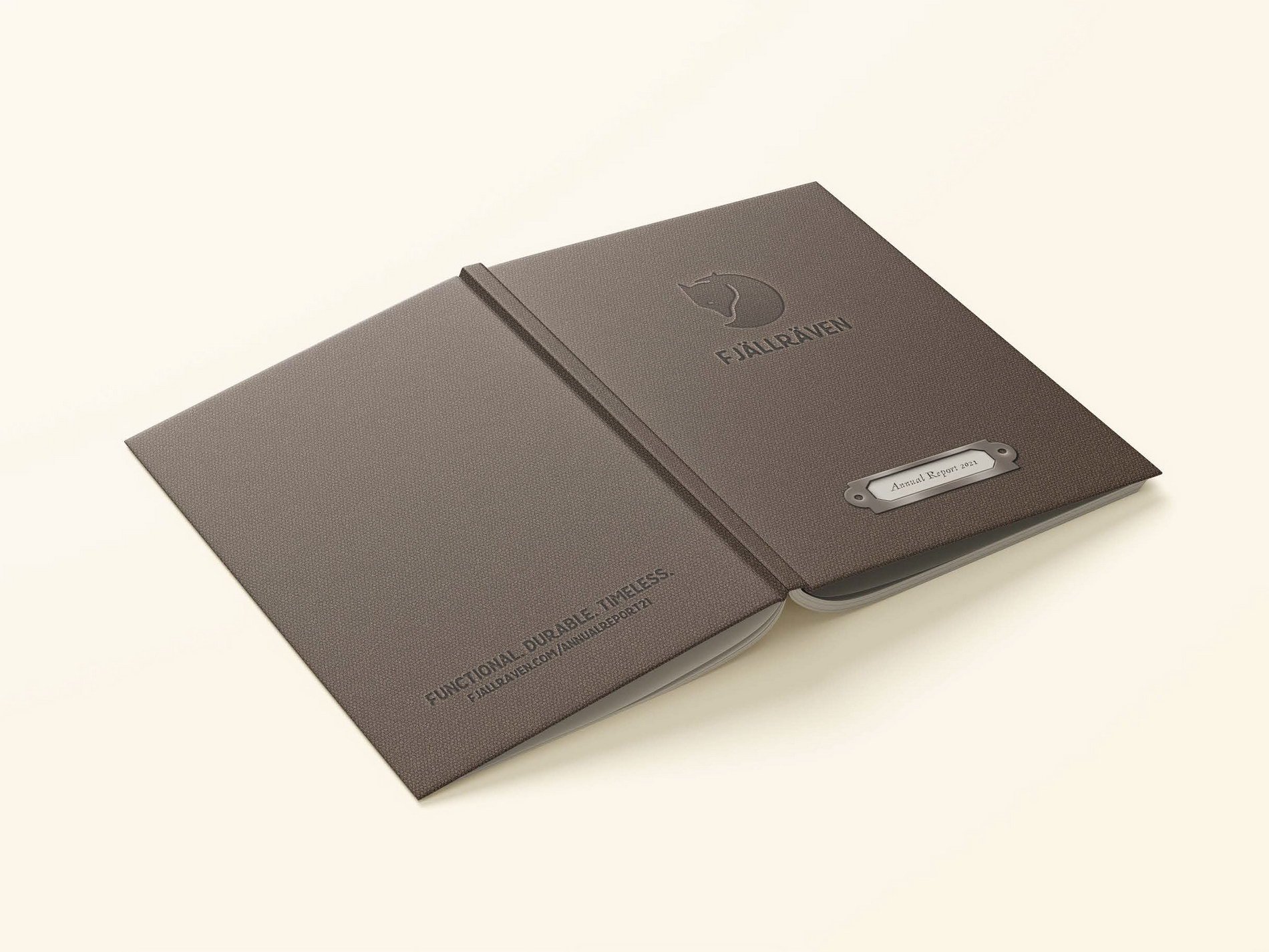
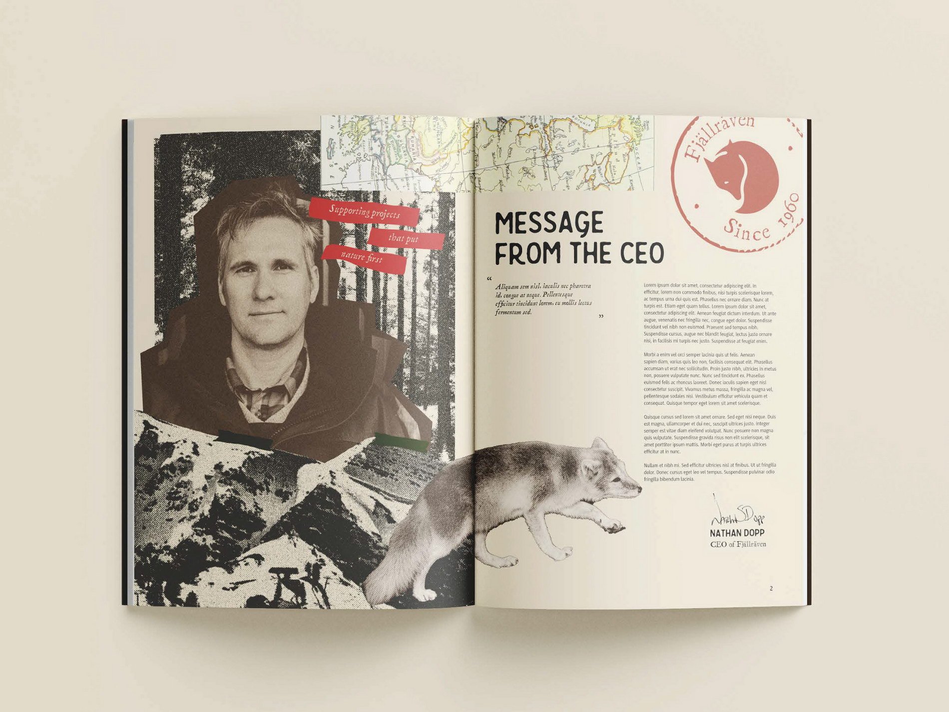
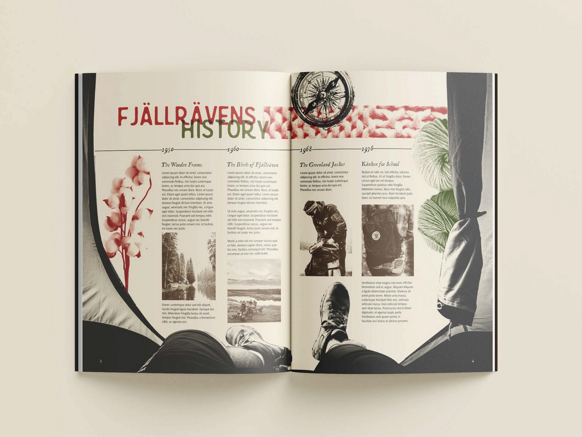
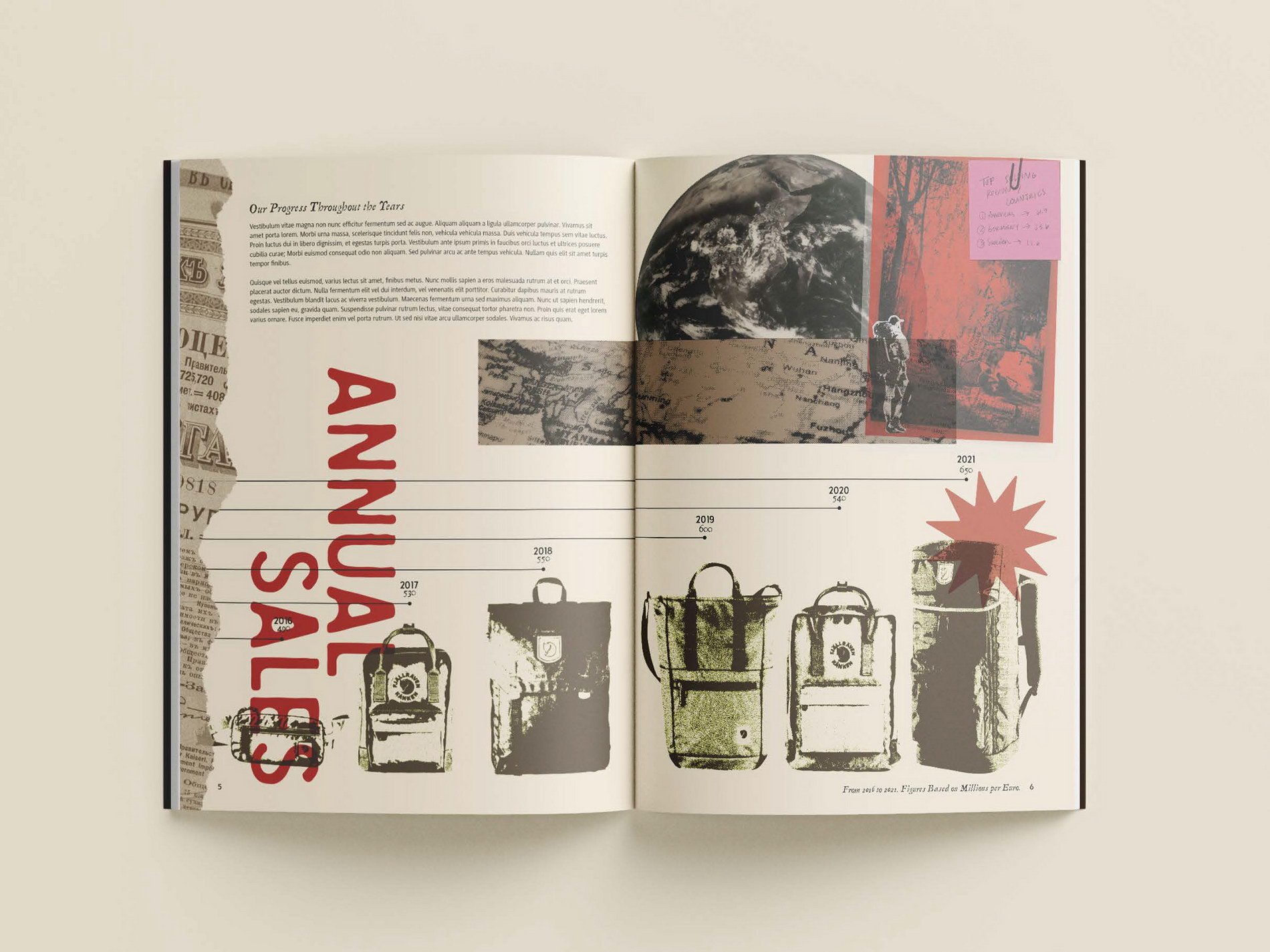
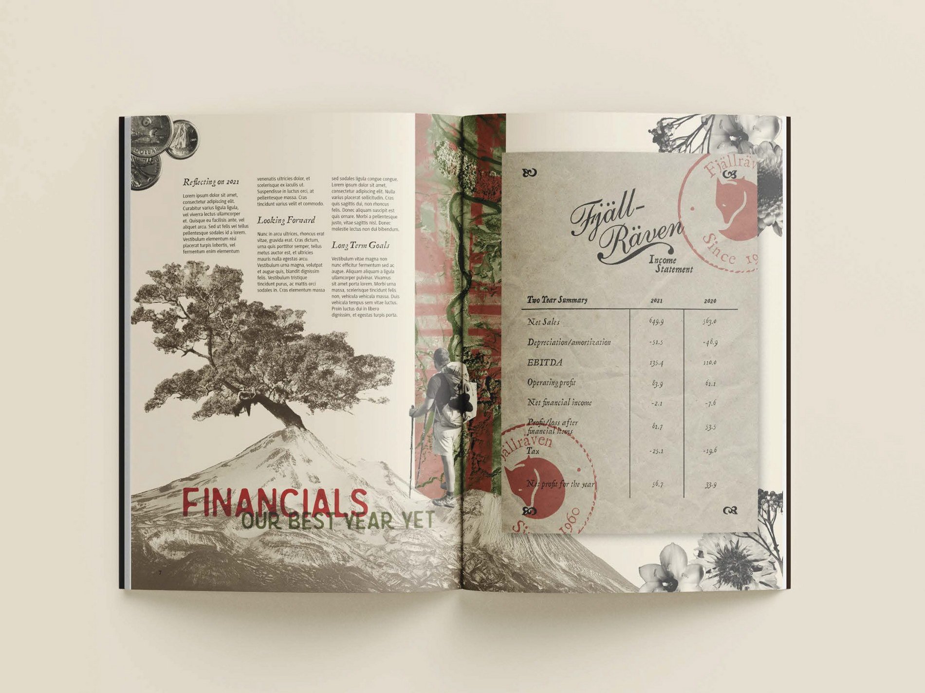
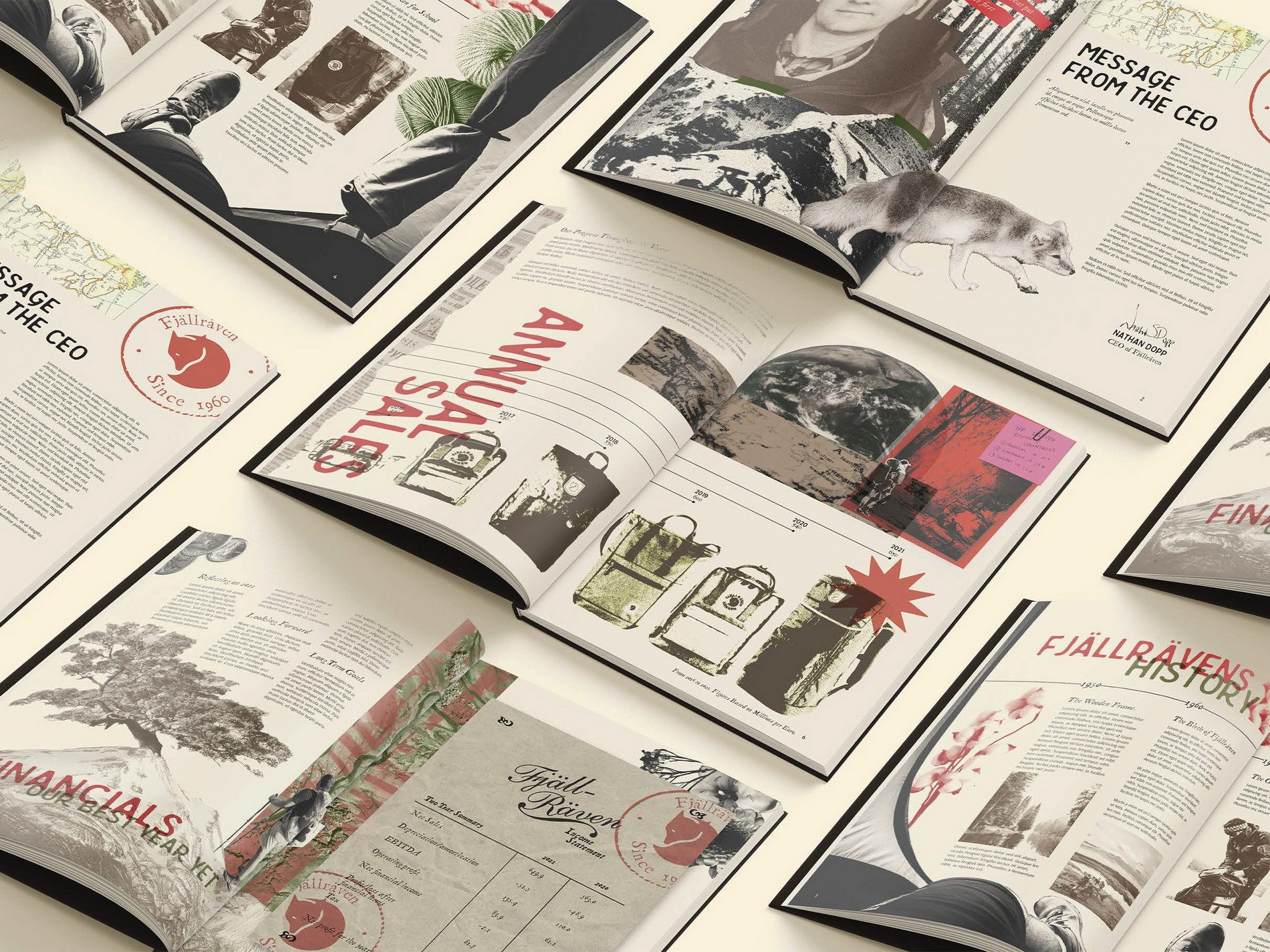
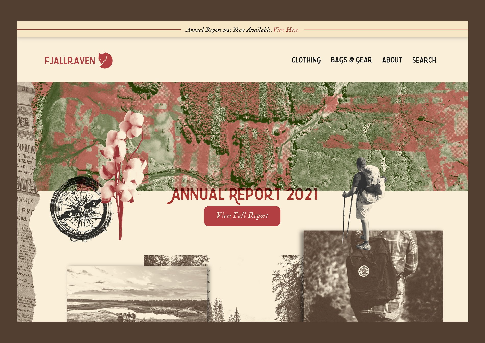
Fjällräven Annual Report design by Angelica Blanch
I had heard of Fjallraven a couple of years back when the famous Kanken bags were seemingly everywhere, especially for teenage girls. Over the past few years, I had also noticed they also sold clothing items and bags outside of the Kanken collection that seemed to focus more on the outdoors and on those who had a more active lifestyle.
When I delved into doing more research about the company for this project, I found that sustainability and the outdoors were two key features of their ‘brand.’ For my annual report, I wanted to emphasize these aspects of their brand in a form of collage work, which is something I hadn’t explored much until this project. Overall, I had so much fun on every step of this project, from conceptualizing to execution!
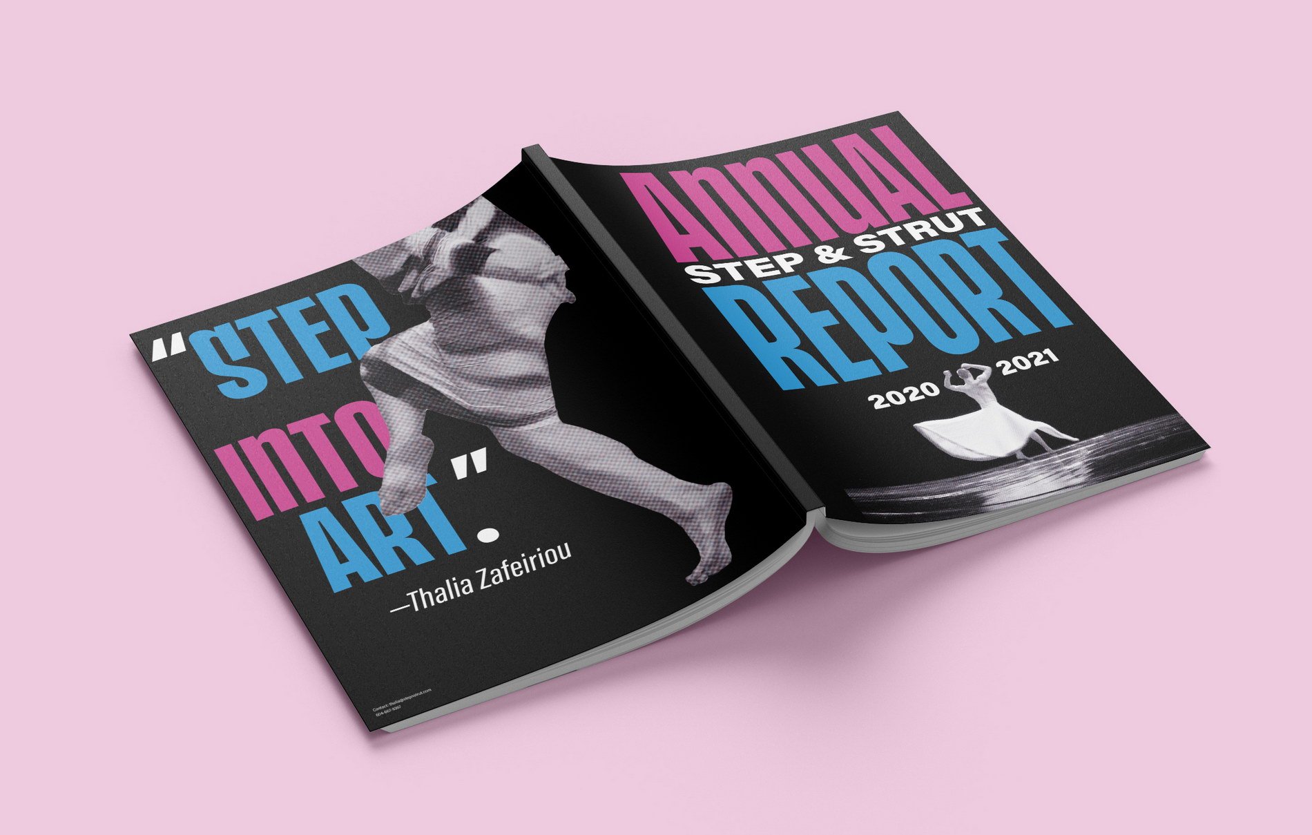
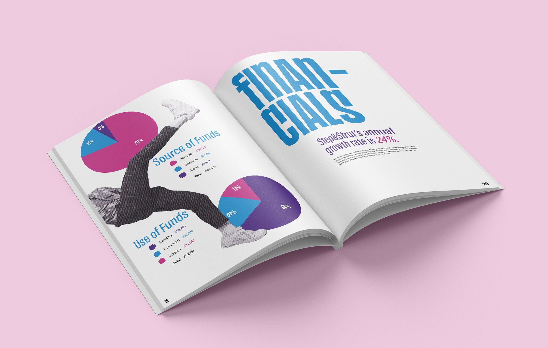
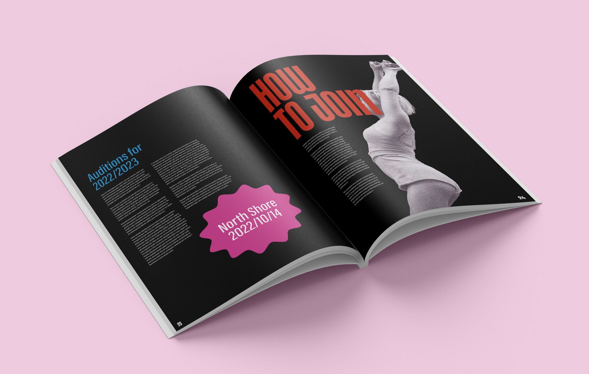
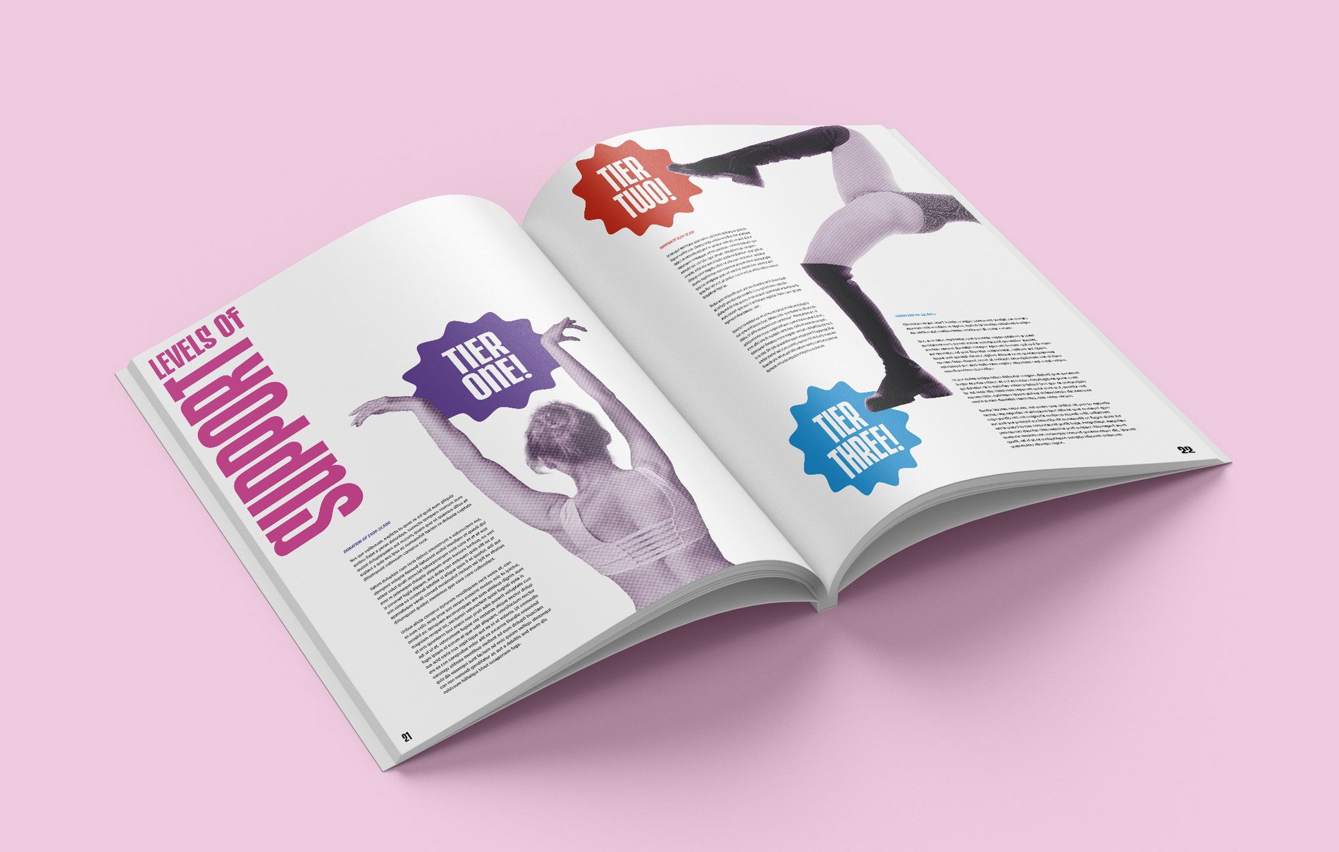
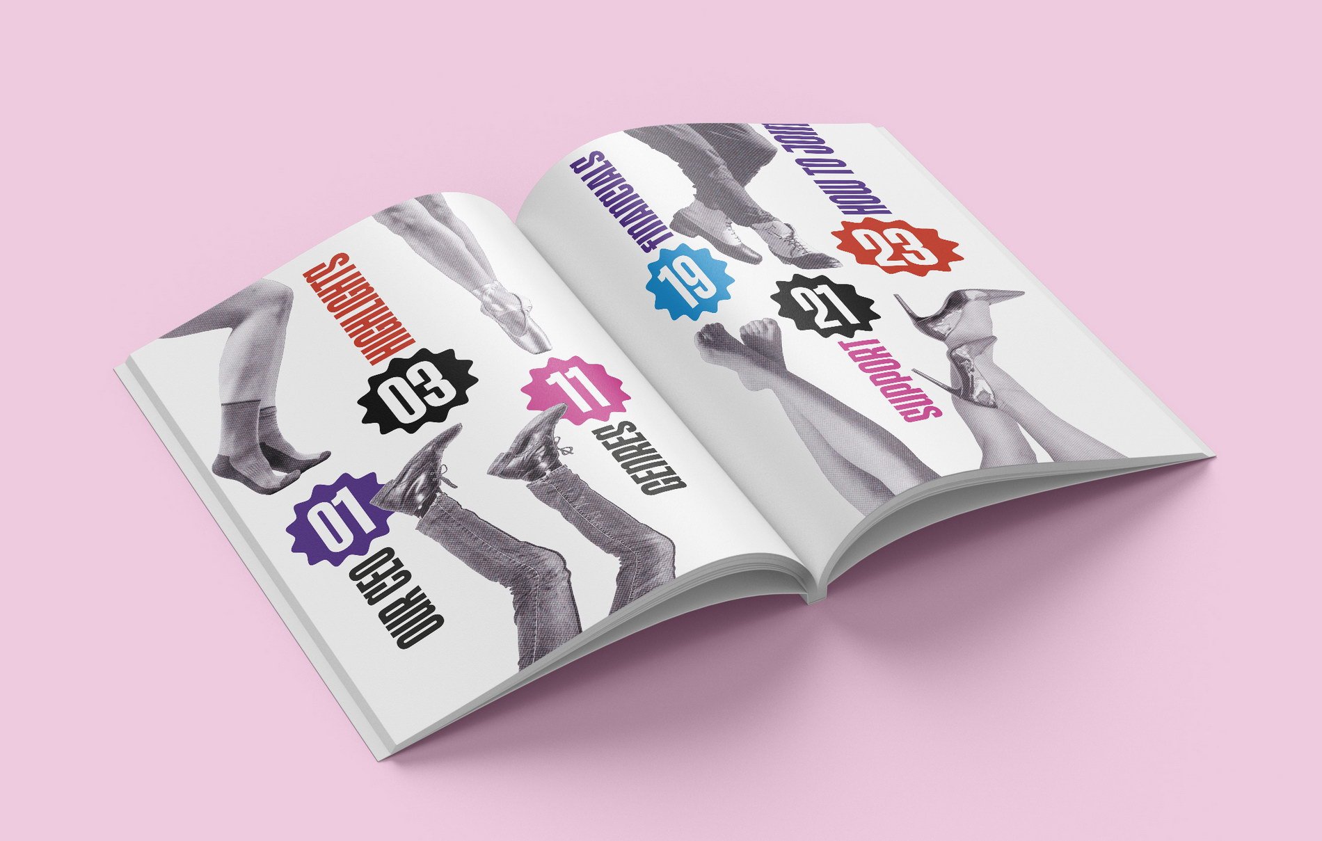
Step And Strut Annual Report design by Lily Rosen
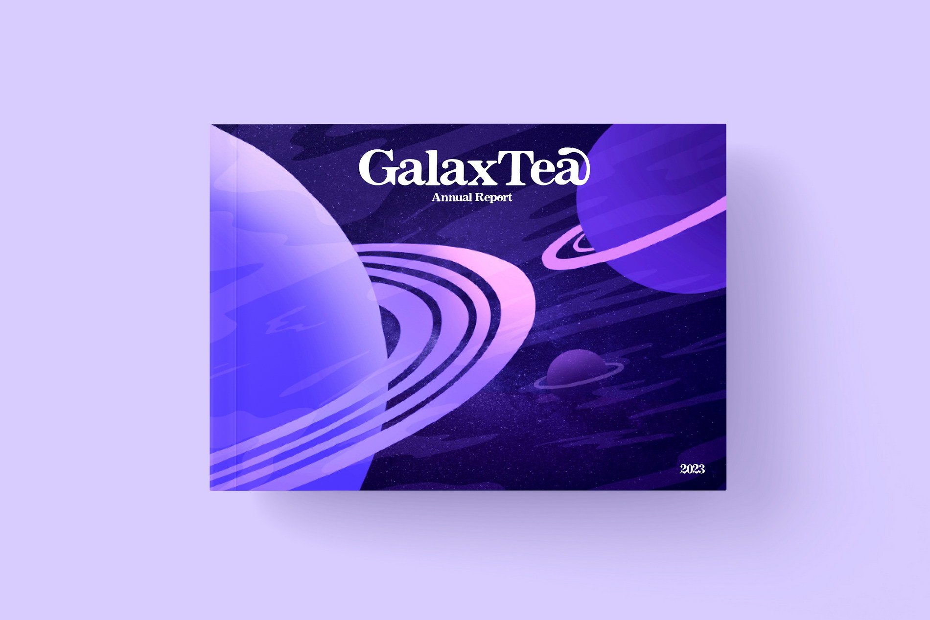
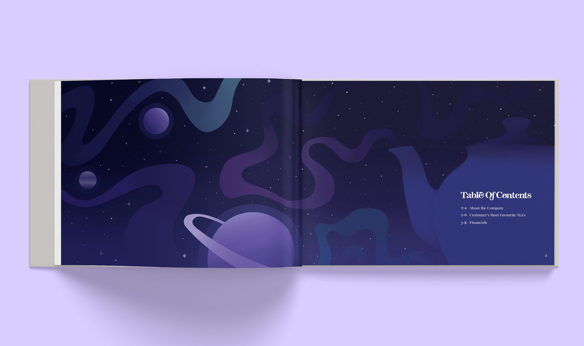
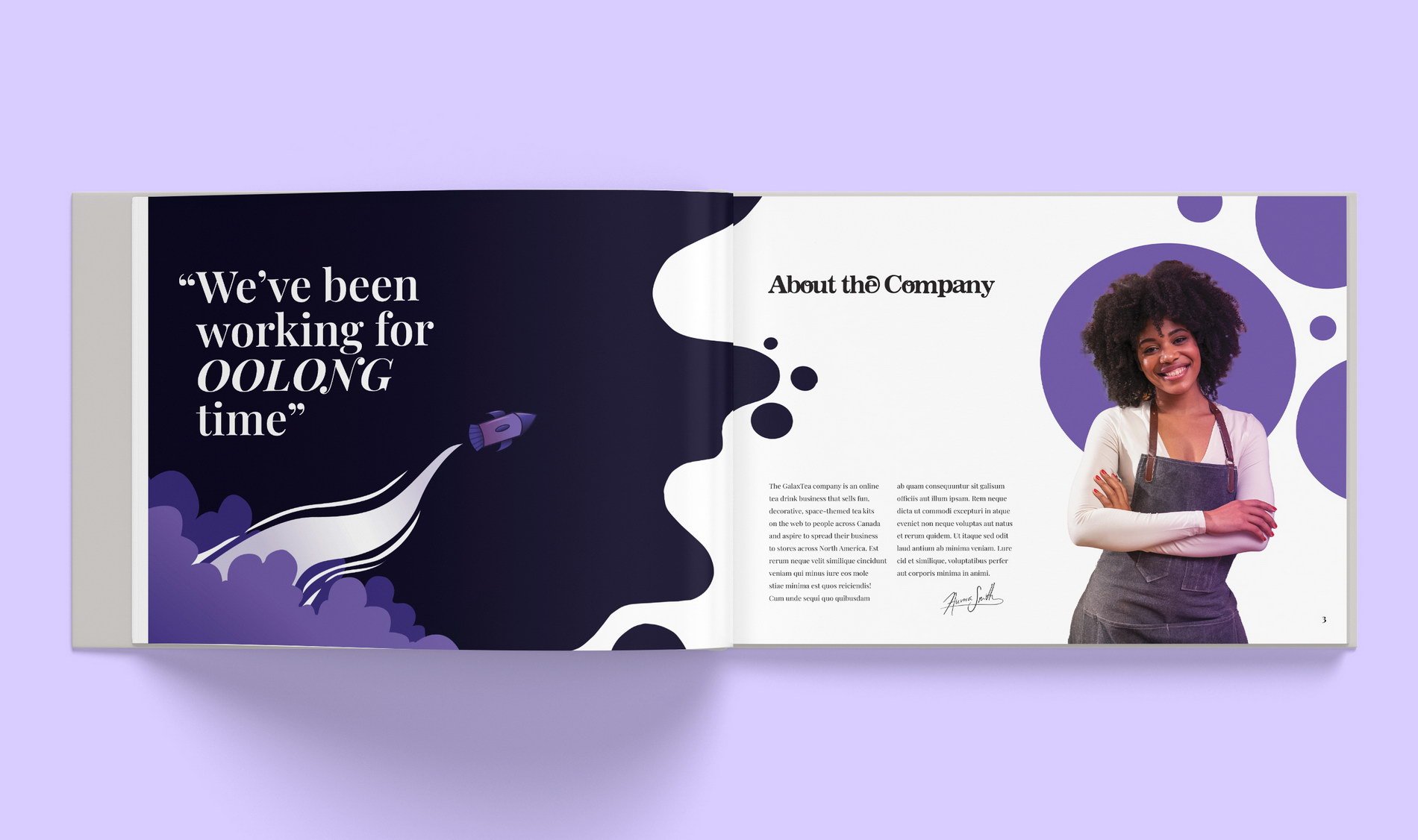
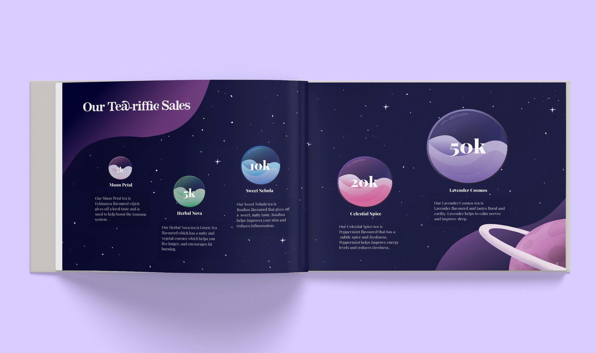
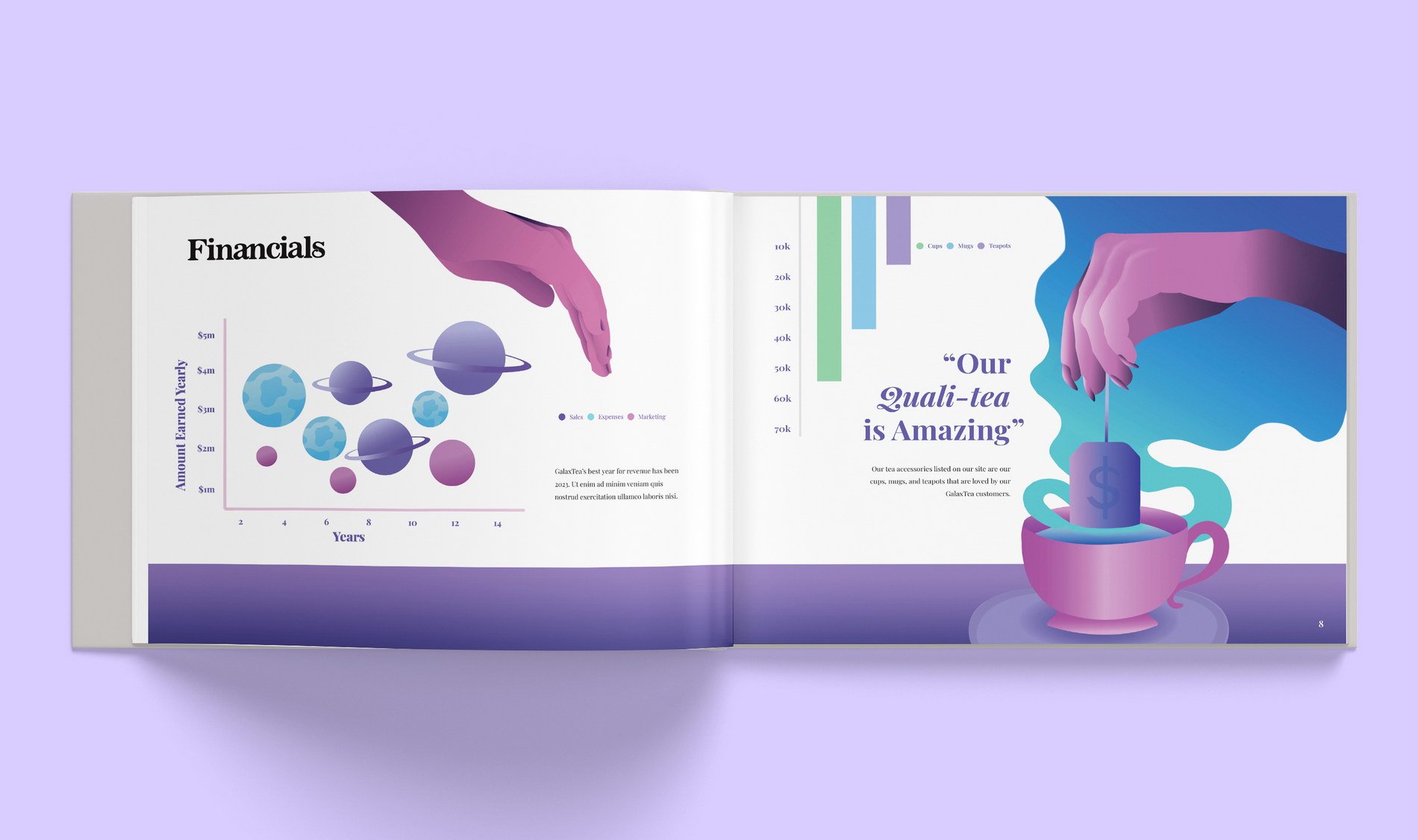
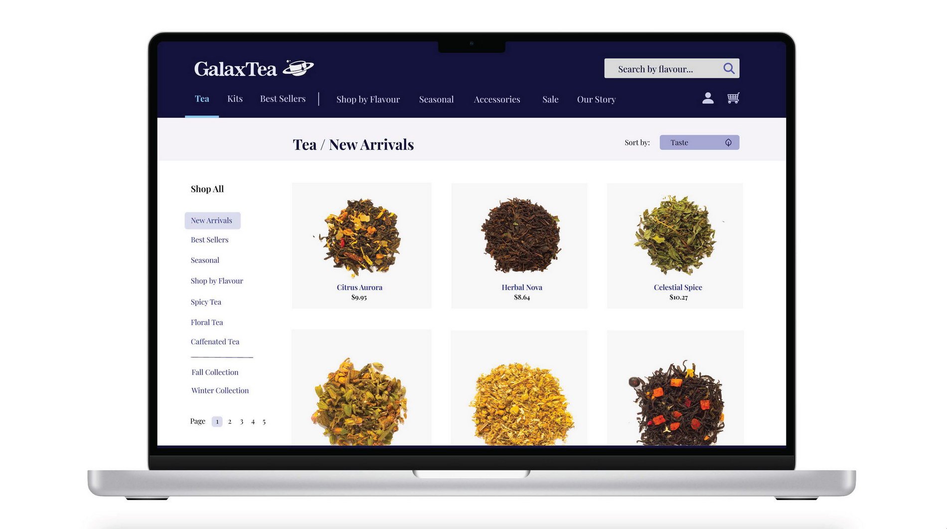
GalaxTea Annual Report design by Makayla Crenshaw
For my annual report, I created a made up tea company named “GalaxTea.” GalaxTea (play on words for “Galaxy”) makes spaced themed tea products, intended to relax busy bodies in need of rest. GalaxTea sells make-at-home tea kits with sustainable packaging intended to help save our planet.
For this project, I envisioned that my annual report design wouldn’t be the typical, plain report design that would be uninteresting to look at, but rather be fun, colourful, and informative, while also being aesthetically pleasing to flip through.
Since I was designing an annual report for a tea company, I knew I couldn’t use images for this project since tea and space aren’t associated with each other. This is what inspired me to rely mainly on illustrations and giving me the freedom to push my creativity. While designing, I made various sketches of my annual report spreads of how I wanted my typography and illustrations to be laid out. I also created moodboards for inspiration of how I wanted my overall report design to look like. Overall, I wanted my annual report to give off the feeling of calmness through my cool tone colour palette, while the overall design would be clean, professional, and polished. This project was a lot of trial and error as I’ve never designed something like this before, but I had lots of fun expressing myself through this assignment! The annual report has been one of my favourite projects I’ve worked on so far at IDEA School of Design.
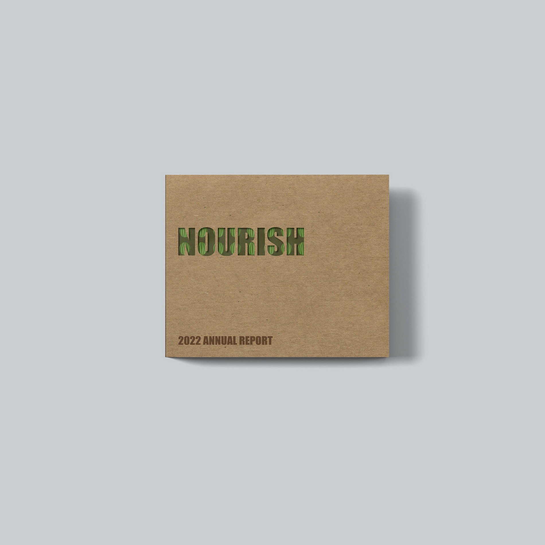
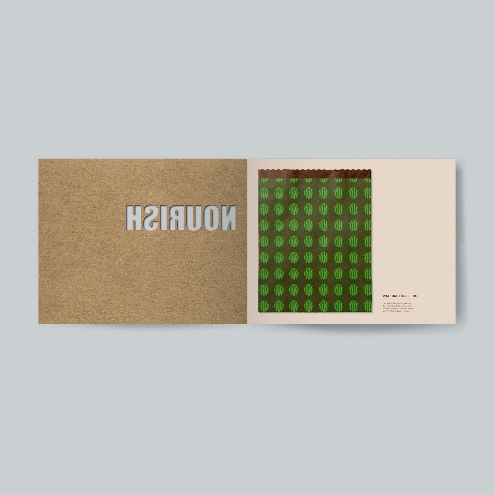
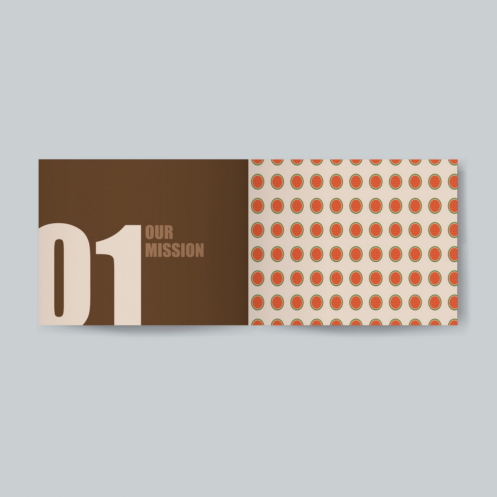
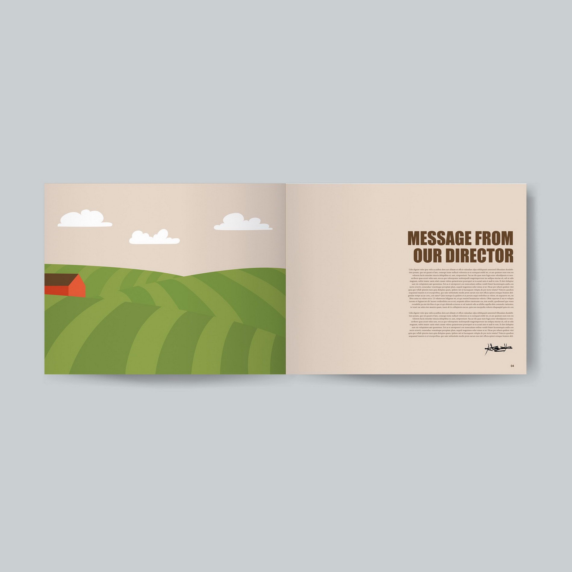
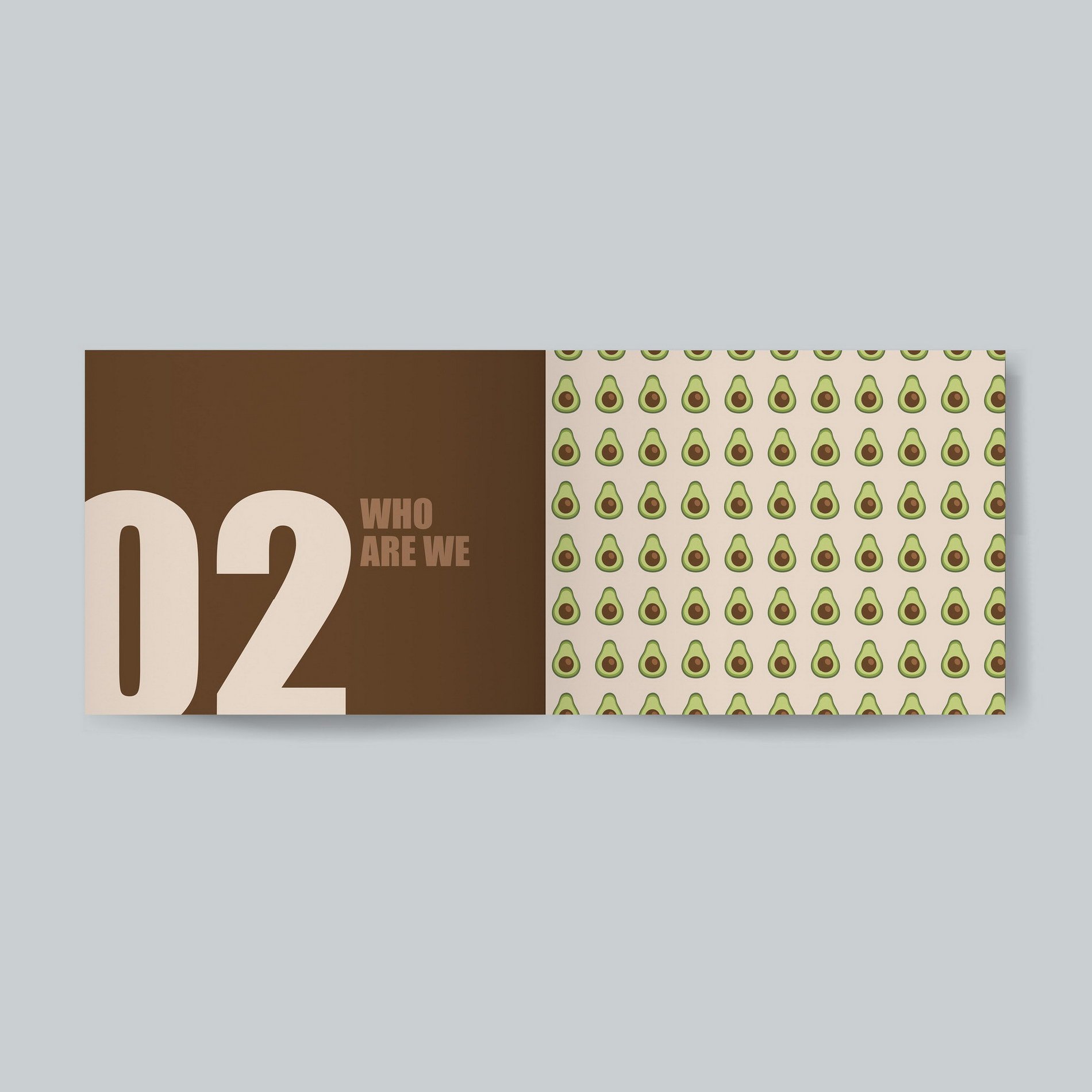
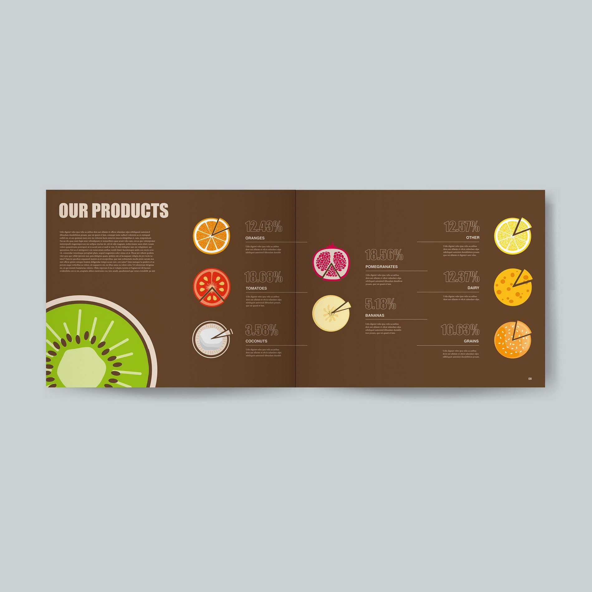
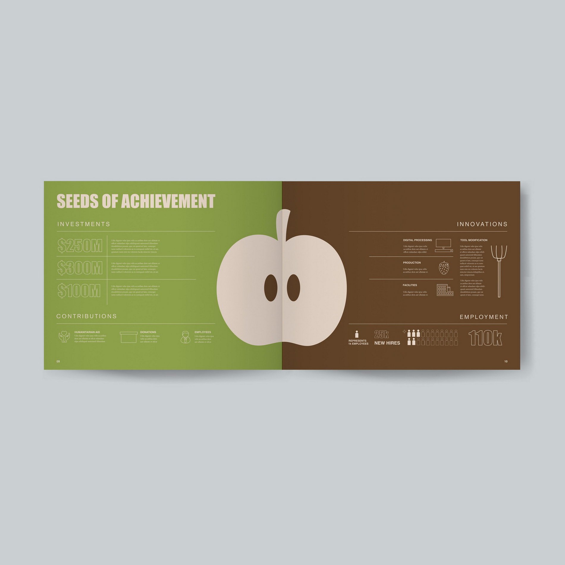
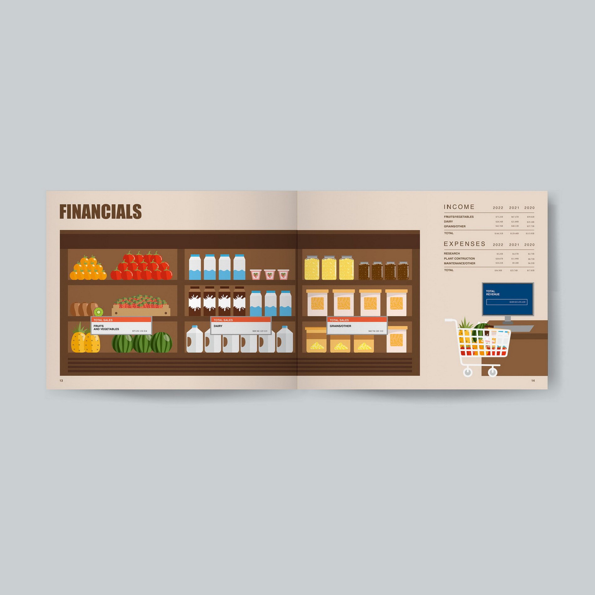
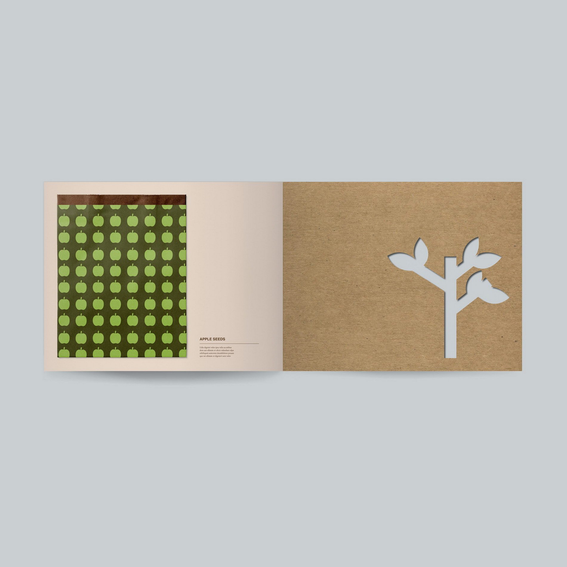
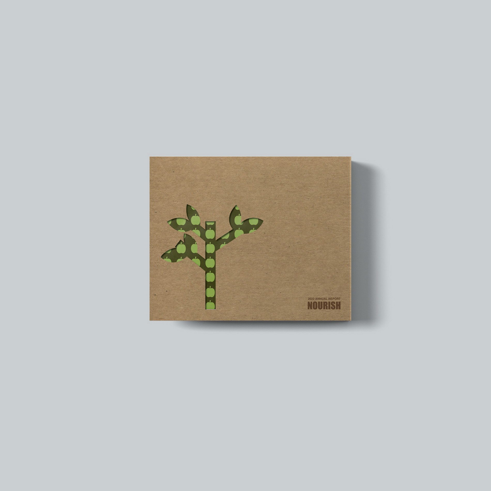
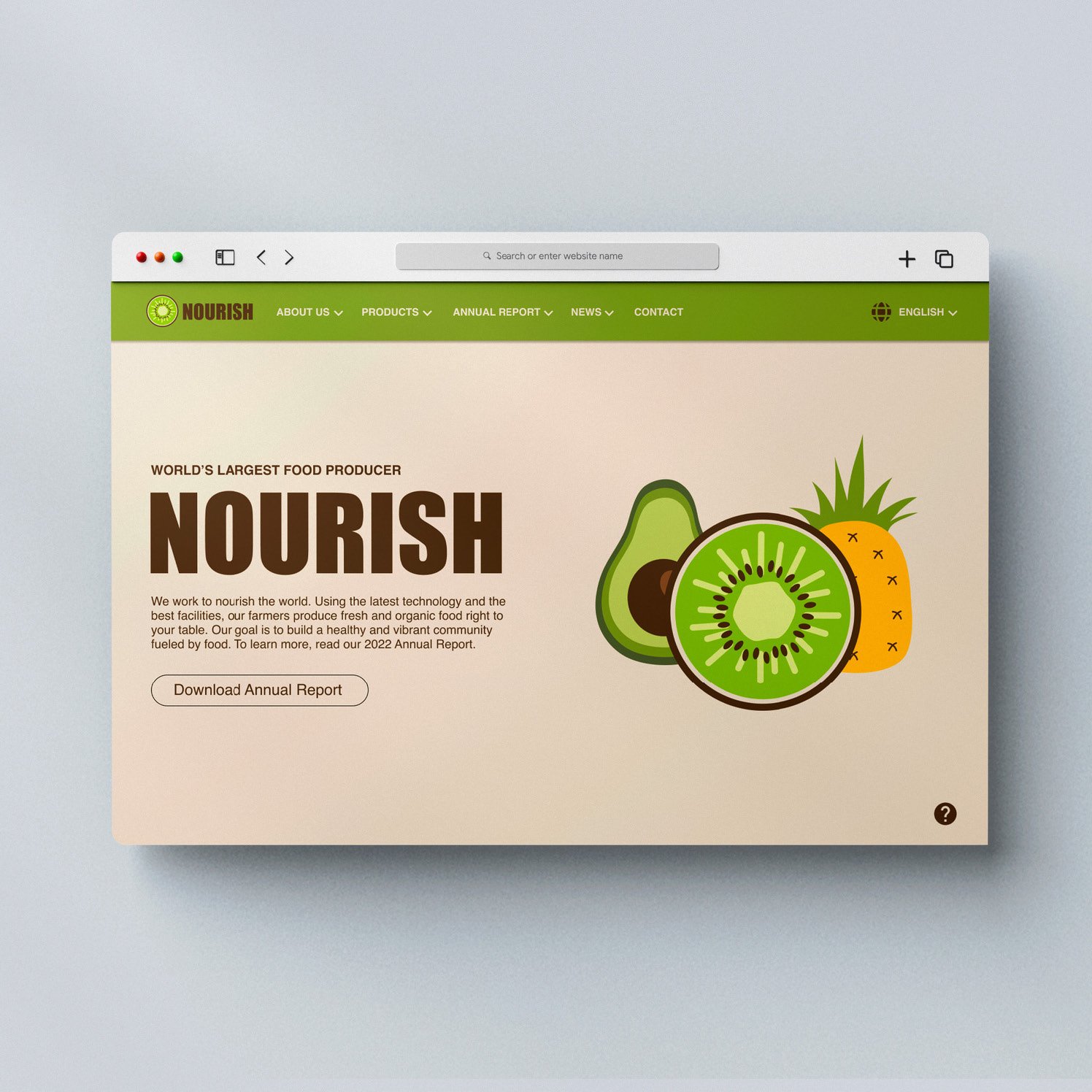
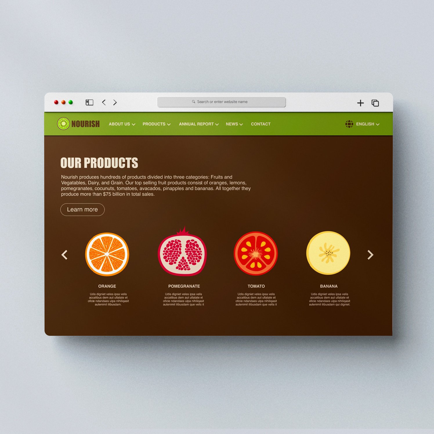
Nourish Annual Report design by Shruti Karthikeyan
For this project I decided to go for a fictional food manufacturing company called Nourish. The main idea behind this design was to create a friendly and cohesive look that would encourage people to buy their food products. I started off by creating multiple moodboards until I landed on one that had a consistent theme and style, which I found to be the most important part of the process. I wanted the design to be clean, refreshing, and have room for colourful illustrations, while still maintaining a professional quality to it. I then brainstormed ideas on what I wanted to include in the report (ex: seed packages, cut out text) and created thumbnail sketches of how I envisioned the layout to look like. After that it was just a matter of turning the sketches into actual layouts and illustrations on InDesign. There was a lot of experimenting with what works and not and multiple revisions, but that’s just part of the design process and I was happy with how it turned out.
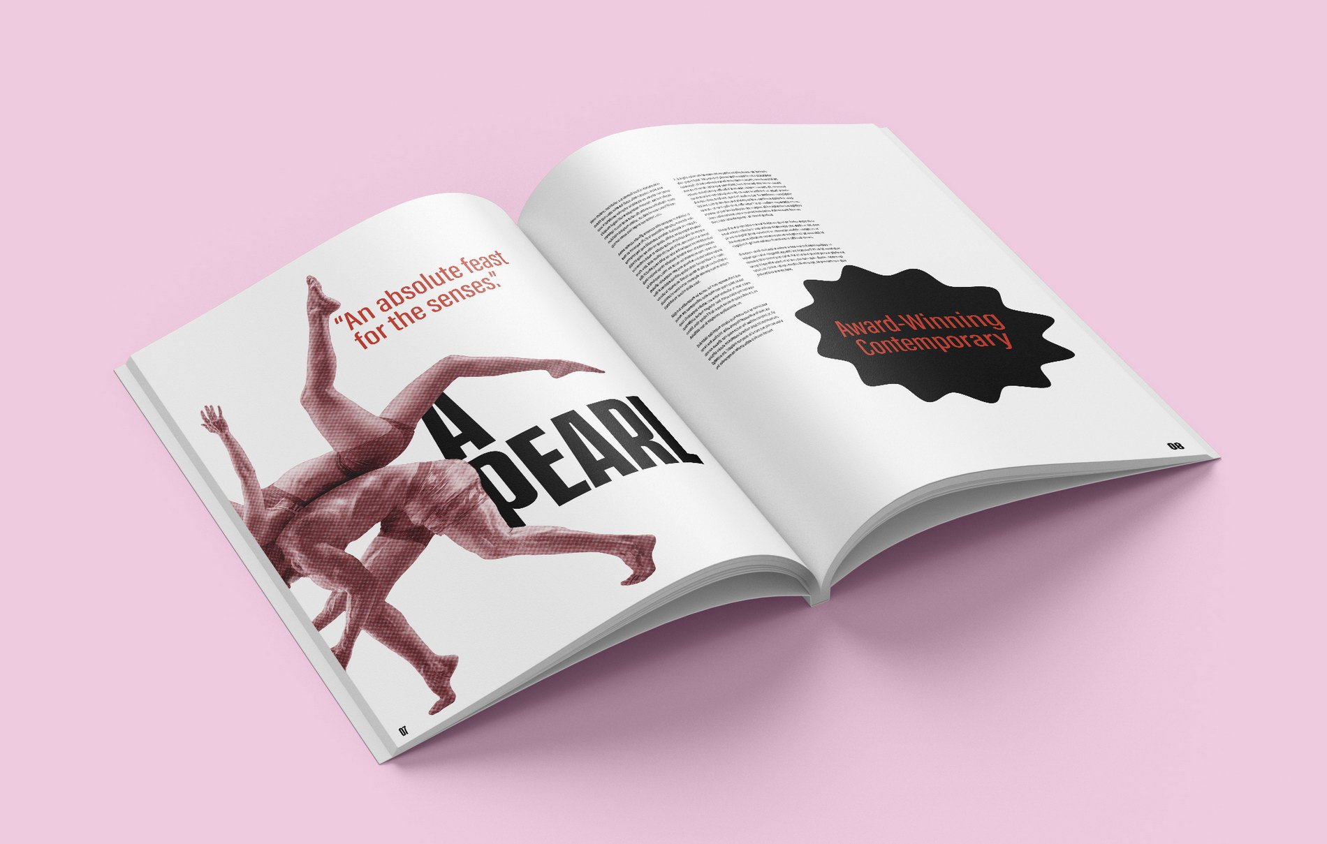
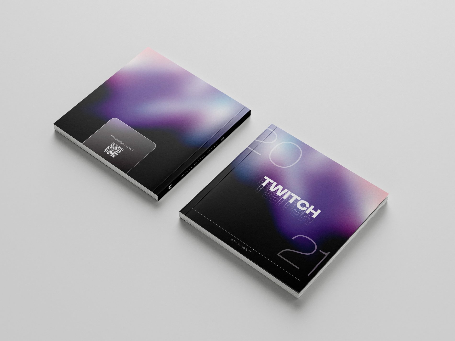
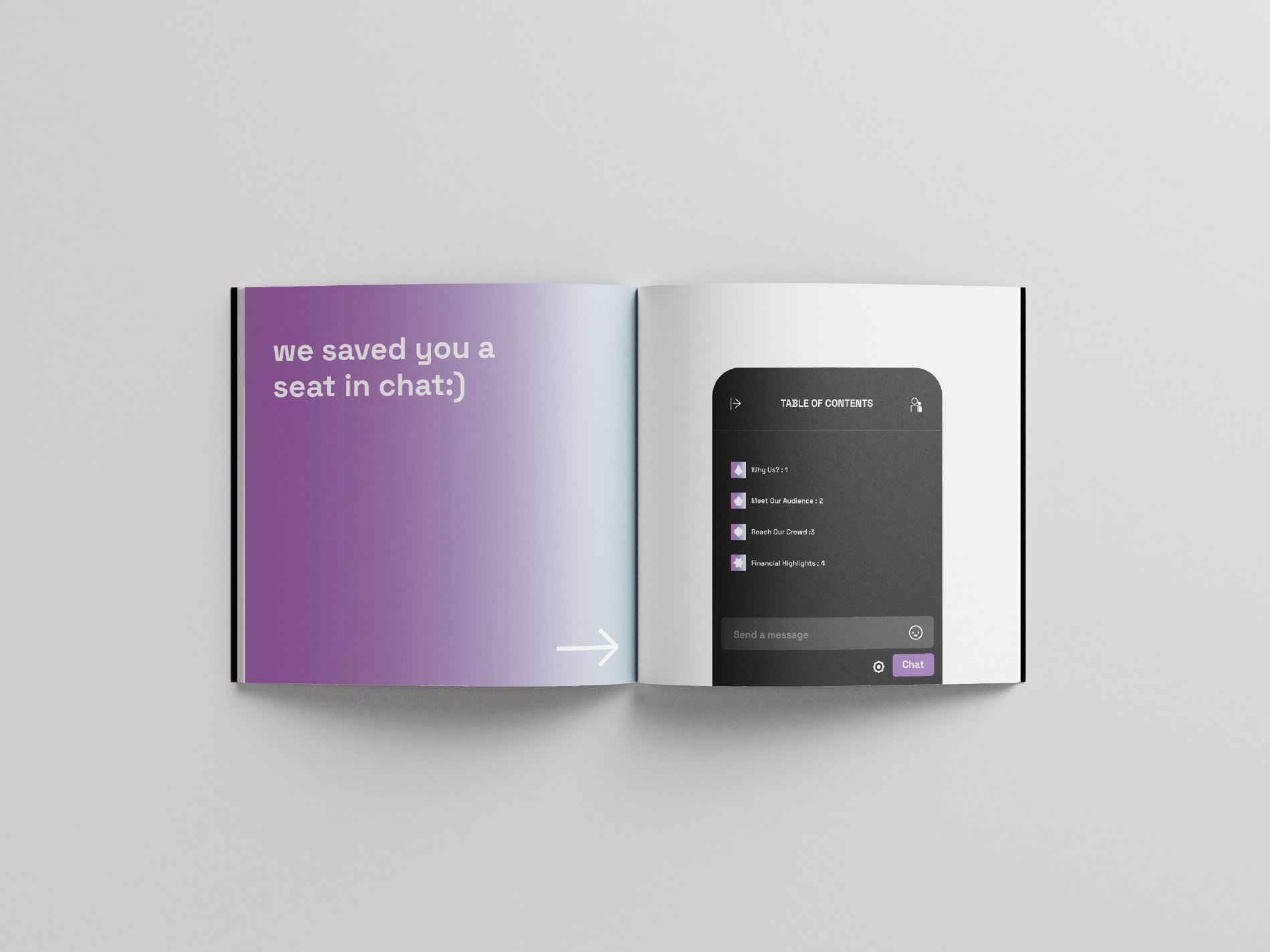
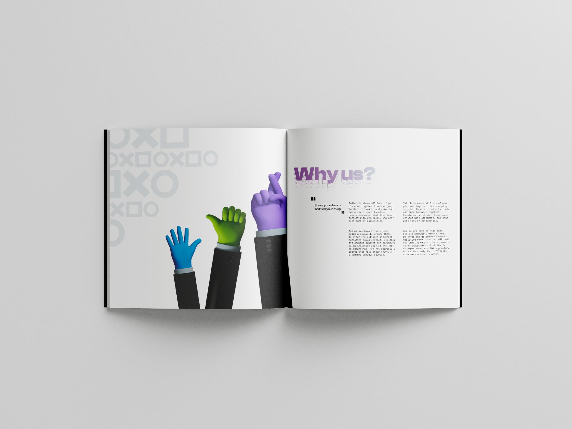
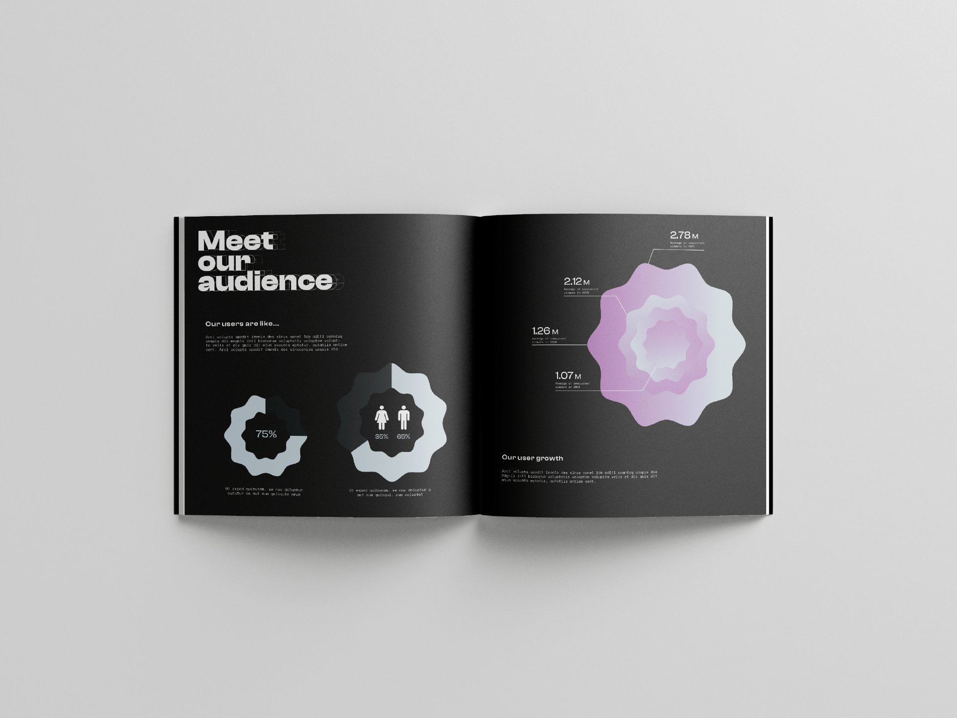
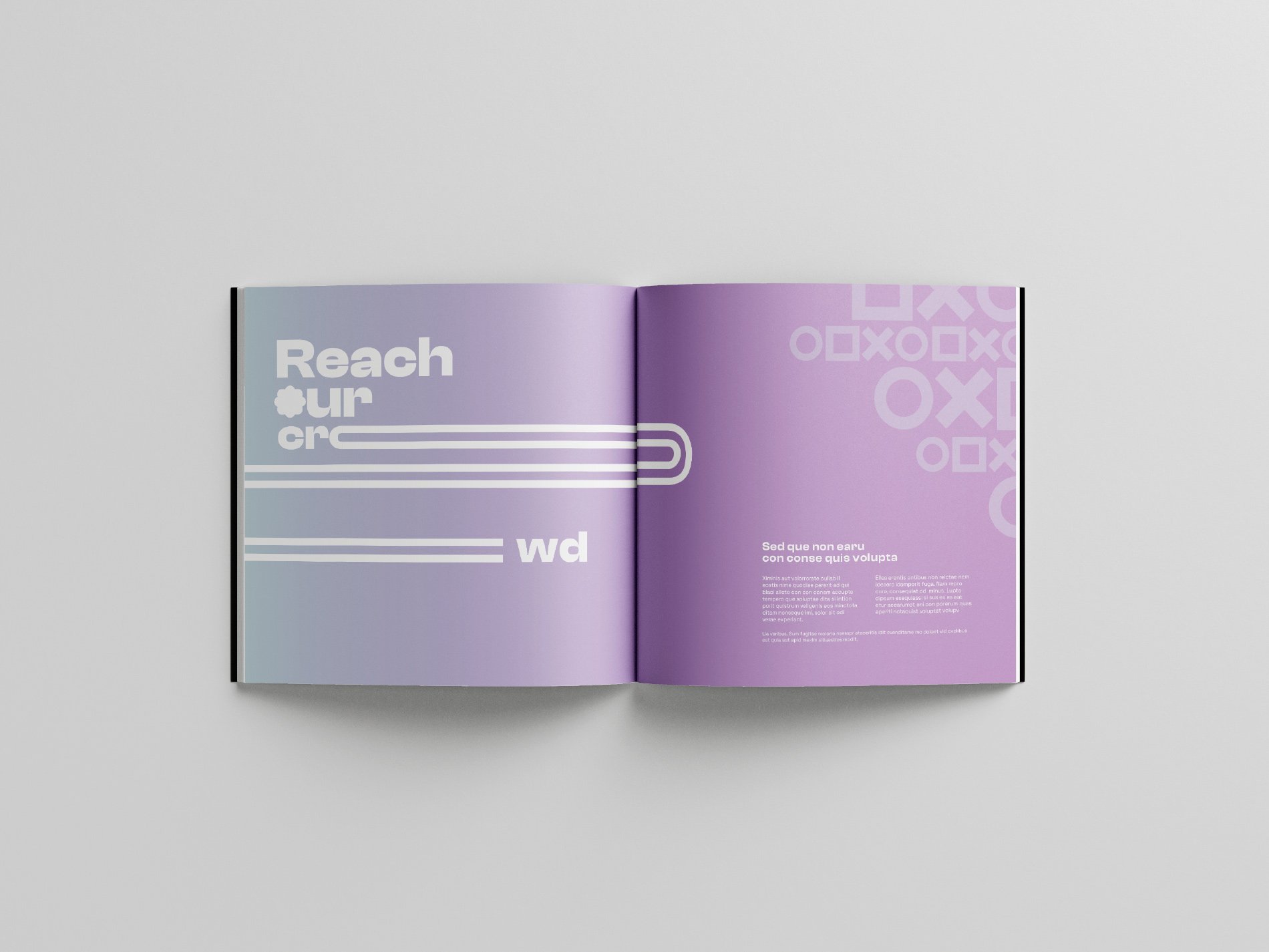
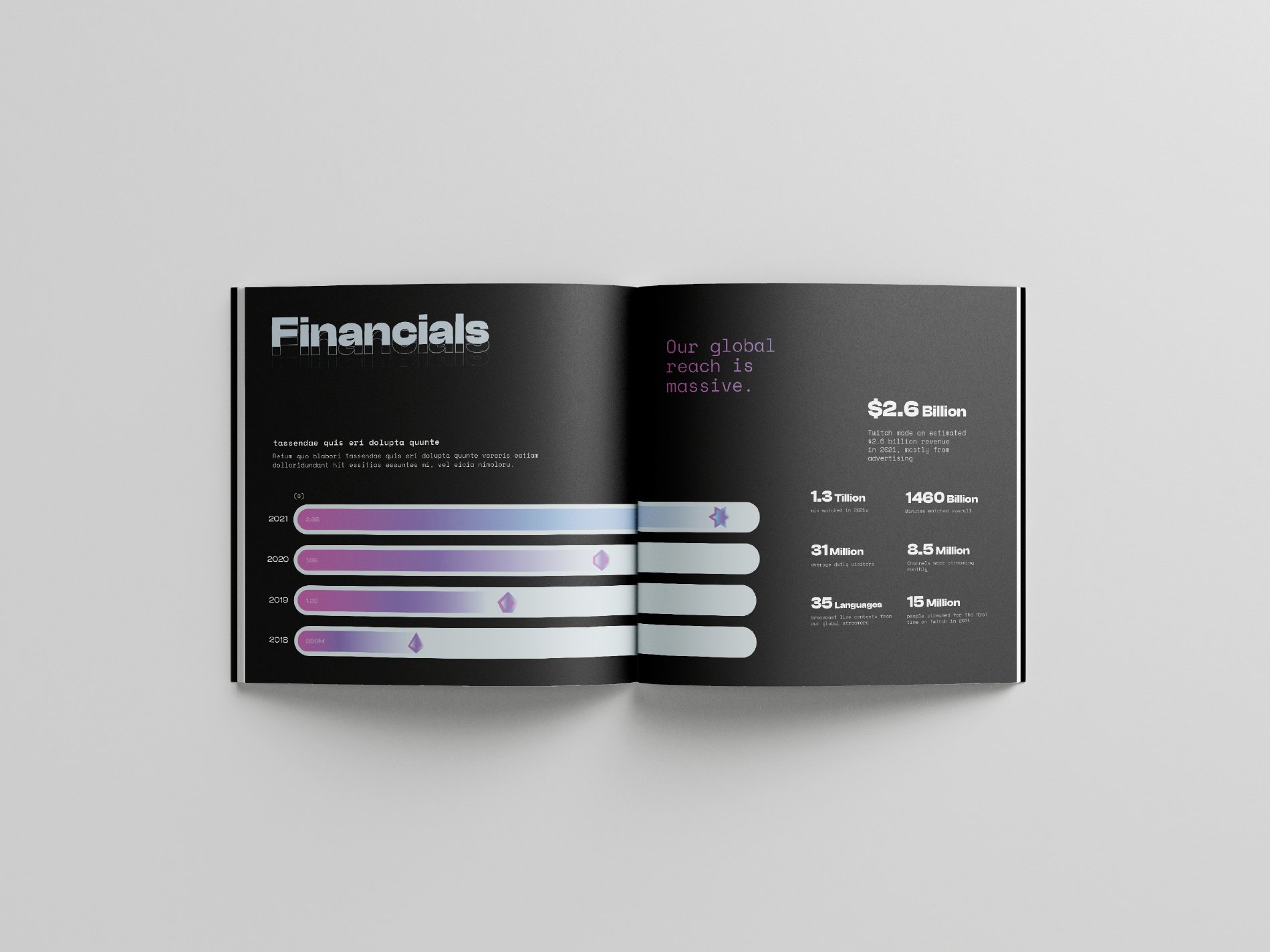
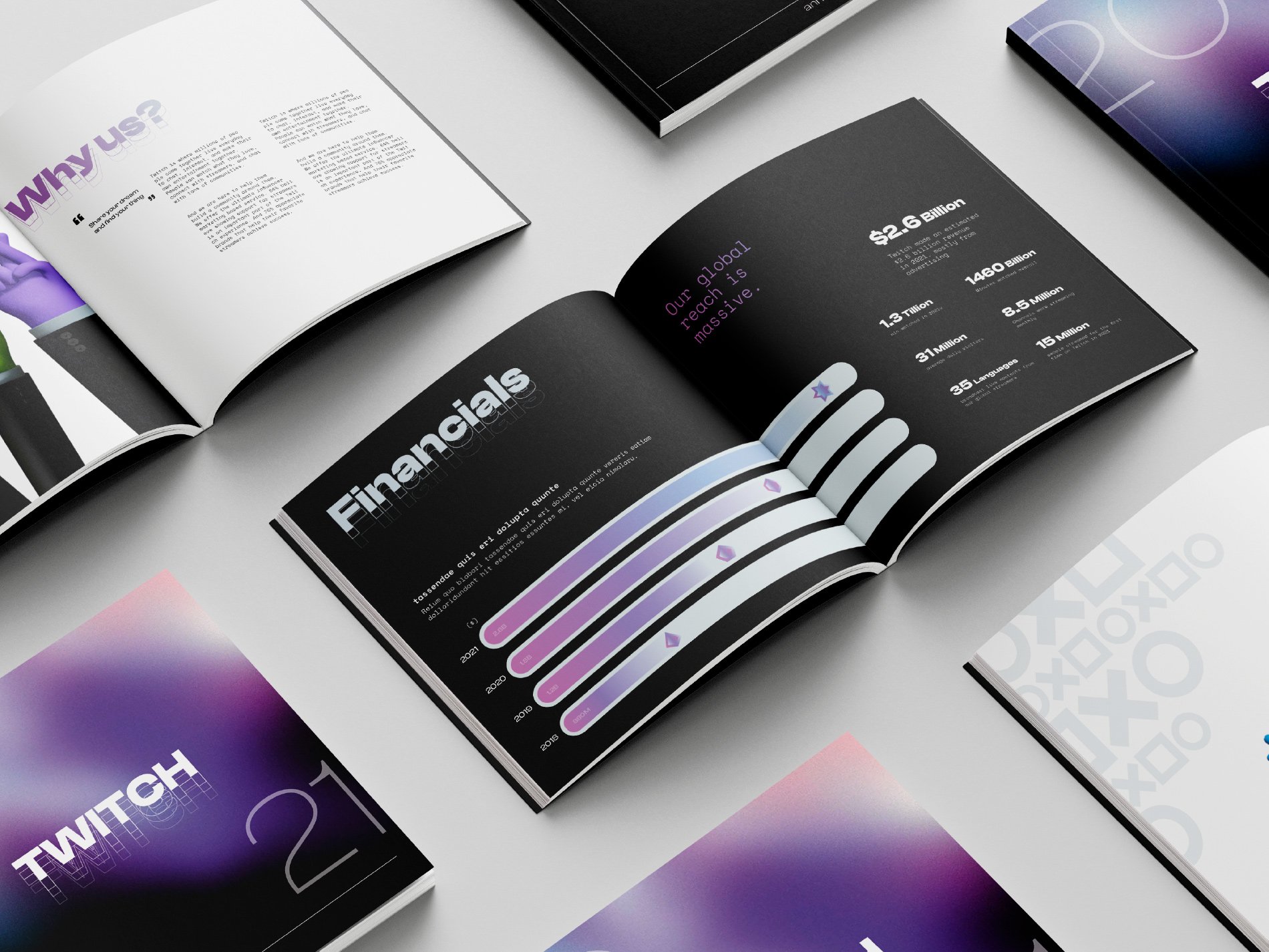
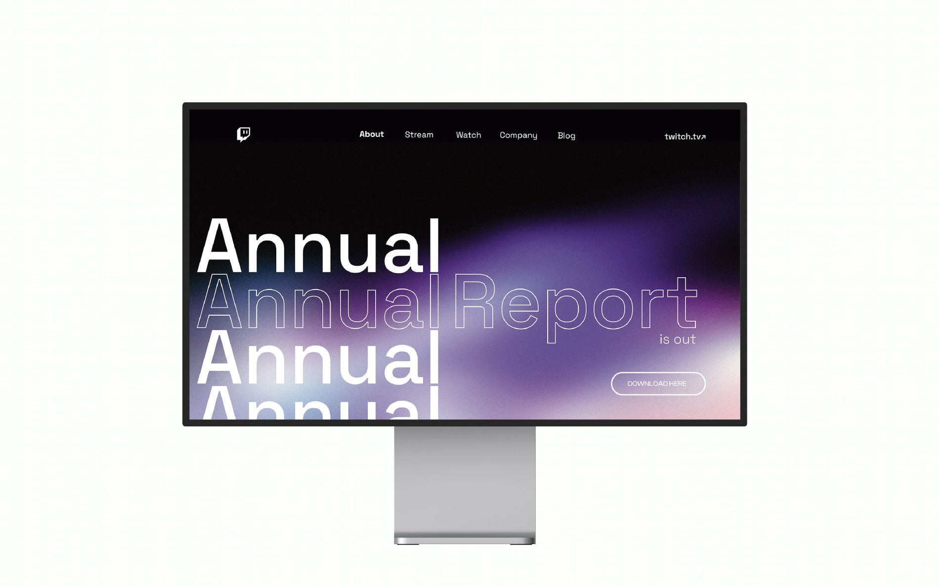
Twitch Annual Report design by Sol Yoon
In my spare time, I enjoy watching Twitch, which sparked my curiosity in the platform's marketing strategy and understanding what appeals to its users. For my annual report project, my goal was to highlight the impact of Twitch's live streaming and advertisement services, while also delving into its strategy to target niche markets and reflecting on the previous year's achievements. Also I wanted to make the target markets feel valued and motivated, in order to inspire their communities and retain them on Twitch. I found that integrating elements of Twitch's internet culture and a futuristic theme helped to make the design more cohesive. Through this project, I learned the importance of having a clear intention and direction for the design in order to effectively manage my time in the future.
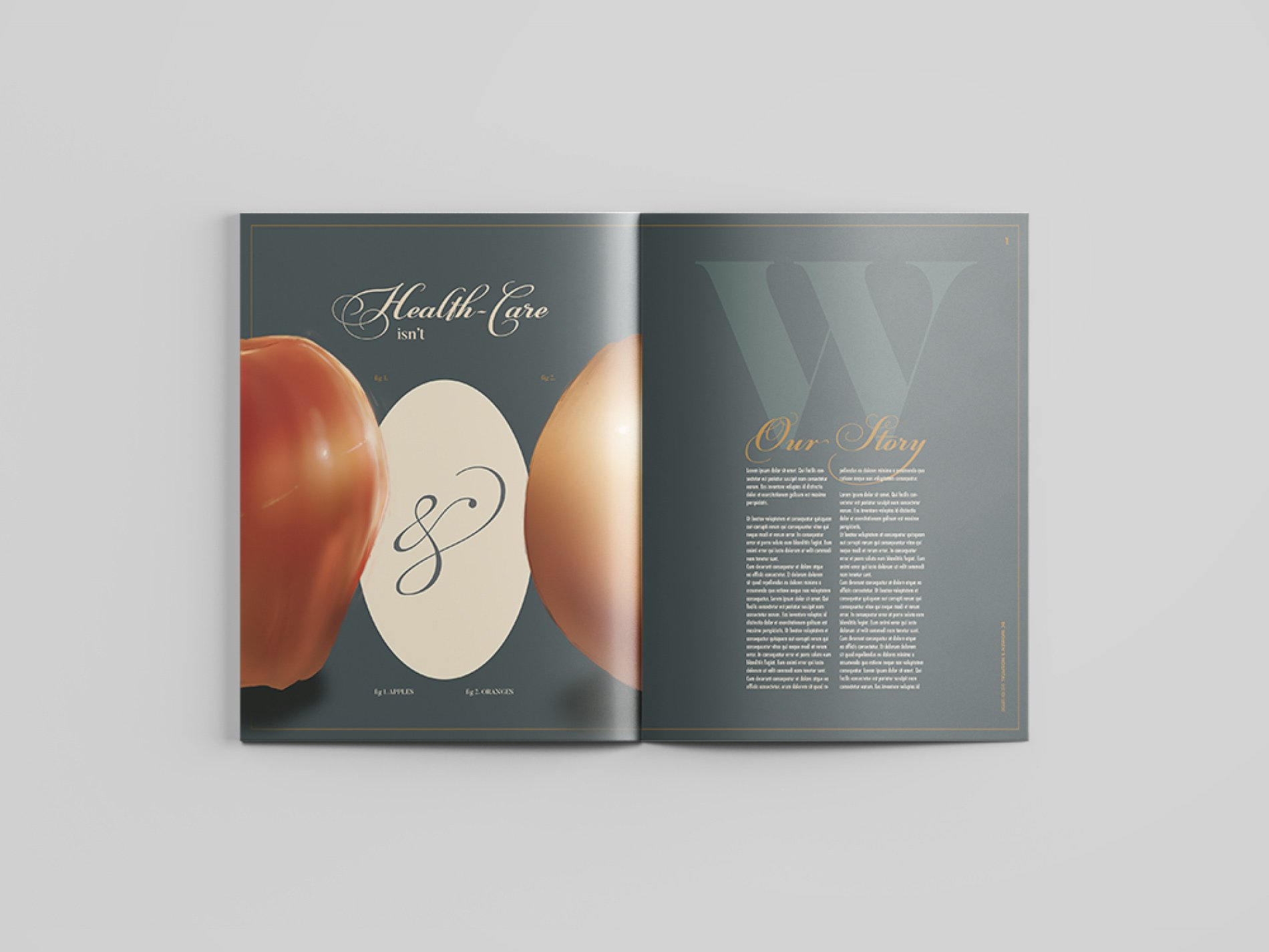
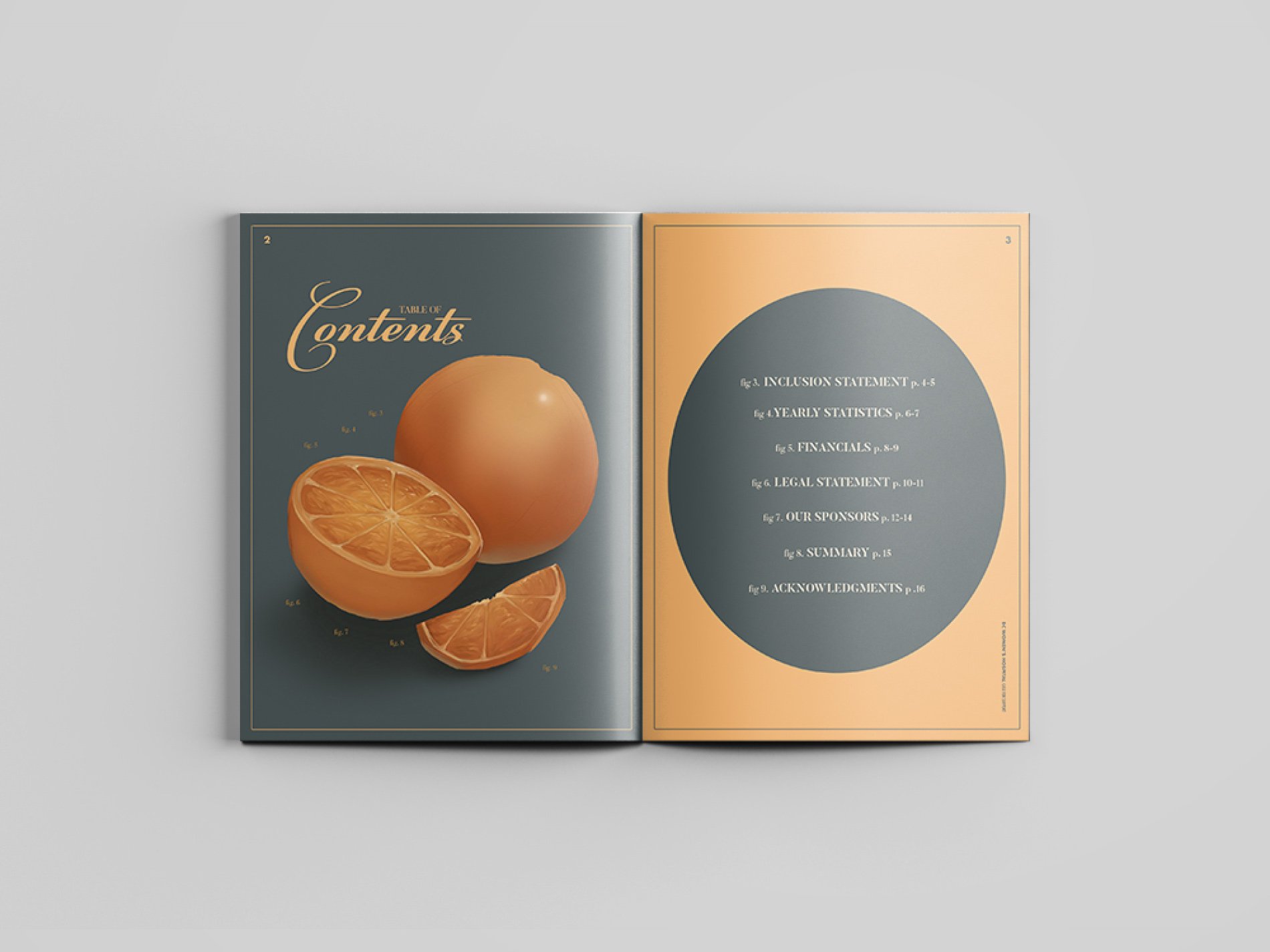
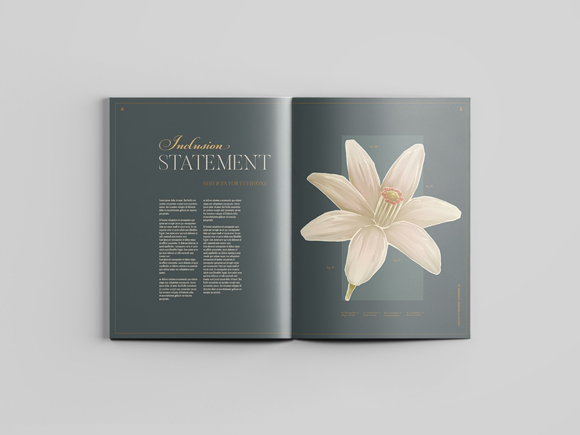
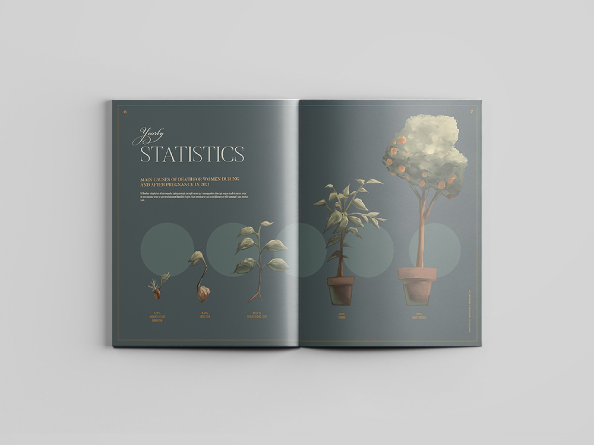
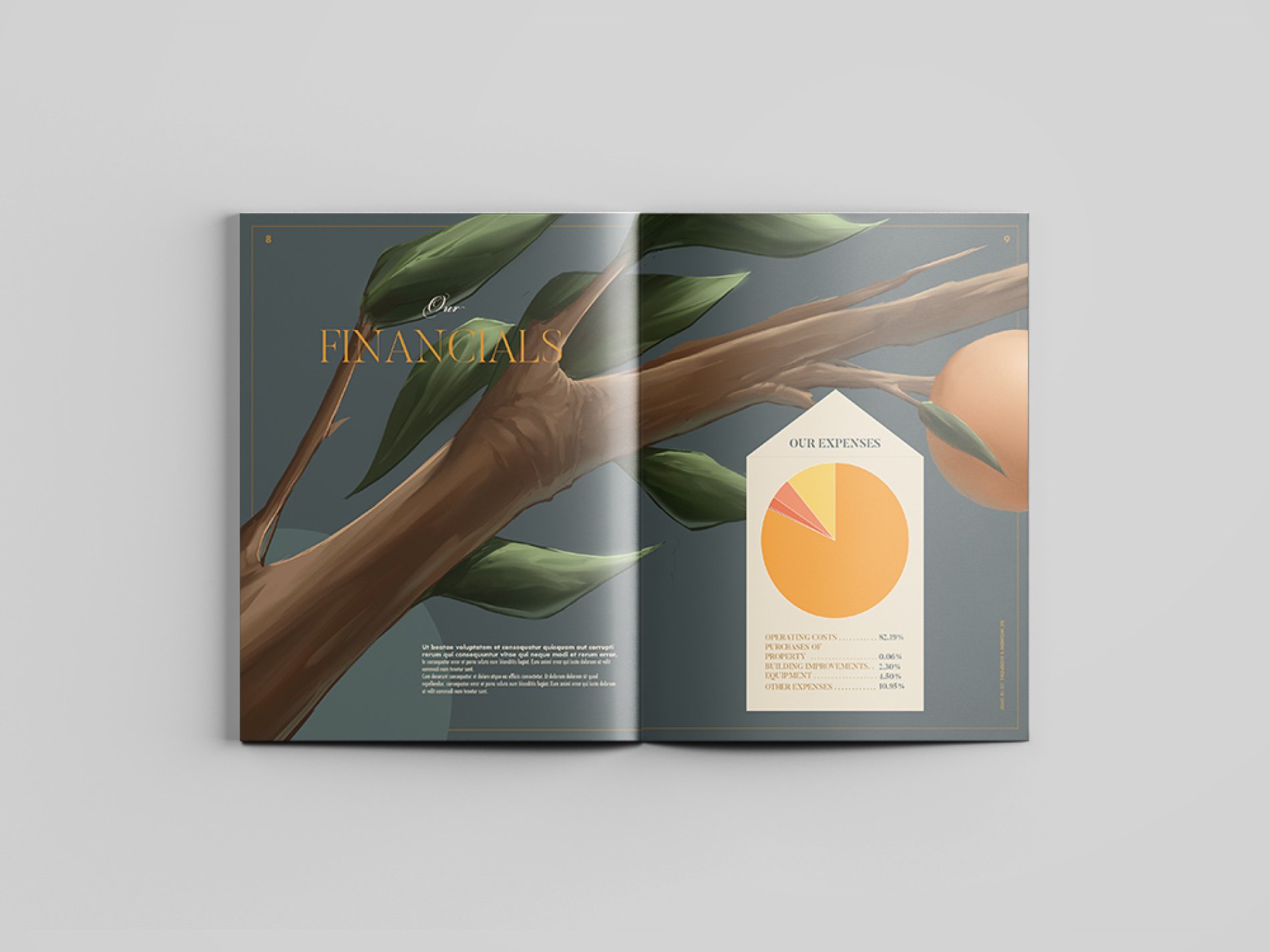
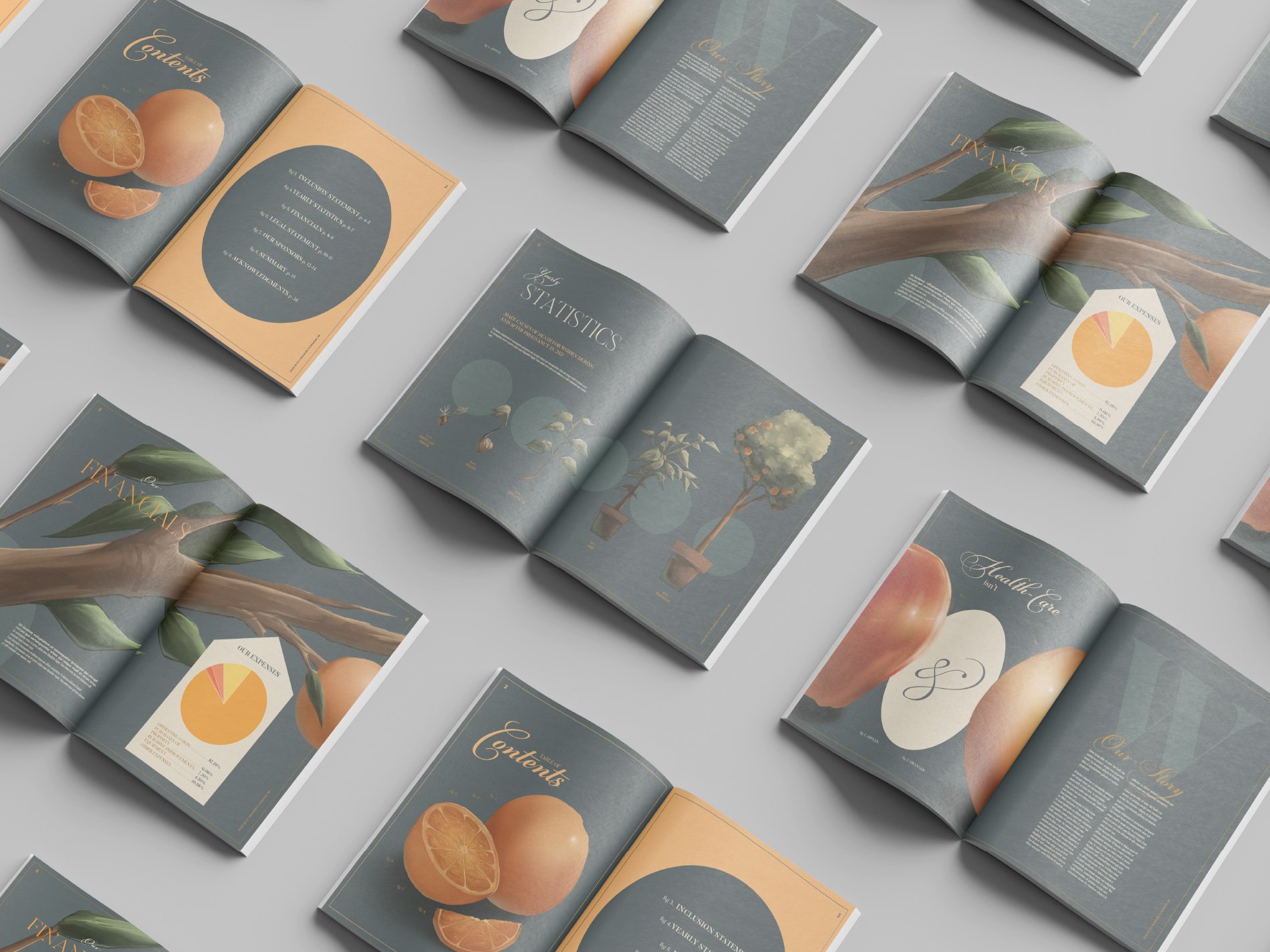
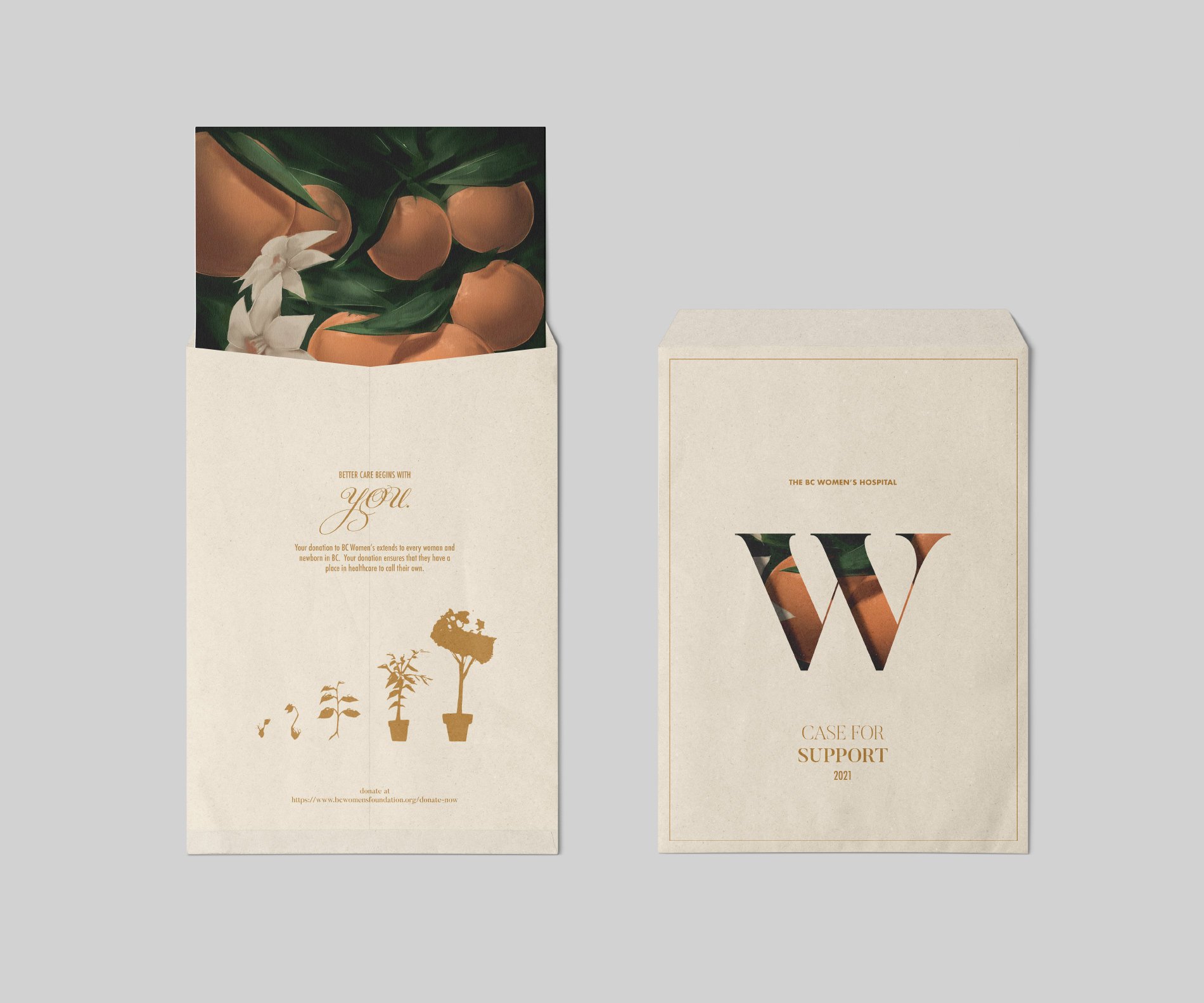
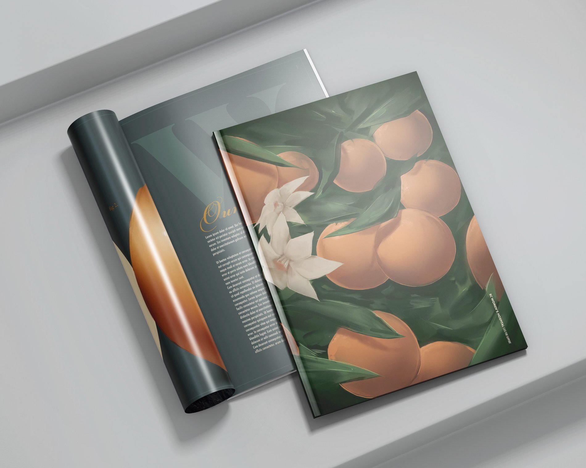
BC Women’s Hospital Annual Report design by Sophia Spanos McGill
For my annual report project, I decided to base the visuals and infographics on the BC Women’s hospital! I aimed to create an elegant, yet humble case for support that explains the necessity of the hospital to the general public using a set of gender-neutral illustrations.
The visuals are a mix of old-fashioned botanical illustrations and a dark, sleek color palette, to reference the history of the hospital and its current relevance. I chose the slogan “Healthcare isn’t apples and oranges” to base the illustrations around, which explains all the orange imagery! The process for this project was a long one, I spent the most time creating thumbnails and making sure the different elements of each page stood well on their own and together as an entity. This project really showed me how important establishing a strong brief and outline is!
Are you a student at IDEA School of Design?
Do you want to get more involved or have your work featured on the IDEA School of Design blog? Reach out to James or your student blog liaison about your blog story idea today!
Are you an IDEA School of Design alumni?
We’re always looking for Grad Spotlight stories about our alumni working in the industry. Reach out to James today!

