“Oystercatcher” by Ethan Woronko (IDEA Grad 2024) is a top packaging and menu design project created in IDEA School of Design’s Branding Concentration
“Oystercatcher” by Ethan Woronko (IDEA Grad 2024) is a top packaging and menu design project in IDEA School of Design’s IDES 362 Visual Communication Studio I: Branding Concentration with Dominique Walker.
Check out this top student packaging and menu design project from our branding concentration!
Rational by Ethan Woronko (IDEA Grad 2024)
For both locals and visitors alike, who seek a true taste of the West coast, we provide a unique BC-grown and harvested seafood selection that shows the splendour of the ingredients. We keep our ingredients local and put the spotlight on the uncommon to show the beauty of what hidden in plain sight.
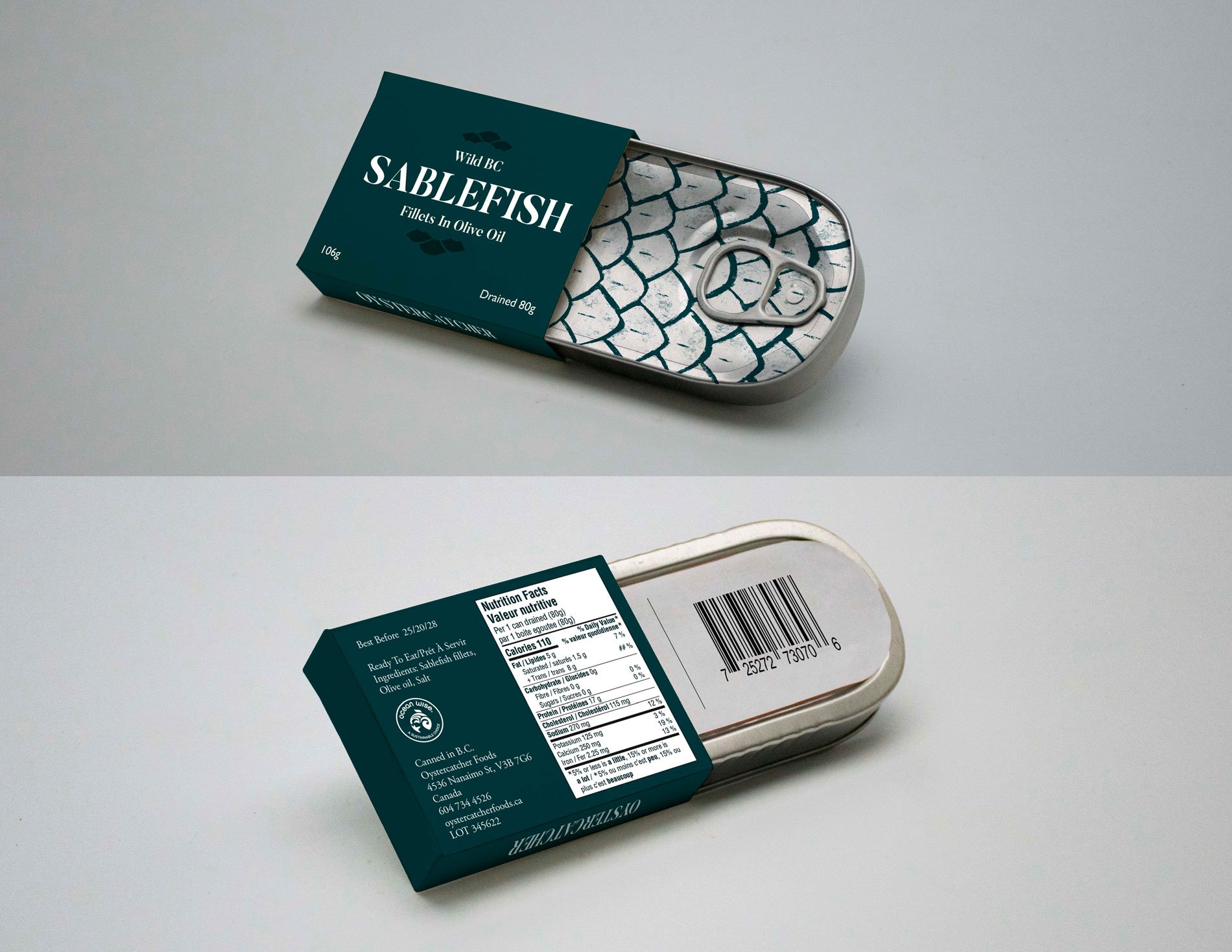
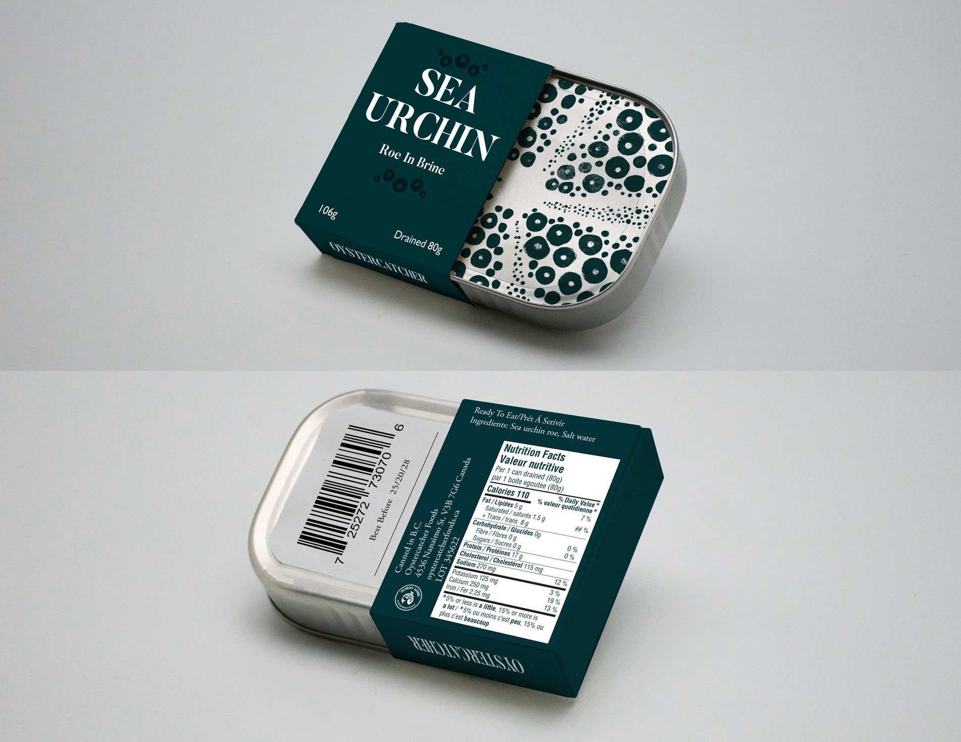
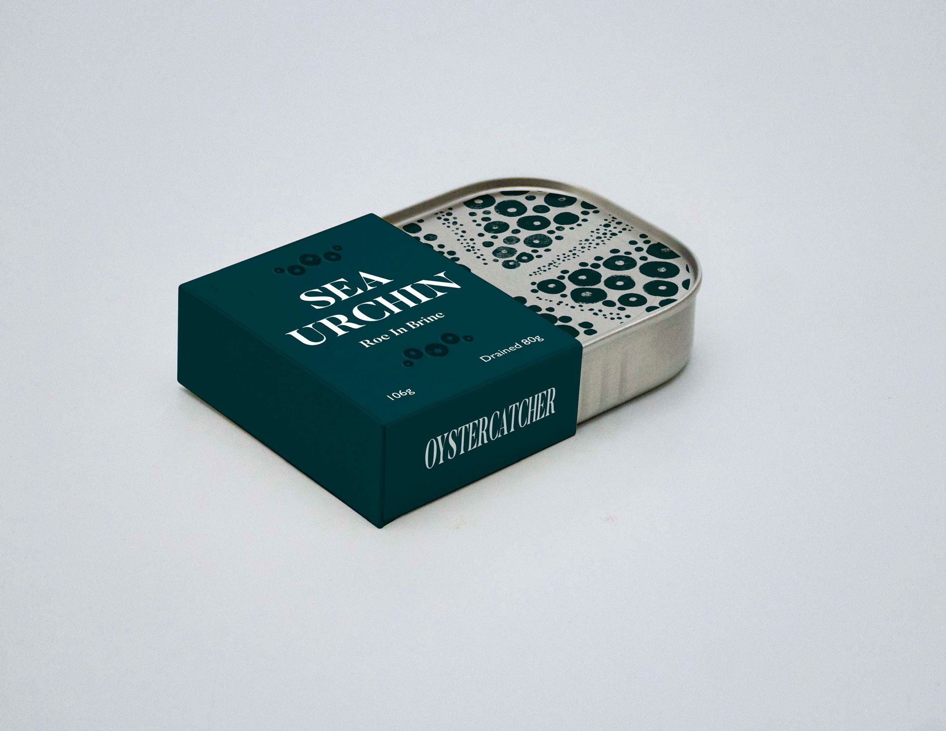
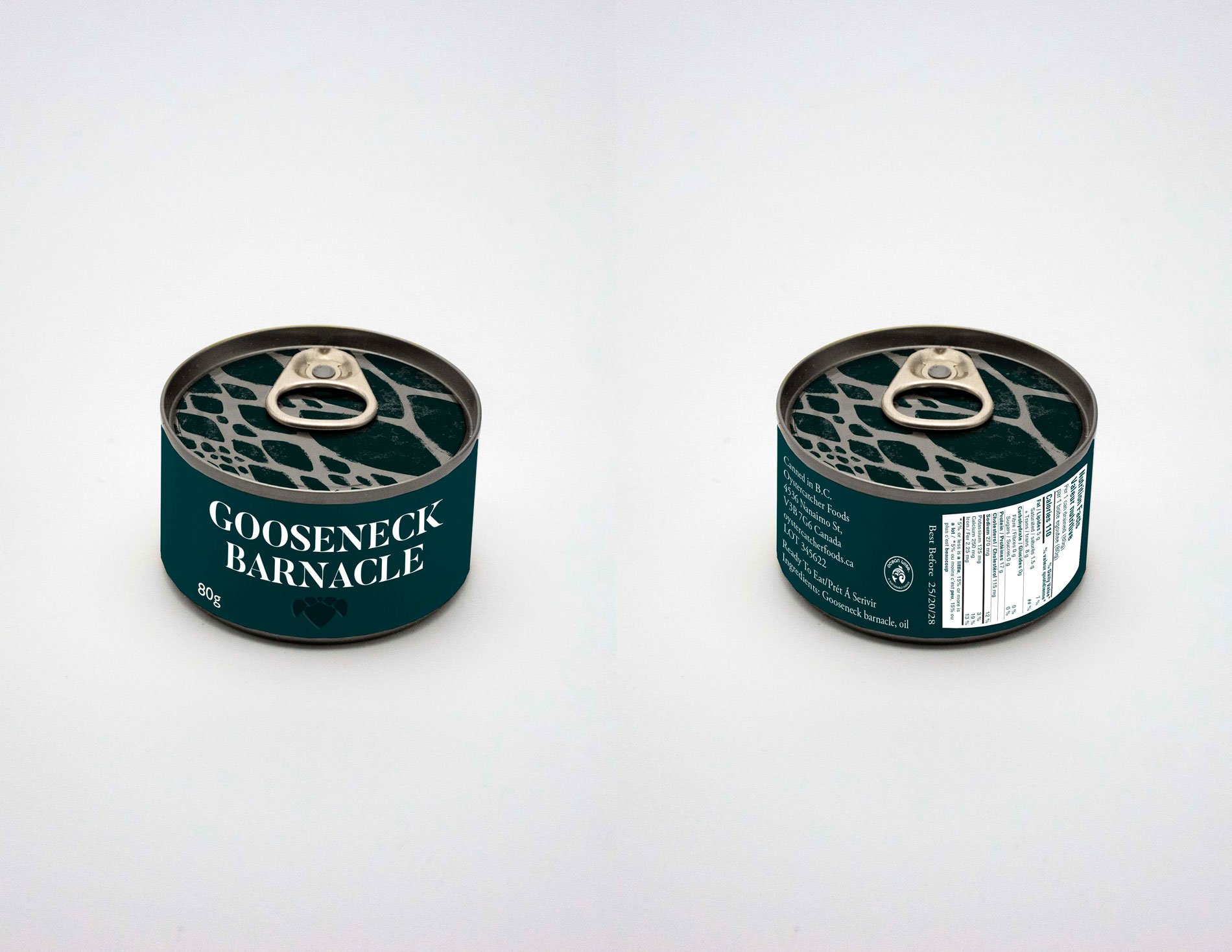
The Oystercatcher brand focuses on simplicity and the high-quality seafood used in its dishes. For the preserved seafood line, tins were used to keep the products fresh and bursting with flavour while also being recyclable and familiar to consumers. .The distinct sea green colour tied to the Oystercatcher brand was used throughout to keep the packages feeling premium and distinguishable on a shelf.
The tins are printed with a hand drawn illustration depicting the texture of the seafood inside and are encased in a dark half box to provide contrast. The roughness of the illustrations assist in making the product feel natural and organic, while the tin showing through allows the iridescence of the sea creatures to show. The box contains all the necessary information including the seafood type, flavouring, and debossed illustration correlating to seafood type. To ensure the brand is recognizable, the sides of the box are printed with the brand name. While sustainability was a major concern in the design of the packaging, some liberties were taken to ensure the design felt high quality and unique, these liberties including the printed tin, and the additional box.
Due to the back label on the box being half size, the barcode is printed onto a small paper label glued to the tin. This paper label also has a small flavour profile and description of the seafood that is revealed once the box is removed. A oceanwise certification icon was included on the back label to allow consumers to trust the product was ethically sourced.
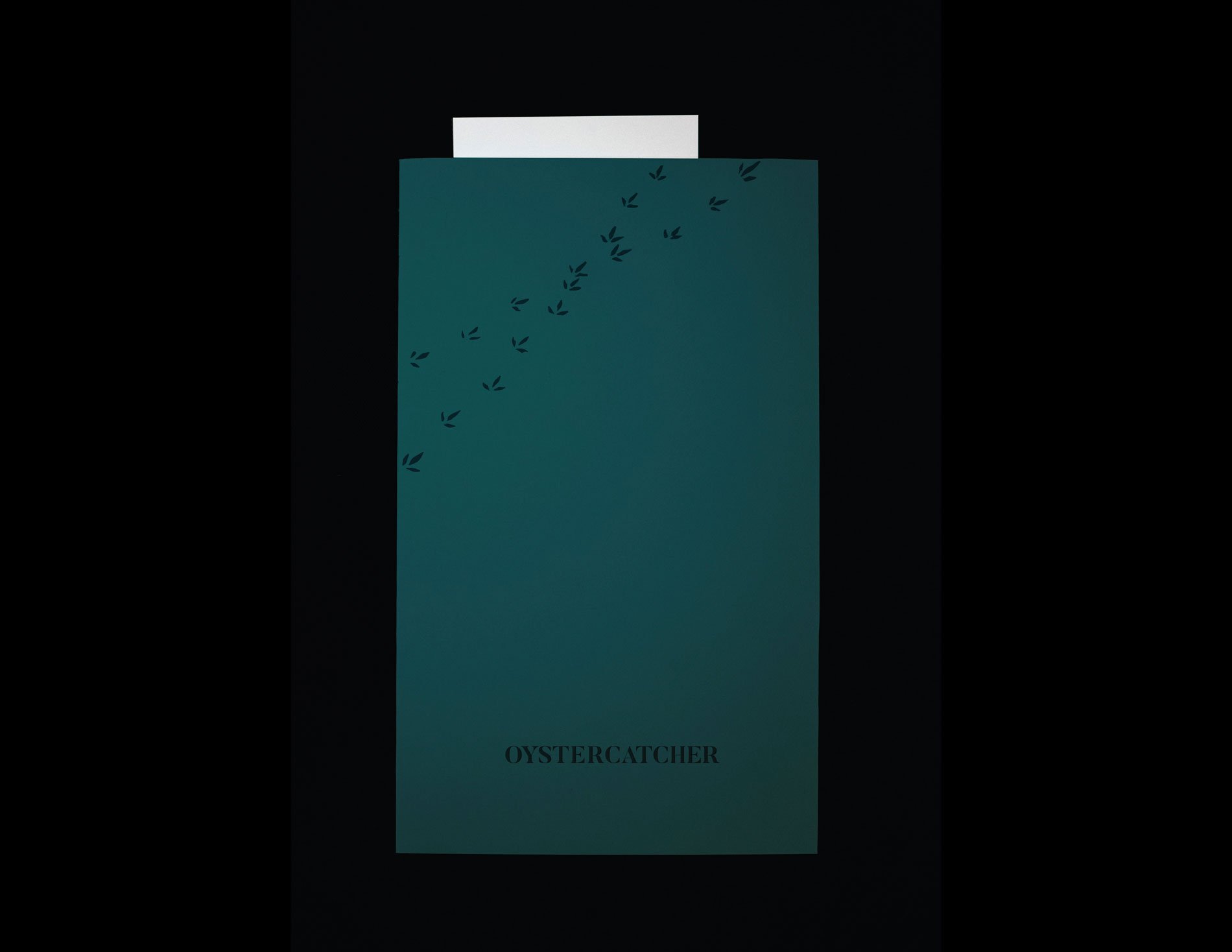
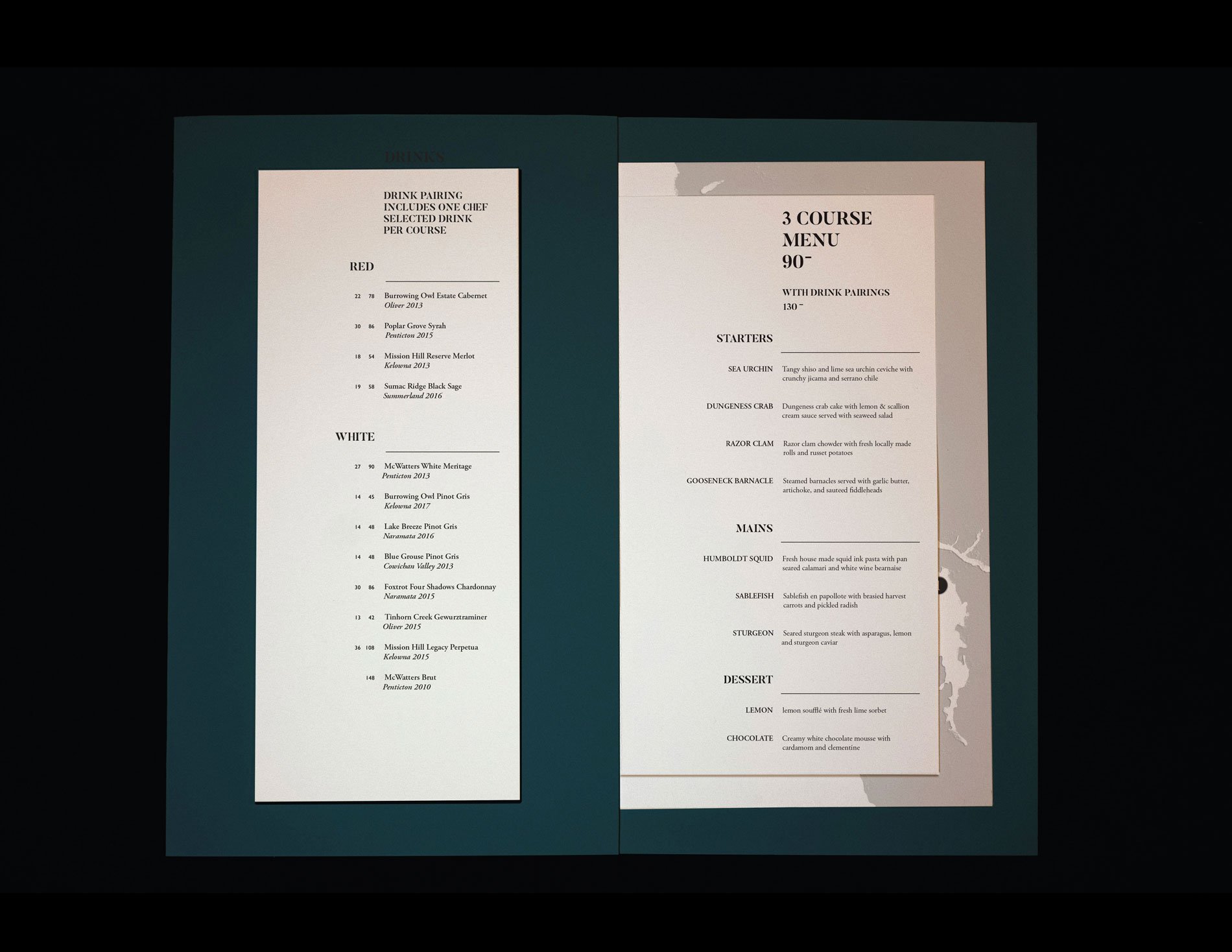
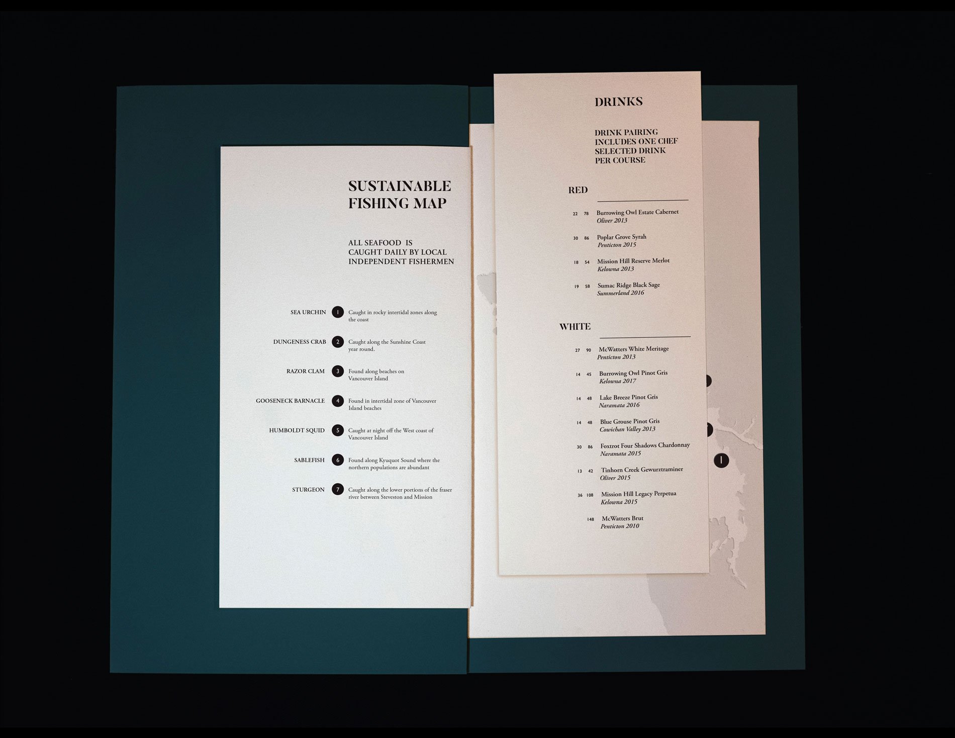
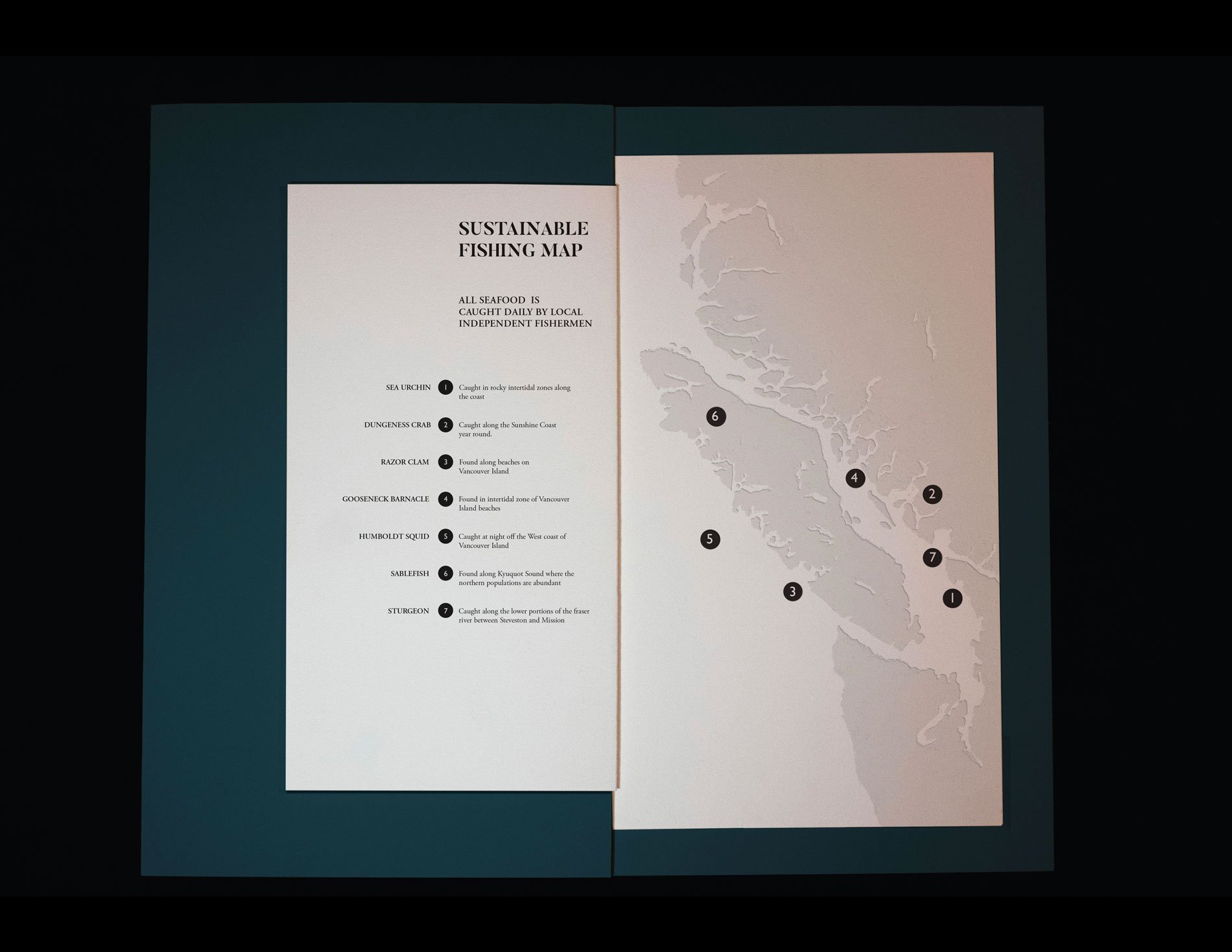
The name “Oystercatcher” is also the name of a lesser-known seabird local to BC that feed on shellfish , fish, and molluscs. To keep the ingredients first and foremost, the design had to be simple yet elegant, so a pair of serif fonts were selected, one display and one for body copy. A dark bluish green is used for the cover and map illustration to tie back to the ocean and give the menu a premium feel. A set price menu was chosen to keep focus on the food and not on how much a dish costs. To make the seafood even more the focus, each dish is labeled simply with the standout ingredient, inviting guests to read further to discover what the dish consists of. A right-loaded 2 column grid is used to keep things interesting while still simple and easy to read. Th e fi shing map was added to the menu to allow guests to see where each dishes main ingredient was caught and possibly where they could find them on their own.
About the Course
Thematically structured around the concept of “design for good”, this course introduces a variety of creative briefs, research methods, leadership skills, and tools that model best practices. Students work in groups to deconstruct the briefs, build on the research, identify tasks, map workflow, explore and define problem-solving strategies, and build solutions and case studies. Students concentrate on branding for project deliverables.

